Creating tables
Where possible, use qlik-embed and qlik/api rather than this framework.
The table shows several fields simultaneously, where the content of each row is logically connected, and may consist of multiple dimensions and measures. Selections can only be made within the dimension columns, each of which provides a search feature in the header.
Learn more about the table chart, or review the table chart API specification.
Table virtualization
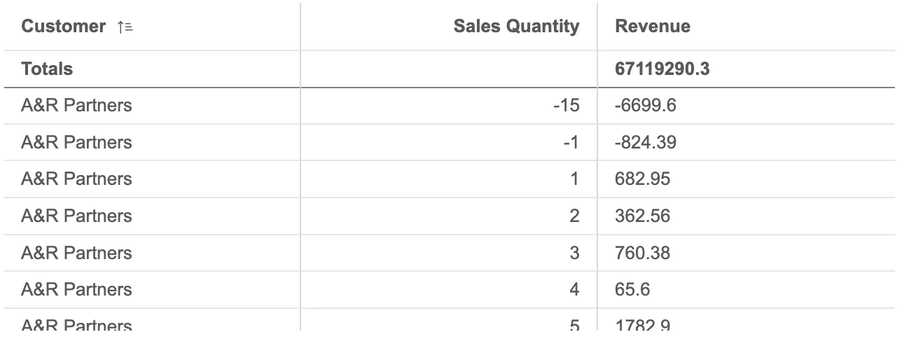
Virtualization enabled by default is a convenient way of displaying a substantial amount of data on the client-side without the need for pagination.
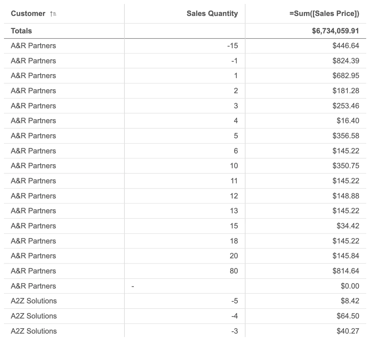
// Configure nucleusconst nuked = window.stardust.embed(app, { context: { theme: "light", // default is light language: "en-US", //default is en-US keyboardNavigation: false, // tell Nebula to handle navigation, default is false constraints: { active: false, // allow interactions, default is false }, }, types: [ { name: "table", load: () => Promise.resolve(window["sn-table"]), }, ],});// Rendering a table which enables virtualizationnuked.render({ type: "table", element: document.querySelector(".table"), fields: ["Customer", "Sales Quantity", "=Sum([Sales Price])"],});Table pagination
Pagination allows for quick navigation in large datasets by splitting up the data into pages with a certain amount of rows. It also enhances accessibility and readability.
To activate pagination in a table, the usePagination property needs to be set to true.
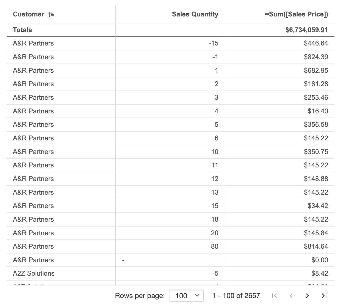
// Rendering a table which paginationnuked.render({ type: "table", element: document.querySelector(".table"), fields: ["Customer", "Sales Quantity", "=Sum([Sales Price])"], properties: { usePagination: true, },});More examples
The table’s appearance can be customized to a great extent. Below are some basic examples:
Styling
Both the header and the body of the table can be styled with colors and font sizes. Additionally, the hover effect on rows can also be styled.
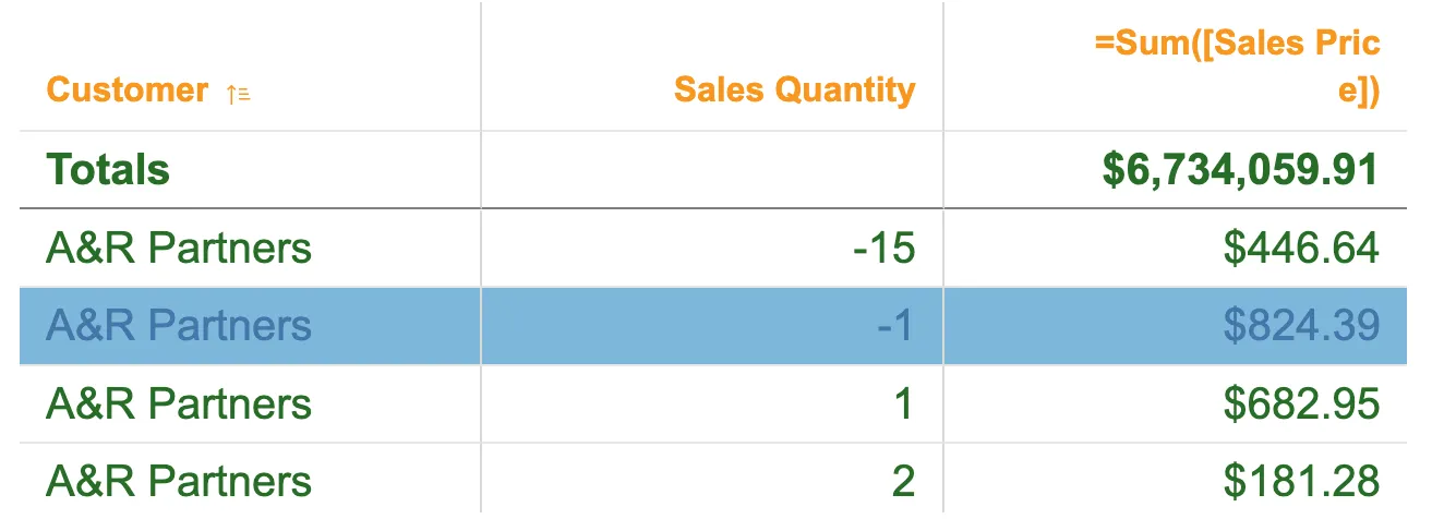
nuked.render({ type: "table", element: document.querySelector(".table"), fields: ["Customer", "Sales Quantity", "=Sum([Sales Price])"], properties: { components: [ { key: "theme", content: { fontSize: 20, fontColor: { index: -1, color: "#276e27", }, hoverEffect: true, hoverColor: { index: -1, color: "#7db8da", }, hoverFontColor: { index: -1, color: "#4477aa", }, }, header: { fontSize: 16, fontColor: { index: -1, color: "#f8981d", }, }, }, ], },});Column Styling
A specific column can be styled with background and font colors. This is achieved through expressions, allowing the color to vary based on the cell’s value.
To change properties on a measure,
the measure itself needs to be defined under properties on qDef.qDef,
followed by the column colors under qAttributeExpressions.
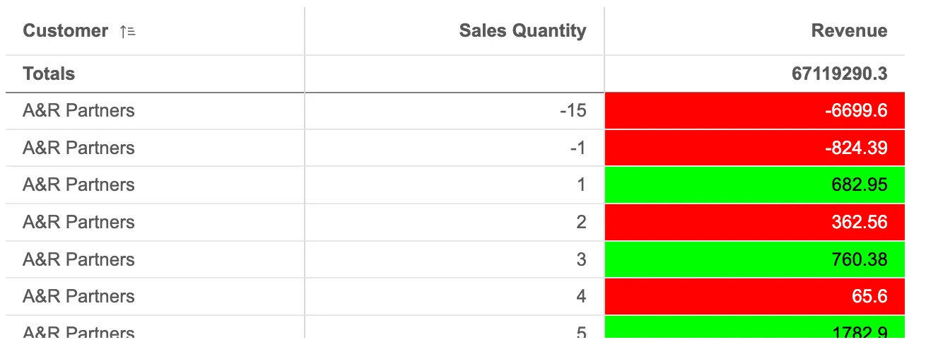
nuked.render({ type: "table", element: document.querySelector(".table"), fields: ["Customer", "Sales Quantity"], properties: { qHyperCubeDef: { qMeasures: [ { qDef: { qDef: "Revenue", }, qAttributeExpressions: [ { qExpression: `=if(Revenue < 400, '#ff0000', '#00ff00')`, qAttribute: true, id: "cellBackgroundColor", }, { qExpression: `=if(Revenue < 400, '#ffffff', '#000000')`, qAttribute: true, id: "cellForegroundColor", }, ], }, ], }, },});Text alignment
Each column’s text alignment can be set to left, center, or right. The default setting is left for text values and right for number values, including those related to dates.
This example has a left-aligned number values.
nuked.render({ type: "table", element: document.querySelector(".table"), fields: ["Customer", "Sales Quantity"], properties: { qHyperCubeDef: { qMeasures: [ { qDef: { qDef: "Revenue", textAlign: { auto: false, align: "left", }, }, }, ], }, },});Totals settings
Numeric values’ totals are displayed below the respective measure names. You can modify the label name, whether to display the totals and their placement, either at the top or bottom.
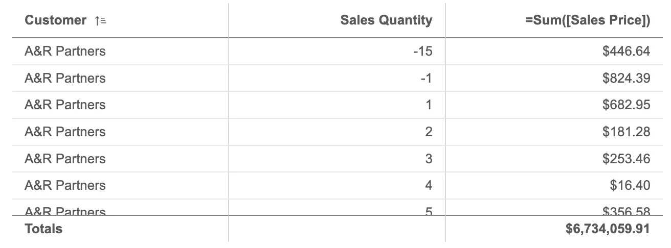
nuked.render({ type: "table", element: document.querySelector(".table"), fields: ["Customer", "Sales Quantity", "=Sum([Sales Price])"], properties: { totals: { label: "Totals", position: "bottom", show: true, }, },});Column width and order
The column width can be defined in different ways:
autocalculates the column width so that the total table width equals the chart width.fitToContentcalculates a width based on the cells’ content.pixelsuses a specified pixel value.percentagesets the column width to specified percentage of the chart width.
nuked.render({ type: "table", element: document.querySelector(".table"), fields: ["Customer", "Sales Quantity"], properties: { qHyperCubeDef: { qMeasures: [ { qDef: { qDef: "Revenue", columnWidth: { type: "pixels", pixels: 350, }, }, }, ], }, },});A custom table order can be set using the qHyperCubeDef.qColumnOrder property.
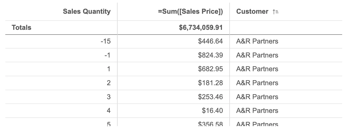
nuked.render({ element: document.querySelector(".object"), type: "table", fields: ["Sales Quantity", "Customer", "=Sum([Sales Price])"], properties: { qHyperCubeDef: { qColumnOrder: [0, 2, 1], }, },});Keyboard navigation
You can use a keyboard to navigate the table when pagination is activated.
When mounting the table, there are two modes to
choose from by setting the property keyboardNavigation
to either true or false (default).
Setting keyboardNavigation to true tells nebula to handle focusing in and out of the table,
while setting it to false makes the first cell of the table focusable in
sequential keyboard navigation. For more information about the stardust
useKeyboard hook, see the reference documentation.)
This is an example of navigating the table with keyboardNavigation: true. The entire table can be focused,
then space/enter can be pressed to focus inside the table.
const n = embed(enigmaApp, {  context: {    keyboardNavigation: true,  },  // ...});
n.render({  type: "table",  element: document.querySelector(".table"),  fields: ["Customer", "Sales Quantity", "=Sum([Sales Price])"],  properties: {    usePagination: true,  },});
This is an example of navigating the table with keyboardNavigation: false.
The first cell of table can be focused, allowing tabbing straight
into the table and then pagination controls.
const n = embed(enigmaApp, {  context: {    keyboardNavigation: false,  },  // ...});
n.render({  type: "table",  element: document.querySelector(".table"),  fields: ["Customer", "Sales Quantity", "=Sum([Sales Price])"],  properties: {    usePagination: true,  },});
Keyboard shortcuts
In the table with pagination enabled, all the interactions that can be done with the mouse (selections, sorting, paging, column resize, search ) are also supported through keyboard shortcuts.
These are many keyboard shortcuts available for working with the table, which vary depending on your location on the chart and the mode you’re in.
| Keyboard shortcut | On table header | On table body | In selections mode on body | On pagination controls |
|---|---|---|---|---|
| Arrow keys | Move focus | Move focus | Move Focus | - |
| Space | Sort on column | Select cell and enter selection mode (on a selectable cell) | Select/deselect cell | Activate control |
| Enter | Sort on column | - | Confirm selections | Activate control |
| Tab | Go to pagination controls | Go to pagination controls | Go to pagination controls | Go to next control |
| Shift + tab | Navigate out of the table | Navigate out of the table | Go to selection toolbar | Go to previous control or back to the table body |
| Shift + up/down arrow | - | Select multiple values (on a selectable cell) | Selects multiple values (on a selectable cell) | - |
| Ctrl/cmd + shift + left/right arrow | Go to previous/next page | Go to previous/next page | Go to previous/next page | Go to previous/next page |
| Escape | Blur and focus the wrapping element* | Blur and focus the wrapping element* | Cancel selections | - |
*Only works when keyboardNavigation: true is set in context.
Within the header menu, you can find options such as search, selections, and adjust column size. To adjust column size, using the Left or Right arrow keys to change the column size. Once you have found the desired size, confirm it by pressing either the Space or Enter key. If you wish to cancel the change, simply press the Escape key.
Pressing the escape key to close the header menu.