Creating scatter plots
Where possible, use qlik-embed and qlik/api rather than this framework.
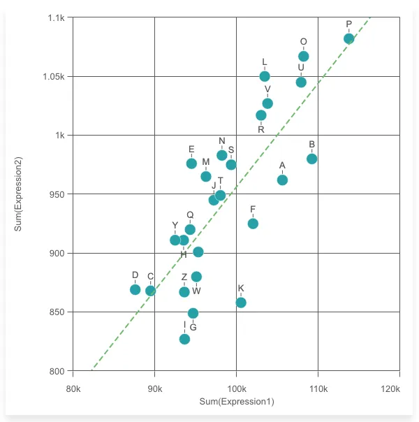
The scatter plot uses bubbles or dots to represent values of two or three measures over a dimension. The first measure is for bubble’s position on the horizontal axis, the second measure is for the bubble’s position on the vertical axis, and the third measure (if any) is for the bubble’s size. The scatter plot is normally used to observe relationships among measures.
Learn more about the scatter plot chart, or review the scatter plot chart API specification.
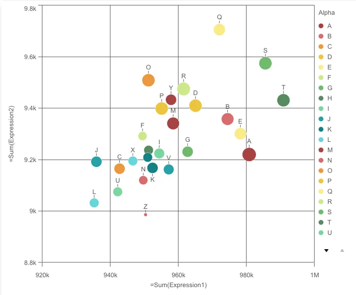
// Configure nucleusconst nuked = window.stardust.embed(app, { context: { theme: "light" }, types: [ { name: "scatterplot", load: () => Promise.resolve(window["sn-scatter-plot"]), }, ],});// Rendering a scatter plot on the flynuked.render({ type: "scatterplot", element: document.querySelector(".scatterplot"), fields: [ "Alpha", "=Sum(Expression1)", "=Sum(Expression2)", "=Sum(Expression3)", ], options: { direction: "ltr", freeResize: true, }, properties: { color: { mode: "byDimension" }, // overrides default properties },});Options
- direction - ltr/rtl
- freeResize - in conjunction with snapshotData on layout, lets the chart ignore size set on snapshotData
Requirements
Requires @nebula.js/stardust version 2.3.0 or later.
Installing
If you use npm: npm install @nebula.js/sn-scatter-plot.
You can also load through the script tag directly from
https://unpkg.com.
More examples
Color bubbles by an expression
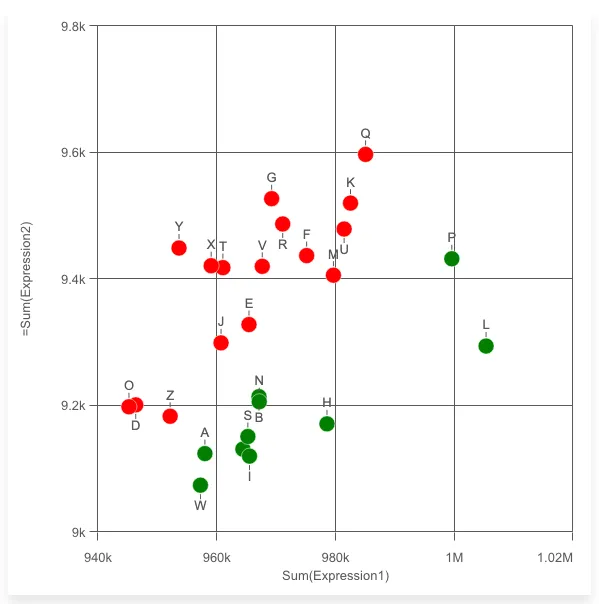
nuked.render({ element: document.getElementById("object"), type: "scatterplot", fields: ["Alpha", "=Sum(Expression2)"], properties: { qHyperCubeDef: { qMeasures: [ { qDef: { qDef: "Sum(Expression1)", }, qAttributeExpressions: [ { // Insert color expression qExpression: "if(sum(Expression2) > 0.0096*sum(Expression1), 'red', 'green')", id: "colorByExpression", }, ], }, ], }, color: { auto: false, mode: "byExpression", expressionIsColor: true, }, },});Navigation panel can be turned on to make browsing chart easier
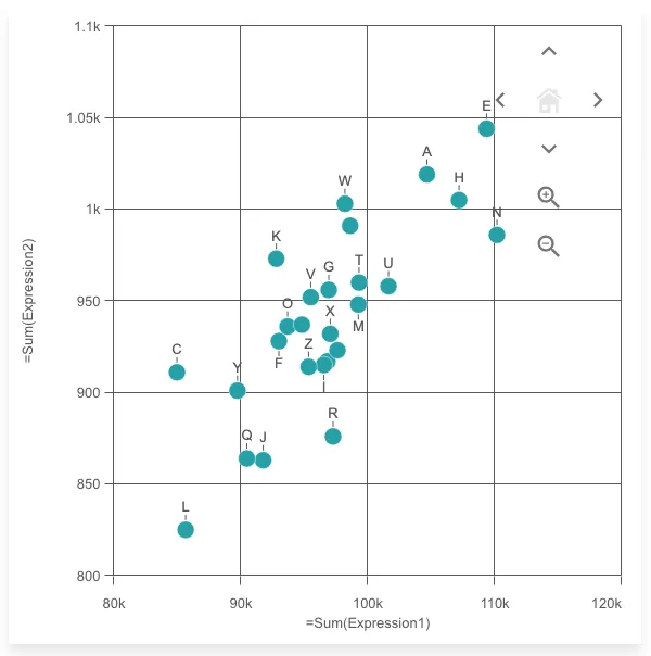
nuked.render({ element: document.getElementById("object"), type: "scatterplot", fields: ["Alpha", "=Sum(Expression1)", "=Sum(Expression2)"], properties: { navigation: true, },});Binned data is turned on automatically if there are more than 1000 data points
When zoomed in or panned outside of the home view, the chart shows an interactive mini map and home button to help with navigating and resetting the view.
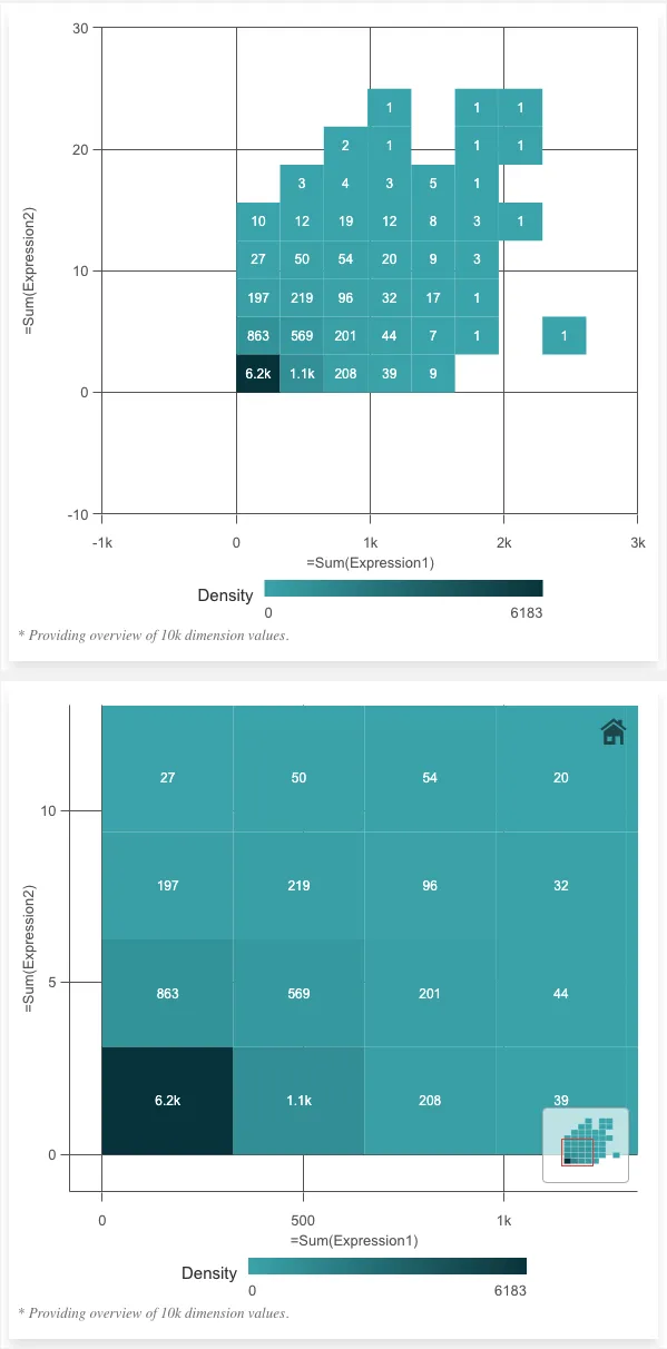
nuked.render({ element: document.getElementById("object"), type: "scatterplot", fields: ["TransID", "=Sum(Expression1)", "=Sum(Expression2)"], properties: { compressionResolution: 2, // queryLevel of bins, smaller number <-> more points per bin },});Best fit line can be turned on
Supported types:
- Linear
- Average
- Second degree polynomial
- Third degree polynomial
- Forth degree polynomial
- Exponential
- Logarithmic
- Power
const nuked = window.stardust.embed(app, {  context: { theme: "light" },  types: [    {      name: "scatterplot",      load: () => Promise.resolve(window["sn-scatter-plot"]),    },  ],});
nuked.render({  element: document.getElementById("object"),  type: "scatterplot",  properties: {    qHyperCubeDef: {      qDimensions: [        {          qDef: {            qFieldDefs: ["Alpha"],          },        },      ],      qMeasures: [        {          qDef: {            qDef: "Sum(Expression1)",          },        },        {          qDef: {            qDef: "Sum(Expression2)",          },          qTrendLines: [            {              qType: "LINEAR",              qXColIx: 1, // The column in the hypercube to be used as x axis.              style: {                autoColor: true,                dashed: true,                lineDash: "8, 4",              },            },          ],        },      ],    },  },});