Creating sankey charts
Where possible, use qlik-embed and qlik/api rather than this framework.
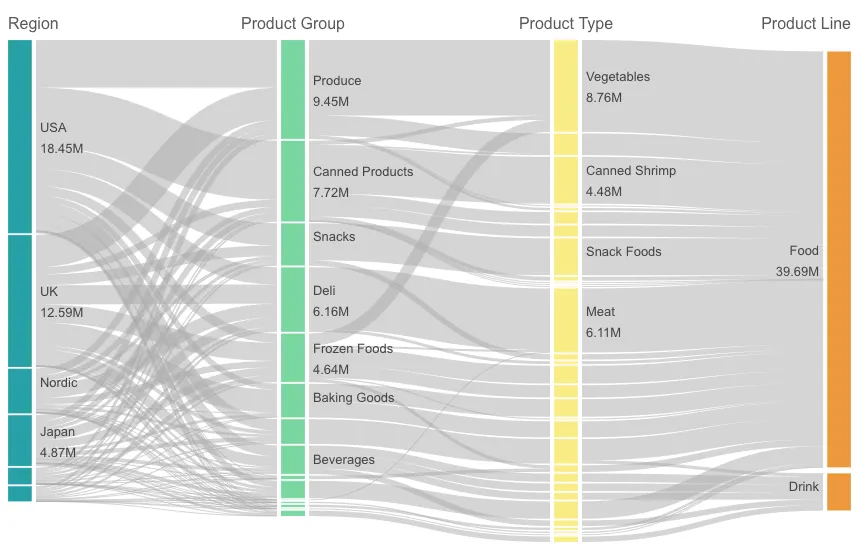
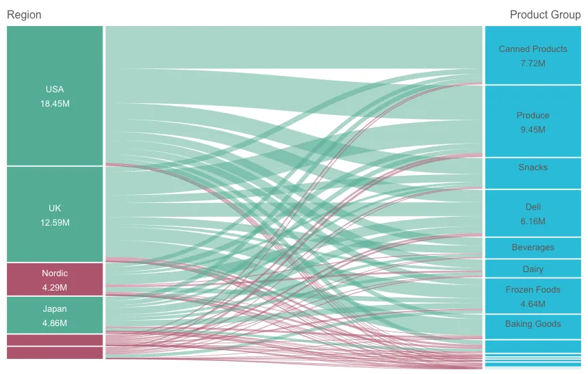
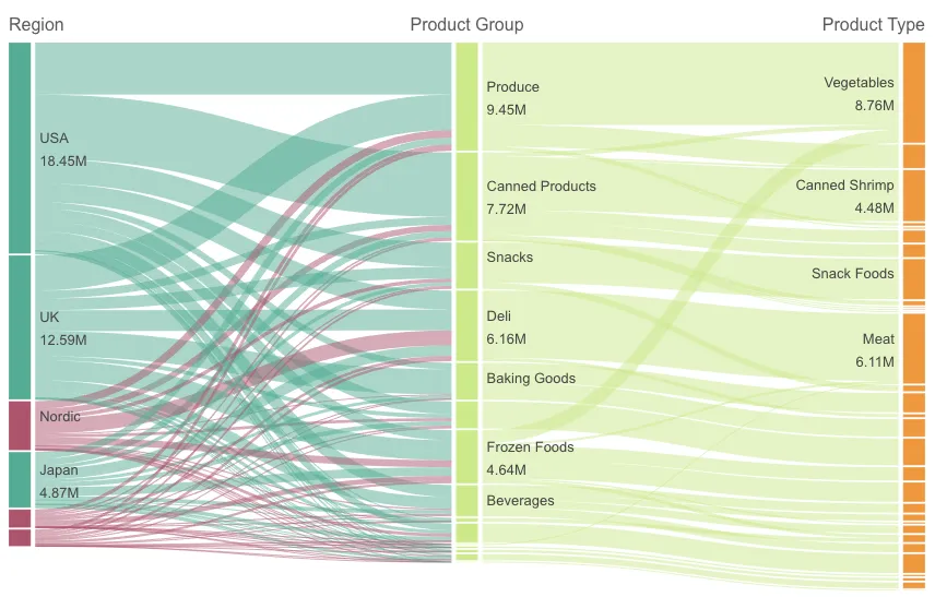
The Sankey chart (Sankey chart) lets you add a specific type of flow chart to the sheet you are editing. The chart visually emphasizes major transfers or flows within defined system boundaries. The width of the chart arrows is shown proportionally to the flow quantity. The Sankey chart is included in the Visualization bundle.
- A minimum of two dimensions and one measure is required. You can use up to five dimensions, but only one measure.
- The dimensions do not need to be of equal size on each side of the diagram.
- You can use the dimension values to set the color of the flows in the chart.
- Link colors can be based on source or target anchor.
Learn more about the sankey chart, or review the sankey chart API specification.
// Configure nucleusconst nuked = window.stardust.embed(app, {  context: { theme: "light" },  types: [    {      name: "sankeychart",      load: () => Promise.resolve(window["sn-sankey-chart"]),    },  ],});
// Rendering a Sankey chart on the flynuked.render({  type: "sankeychart",  element: document.querySelector(".sankey"),  fields: [    "Region",    "Product Group",    "Product Type",    "Product Line",    "=Sum(Margin)",  ],
  // overrides default properties  properties: {    node: {      padding: 0.2,      width: 0.3,    },    link: {      opacity: 0.5,      shadow: false,      color: 3,      colorBy: "custom",    },  },});
Requirements
Requires @nebula.js/stardust version 1.2.0 or later.
Installing
If you use npm: npm install @nebula.js/sn-sankey-chart.
You can also load through the script tag directly from
https://unpkg.com.
More examples
Node and link colors
You can change the node colors of each dimension value. The color should be a valid CSS color.
The colors of chart links are based on either the source or target anchors.
To apply the source or target anchor color to chart links
either use the string ='SOURCE' or ='TARGET'.
You can also select a separate color by entering a color code string.
The color should be a valid CSS color.
nuked.render({ element: document.querySelector(".object"), type: "sankeyChart", properties: { node: { padding: 0.1, width: 0.7, }, qHyperCubeDef: { qDimensions: [ { qDef: { qFieldDefs: ["Region"], }, qAttributeExpressions: [ { qExpression: "if(Sum(total<Region> Margin) > 4500000, '#53ac94', '#ac536b')", }, ], }, { qDef: { qFieldDefs: ["Product Group"], }, qAttributeExpressions: [ { qExpression: "'#28bad7'", }, ], }, ], qMeasures: [ { qDef: { qDef: "Sum(Margin)", }, qAttributeExpressions: [ { qExpression: "if(Sum(Margin) > 300000, '#53ac94', '#ac536b')", }, ], }, ], qInitialDataFetch: [ { qLeft: 0, qTop: 0, qWidth: 6, qHeight: 1000, }, ], }, },});Links colored based on their source
nuked.render({ element: document.querySelector(".object"), type: "sankeyChart", fields: ["Product Group", "Product Type"], properties: { qHyperCubeDef: { qDimensions: [ { qDef: { qFieldDefs: ["Region"], }, qAttributeExpressions: [ { qExpression: "if(Sum(total<Region> Margin) > 4500000, '#53ac94', '#ac536b')", }, ], }, ], qMeasures: [ { qDef: { qDef: "Sum(Margin)", }, qAttributeExpressions: [ { qExpression: "='SOURCE'", }, ], }, ], qInitialDataFetch: [ { qLeft: 0, qTop: 0, qWidth: 6, qHeight: 1000, }, ], }, },});