Creating Network charts
Where possible, use qlik-embed and qlik/api rather than this framework.
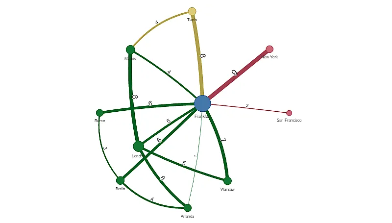
The network chart lets you draw a network of connected nodes and edges from a specific type of data set. A network chart shows how information flows, how components interact, and where components exist in the network. The network chart is included in the Visualization bundle.
Learn more about the network chart, or review the network chart API specification.

// Configure nucleusconst nuked = window.stardust.embed(app, {  context: { theme: "light" },  types: [    {      name: "qlik-network-chart",      load: () => Promise.resolve(window["sn-network-chart"]),    },  ],});
// Rendering a Sankey chart on the flynuked.render({  type: "qlik-network-chart",  element: document.querySelector(".network"),  fields: [    "ID",    "Name"    "LinkTo",    "Group",    "=Sum(Volume)"  ],});
Formatting your data
A network chart requires data that is structured consistently according to a network data model where each record can have multiple parents and children. Each record needs to contain at least:
- A field that identifies the node, the node identifier. Node identifier values must be integer values, starting from 0 and in sequential order.
- A field with the name of the node.
- A field that defines the parent node. This value needs to be the node identifier of another node. If this field is empty, and no other record refers to this node, a disconnected node is created.
Here is some example data that you can save in a text editor and load in a new app. You need to load both example files. The example shows passenger flows between different airports.
- ID is the identifier of an airport node.
- Name is the name of an airport node. This is used as label of the node.
- LinkTo contains the node identifier of the parent node.
- Group states the group of a node. This can be used to color the nodes according to group.
- Volume is the passenger flow volume between ID and LinkTo. This can be used as a measure in edge size.
- NodeVolume is the total passenger flow volume for a node. This is loaded in a separate table as the chart cannot aggregate the volumes automatically.
Example 1: Airports1.csv
ID;Name;LinkTo;Group;Volume0;Frankfurt;;0;1;London;0;1;52;Madrid;0;1;42;Madrid;1;1;83;Warsaw;0;1;74;Arlanda;0;1;13;Warsaw;1;1;54;Arlanda;1;1;65;Tunis;0;2;85;Tunis;2;2;46;Berlin;0;1;66;Berlin;4;1;47;Rome;0;1;67;Rome;6;1;38;San Francisco;0;3;29;New York;0;3;9Example 2: Airports2.csv
ID,NodeVolume0,481,242,163,124,115,126,137,98,29,9Installing
If you use npm: npm install @nebula.js/sn-network-chart.
You can also load through the script tag directly from
https://unpkg.com.