Creating line charts
Where possible, use qlik-embed and qlik/api rather than this framework.
The line chart is a common, widely used visualization. It is often used to show trends over time.
When the number of dimension values exceeds the width of the visualization, a mini chart with a scroll bar is displayed. You can scroll by using the scroll bar in the mini chart, or, depending on your device, by using the scroll wheel or by swiping with two fingers.
Learn more about the line chart, or review the line chart API specification.
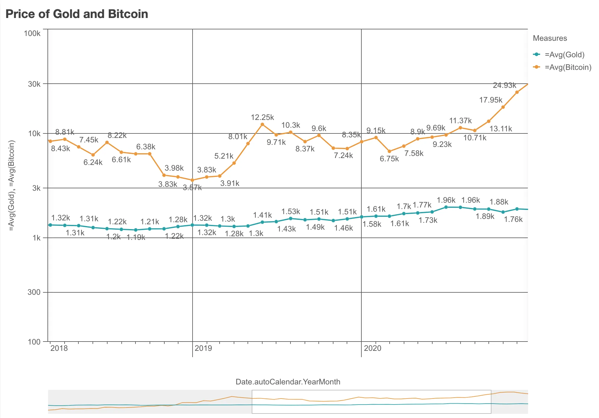
// Configure nucleusconst nuked = window.stardust.embed(app, {  context: { theme: "light" },  types: [    {      name: "line-chart",      load: () => Promise.resolve(window["sn-line-chart"]),    },  ],});// Rendering a line chart on the flynuked.render({  element: document.querySelector(".lines"),  type: "line-chart",  fields: ["Date.autoCalendar.YearMonth", "=Avg(Gold)", "=Avg(Bitcoin)"],
  // Overrides default properties  properties: {    title: "Price of Gold and Bitcoin",    dataPoint: {      show: true,      showLabels: true,    },    gridLine: {      auto: false,    },    dimensionAxis: {      show: "all",      dock: "near",    },    measureAxis: {      spacing: 0.5,      dock: "near",      show: "all",      logarithmic: true,    },  },});
In a line chart you need at least one dimension and one measure. With one dimension, you can include up to 15 measures. You can also have two dimensions and one measure.
| Dimensions | Measures | Results |
|---|---|---|
| 1 | 1 | A simple line chart with a single line |
| 1 | 2-15 | A line chart with one line for each measure. |
| 2 | 1 | A line chart with the first dimension on the axis, and a line for each value of the second dimension |
Requirements
Requires @nebula.js/stardust version 1.2.0 or later.
Installing
If you use npm: npm install @nebula.js/sn-line-chart.
You can also load through the script tag directly from
https://unpkg.com.
More examples
One dimension, two measures, area styling
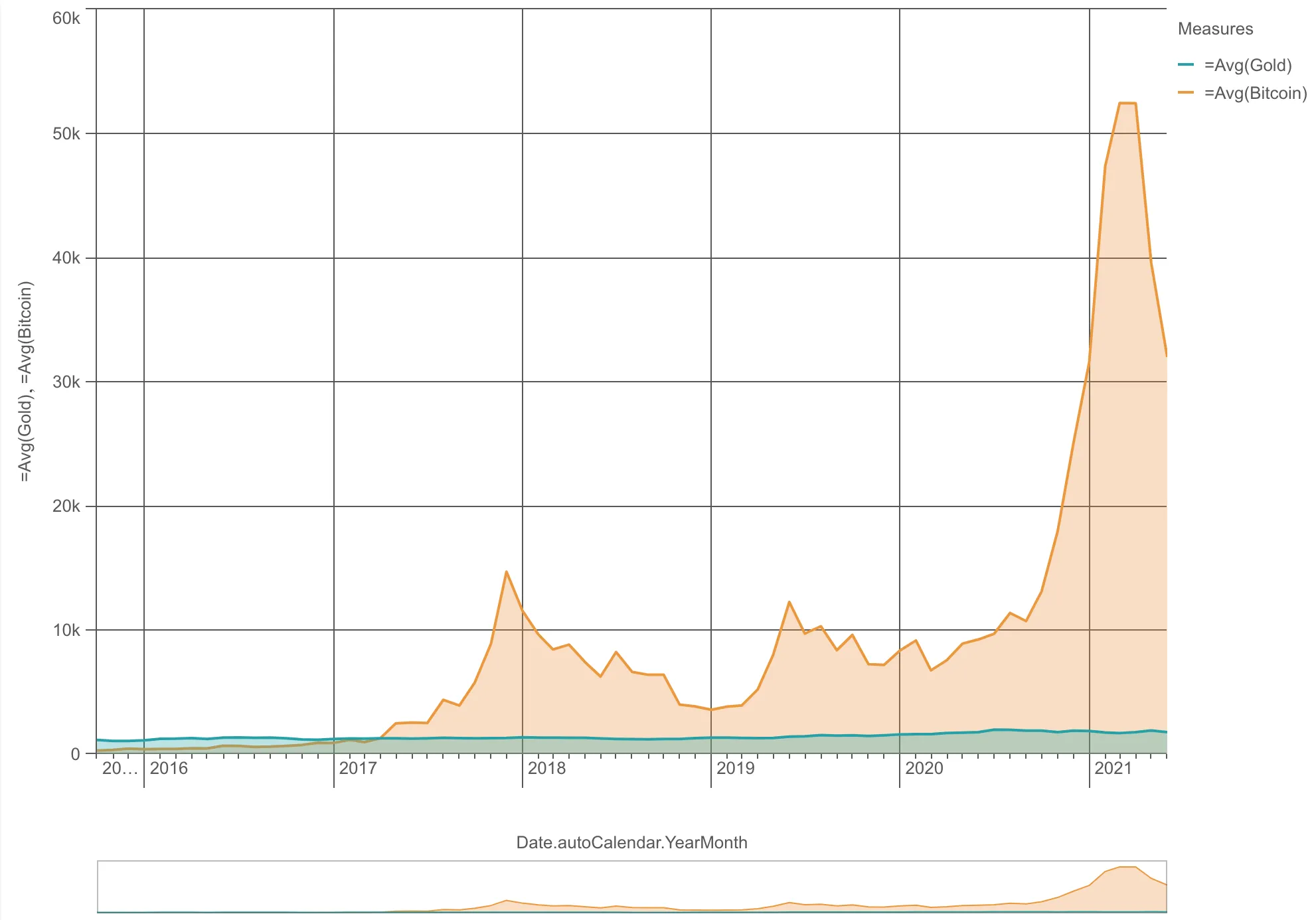
nuked.render({  element: document.querySelector(".lines"),  type: "line-chart",  fields: ["Date.autoCalendar.YearMonth", "=Avg(Gold)", "=Avg(Bitcoin)"],
  // Overrides default properties  properties: {    lineType: "area",  },});
One dimension, two measures, vertical orientation
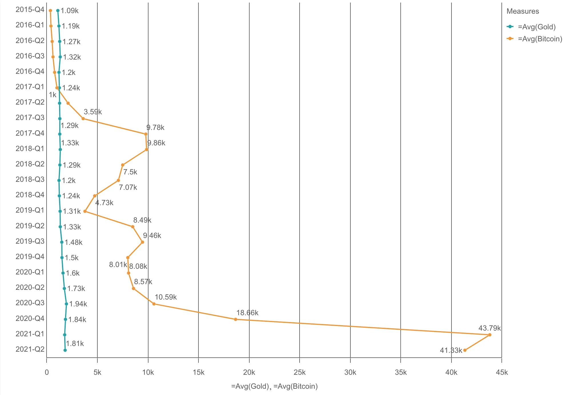
nuked.render({  element: document.querySelector(".lines"),  type: "line-chart",  fields: [    "Date.autoCalendar.Quarter",    "Date.autoCalendar.Year",    "=Avg(Bitcoin)",  ],
  // Overrides default properties  properties: {    orientation: "vertical",    dimensionAxis: {      continuousAuto: false,      dock: "near",    },    dataPoint: {      show: true,      showLabels: true,    },    preferContinuousAxis: false,  },});
Two dimensions, one measure
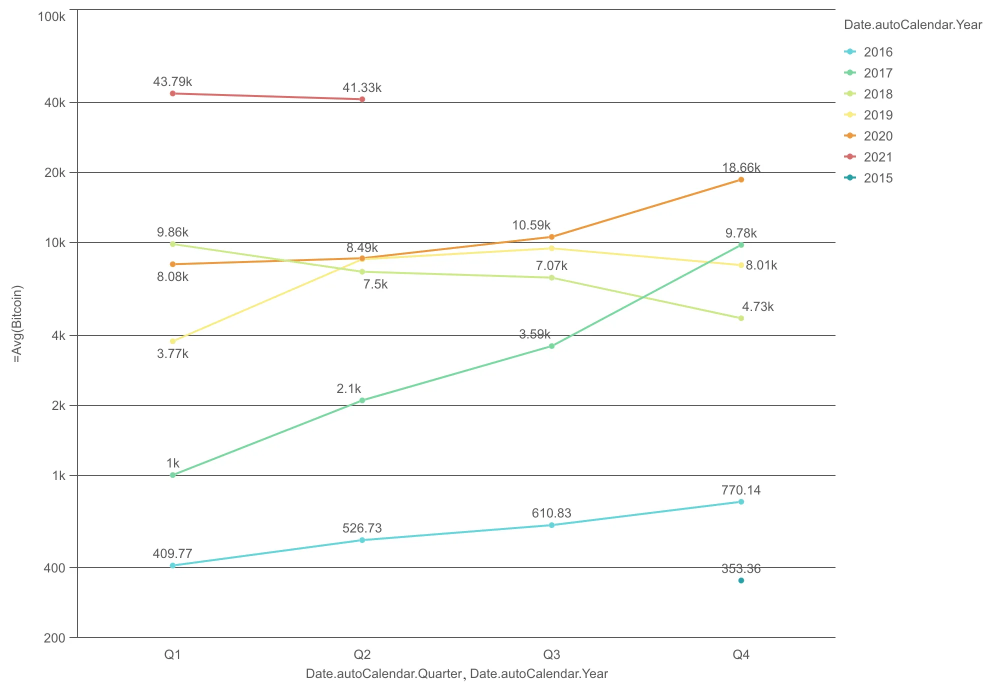
nuked.render({ element: document.querySelector(".lines"), type: "line-chart", // Two dimensions, one measure fields: [ "Date.autoCalendar.Quarter", "Date.autoCalendar.Year", "=Avg(Bitcoin)", ], properties: { measureAxis: { dock: "near", show: "all", logarithmic: true, }, dataPoint: { show: true, showLabels: true, }, },});One dimension, two measures, two reference lines
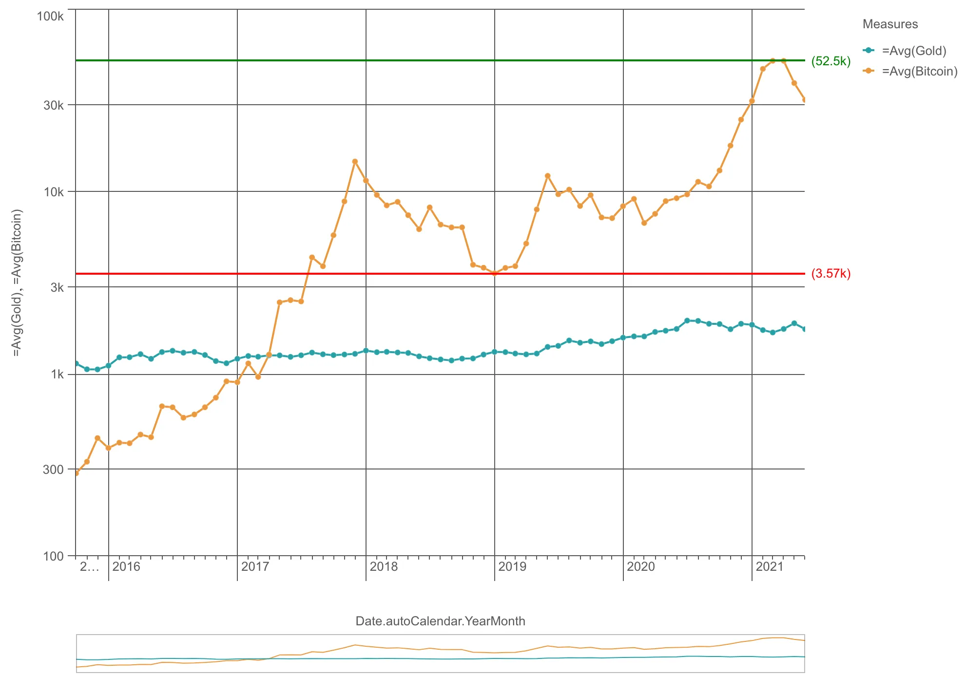
nuked.render({      element: document.querySelector('.lines'),      type: 'line-chart',      fields: ['Date.autoCalendar.YearMonth', '=Avg(Gold)', '=Avg(Bitcoin)'],
      // Overrides default properties      properties: {        refLine: {          refLines: [            {              label: '',              paletteColor: {                color: 'green',              },              refLineExpr: {                value: 52500,              },              show: true,            },            {              label: '',              paletteColor: {                color: 'red',              },              refLineExpr: {                value: 3570,              },              show: true,            },          ],        },        measureAxis: {          dock: 'near',          show: 'all',          logarithmic: true,        },        dataPoint: {          show: true,        },      },    });  });