Creating grid charts
Note: Where possible, use qlik-embed and qlik/api rather than this framework.
The grid chart uses symbols of varying size sorted in a grid to visualize a measure across two dimensions. The measure is the metric that determines the size of the symbol in each crossing.
Learn more about the grid chart, or review the grid chart API specification.

// Configure nucleusconst nuked = window.stardust.embed(app, { context: { theme: "light" }, types: [ { name: "sn-grid-chart", load: () => Promise.resolve(window["sn-grid-chart"]), }, ],});
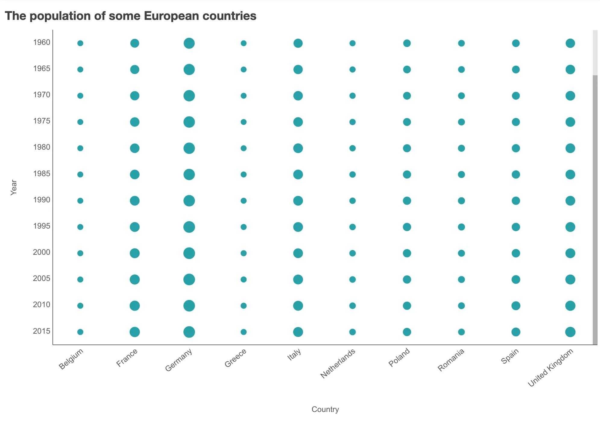
// Rendering a simple grid chartnuked.render({ element: document.querySelector(".grid"), type: "sn-grid-chart", fields: ["Country", "Year", "=Sum(Population)"], properties: { title: "The historical populations of some European countries", },});
Requirements
Requires @nebula.js/stardust
version 1.2.0
or later.
Installing
If you use npm: npm install @nebula.js/sn-grid-chart
.
You can also load through the script tag directly from
https://unpkg.com.
More examples
Change symbol size and shape
The size and shape of the symbols can be modified.

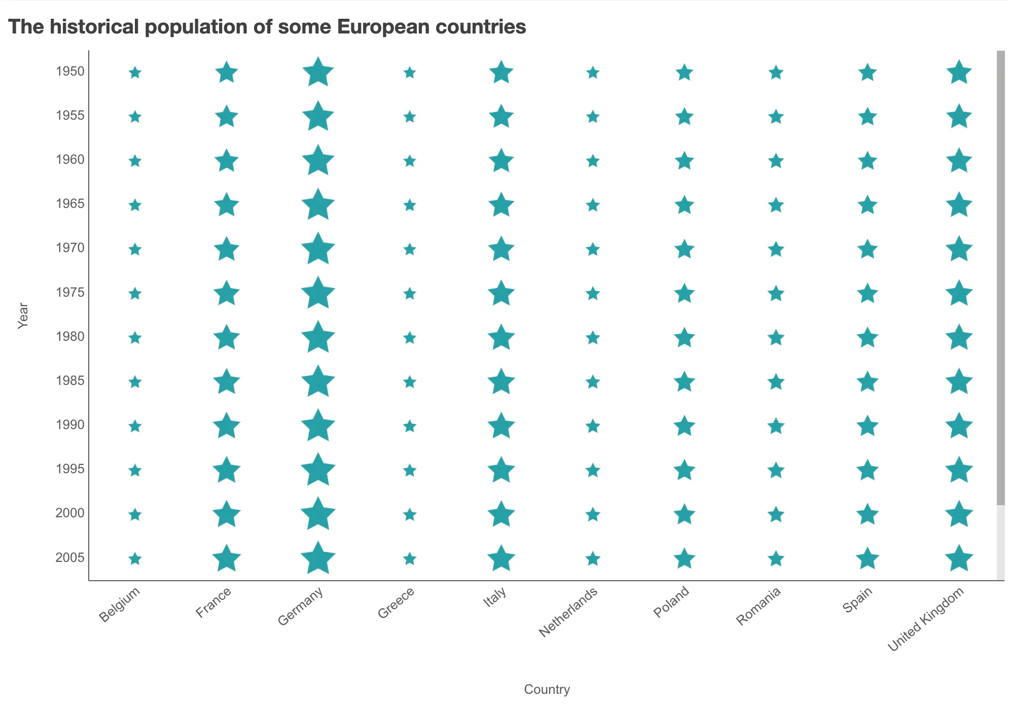
// Rendering a grid chart with customized symbolsnuked.render({ element: document.querySelector(".grid"), type: "sn-grid-chart", // fields: ['Country', 'Year', '=Sum(Population)'], properties: { title: "The historical populations of some European countries", dataPoint: { rangeBubbleSizes: [0.25, 0.85], symbol: "star", }, },});
Customize the look of the chart
You can color the symbol by measure and add a legend to show more information about the measure. The axis titles can be hidden and the gridlines can be shown to further improve the look.

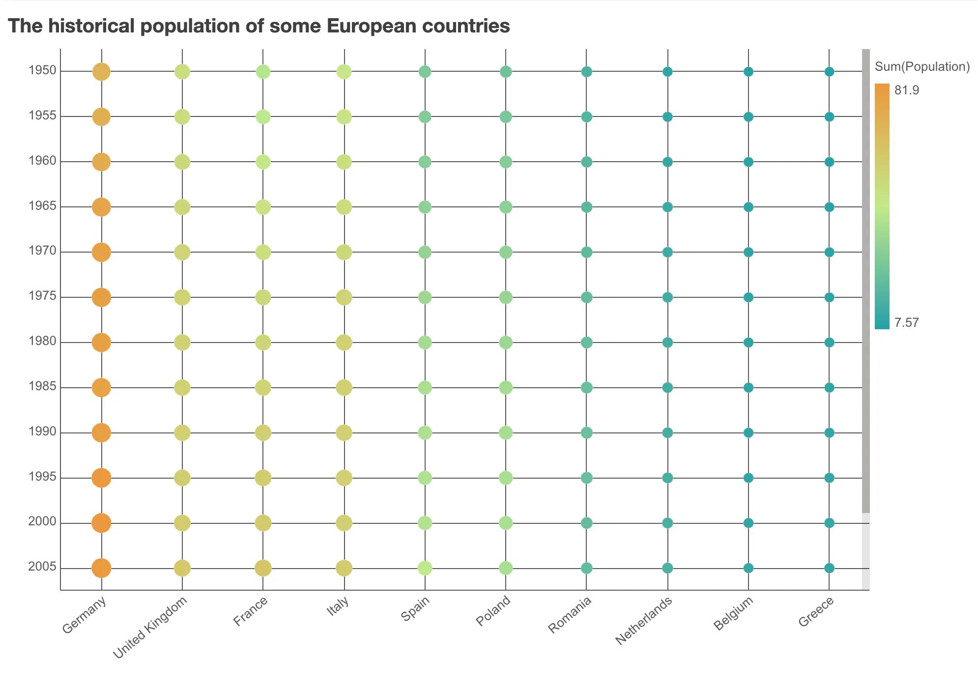
// Rendering a customized grid chartnuked.render({ element: document.querySelector(".grid"), type: "sn-grid-chart",
// Define all `fields` in `properties` properties: { title: "The historical populations of some European countries", qHyperCubeDef: { qDimensions: [ { qDef: { qFieldDefs: ["Country"] }, }, { qDef: { qFieldDefs: ["Year"] },
qAttributeExpressions: [ { qExpression: "Sum(Population)", id: "colorByAlternative", }, ], }, ], qMeasures: [ { qDef: { qDef: "Sum(Population)", }, }, ], qMode: "T", qAlwaysFullyExpanded: true, }, color: { auto: false, mode: "byMeasure", measureScheme: "dg", reverseScheme: true, }, legend: { show: true, dock: "auto", showTitle: true, }, xAxis: { show: "label", dock: "near", gridLines: true, }, yAxis: { show: "label", dock: "near", gridLines: true, }, },});
Grid chart plugins
A plugin can be passed into a grid chart to add or modify its capability or visual appearance. A plugin needs to be defined before it can be rendered together with the chart.
// Step 1: define the plugin
// Modifying the look of the existing point componentconst pointPlugin = { info: { name: "point-plugin", type: "component-definition", }, fn: ({ layout, keys }) => { const componentDefinition = { type: "point",
// Provide the same name as the exisiting point component to override it key: keys.COMPONENT.POINT, settings: { strokeWidth: "2px", stroke: "dimgray",
// Using data property 'd' and layout as input for helper functions size: (d) => getSizeInLogarithmScale(d, layout), fill: (d) => getColorBasedOnMedian(d), }, }; return componentDefinition; },};
// Step 2: passing the plugin definition into the render function
// Rendering a grid chart with pluginsnuked.render({ element: document.getElementById("object"), type: "sn-grid-chart", fields: ["Country", "Year", "=Sum(Population)"], plugins: [pointPlugin], properties: { title: "The historical population of some European countries", },});
The plugin definition is an object, with two properties info
and fn
.
The fn
returns a picasso.js
component. To build this component,
some important chart internals are passed into the argument object of fn
.
// Structure of the argument object of fnconst pluginArgs = { layout, keys: { SCALE: { X, Y, }, COMPONENT: { X_AXIS, Y_AXIS, POINT, }, COLLECTION: { MAIN, }, },};
With plugins, you can either add new components or modify existing components of the grid chart.
Add new components
The new component can be a standard Picasso component or a custom Picasso component. Below is a custom component which add labels next to the grid bubbles.

// Implementing a custom labels plugin, so that we can use it laterconst labelsPluginDefinition = { info: { componentName: "custom-labels-plugin", name: "custom-labels-plugin", type: "custom-component", }, fn: () => { const implementation = { require: ["chart", "renderer"], render() { const { items } = this.chart.component("point-component").data; const scale = this.chart.scales(); const { width, height } = this.rect; const labels = items.map((item) => ({ type: "text", text: item.size.label, x: (scale.x(item.x.value) + scale.x.bandwidth() * 0.5) * width, y: (scale.y(item.y.value) + scale.y.bandwidth() * 0.2) * height, anchor: "middle", fill: "red", fontSize: "14ppx", })); return labels; }, }; return implementation; },};
// Using the labels plugin, defined aboveconst labelsPlugin = { info: { name: "labels", type: "component-definition", }, fn: ({ keys }) => { const componentDefinition = { // The type has to match with the componentName of the labels plugin definition above type: "custom-labels-plugin", key: "my-labels", }; return componentDefinition; },};
Modify existing components
As an example, the positions and the appearance of the axes can be modified by plugins.
To override an existing component, fn
should returns a picasso.js
component
that has the same key
as the existing component (keys.COMPONENT.X_AXIS
in
this example).

// Modifying the look and the position of the x-axisconst xAxisPlugin = { info: { name: "x-axis-plugin", type: "component-definition", }, fn: ({ keys, layout }) => { const componentDefinition = { type: "axis",
// Provide the same name as the exisiting x-axis component to override it key: keys.COMPONENT.X_AXIS, layout: { dock: "top" }, settings: { labels: { fontFamily: "Cambria, serif", fontSize: "15px", fill: "dimgray", }, line: { stroke: "gray" }, }, }; return componentDefinition; },};
// y-axis plugin can be defined with similar code// ...
Plugins disclaimer
- The plugins API is still experimental.
- It is not guaranteed that the chart is compatible with all different settings, especially when modifying existing components.