Creating gauge
Where possible, use qlik-embed and qlik/api rather than this framework.
The gauge is often used to present KPIs, that is a single measure value, in the form of a radial gauge or a bar gauge.
Learn more about the gauge, or review the gauge API specification.
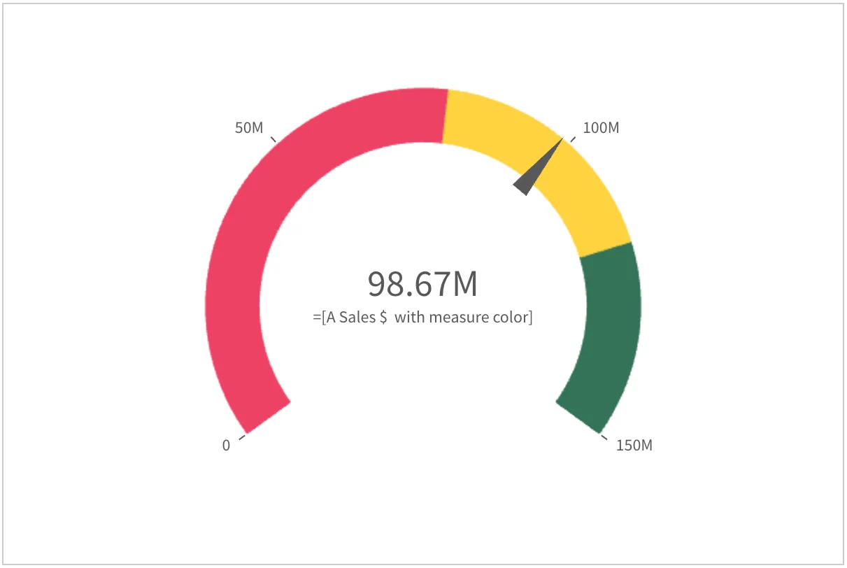
const nebula = embed(app, {  context: { theme: "light" },  types: [    {      name: "gauge",      load: () => Promise.resolve(gauge),    },  ],});
nebula.render({  type: "gauge",  element: document.querySelector(".object"),  fields: ["=[A Sales $  with measure color]"],  options: { direction: "ltr", freeResize: true },  properties: {    measureAxis: {      min: 0,      max: 150000000,    },    useSegments: true,    color: { useBaseColors: "off" },    segmentInfo: {      limits: [        {          value: { qValueExpression: { qExpr: "Sum ([Sales Amount])*0.8" } },          gradient: false,        },        {          value: { qValueExpression: { qExpr: "Sum ([Sales Amount])*1.2" } },          gradient: false,        },      ],      paletteColors: [        { color: "#EE4266" },        { color: "#FFD23F" },        { color: "#337357" },      ],    },  },});
Options
- direction - ltr/rtl
- freeResize - in conjunction with snapshotData on layout, lets the chart ignore size set on snapshotData
Requirements
Requires @nebula.js/stardust version 1.2.0 or later.
Installing
If you use npm: npm install @nebula.js/sn-gauge.
You can also load through the script tag directly from
https://unpkg.com.
More examples
Radial gauge with label styles, right-to-left direction, and narrow axis spacing
You can decorate the labels of the radial gauge in
the previous example with more styles (font family and color),
by adding styling "components" into the "properties" of the gauge.
Also, for the sake of demonstration
the direction of the chart is changed from "ltr" to "rtl",
and the axis spacing is made narrow (that is more ticks along the curved axis).
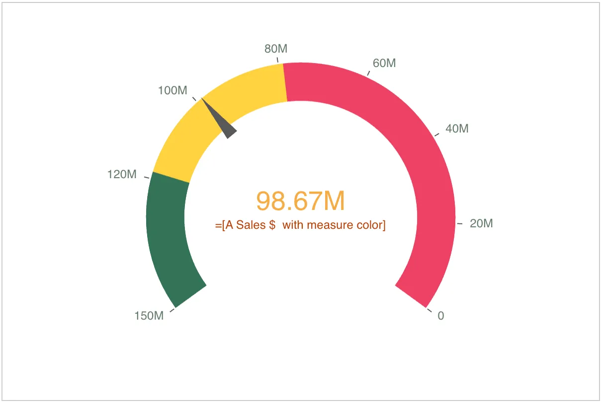
nebula.render({ type: "gauge", element: document.querySelector(".object"), fields: ["=[A Sales $ with measure color]"], options: { direction: "rtl" }, properties: { measureAxis: { min: 0, max: 150000000, spacing: 0.5, }, useSegments: true, color: { useBaseColors: "off" }, segmentInfo: { limits: [ { value: { qValueExpression: { qExpr: "Sum ([Sales Amount])*0.8" } }, gradient: false, }, { value: { qValueExpression: { qExpr: "Sum ([Sales Amount])*1.2" } }, gradient: false, }, ], paletteColors: [ { color: "#EE4266" }, { color: "#FFD23F" }, { color: "#337357" }, ], }, components: [ { key: "axis", axis: { title: { fontFamily: "Montserrat, sans-serif", color: { color: "#bb3e00" }, }, label: { name: { color: { color: "#657c6a" }, fontFamily: "Open Sans, sans-serif", }, }, }, }, { key: "value", label: { value: { color: { color: "#f7ad45" }, fontFamily: "Roboto, sans-serif", }, }, }, ], },});Horizontal bar gauge with segments and reference lines
You can combine segments and reference lines to clearly put the measured value in context.
In the example below, you can compare the current sales value with the value of last year and with the expected value. The segments colors indicate which range the current value falls into, and the reference lines and labels provide information about the referenced values.
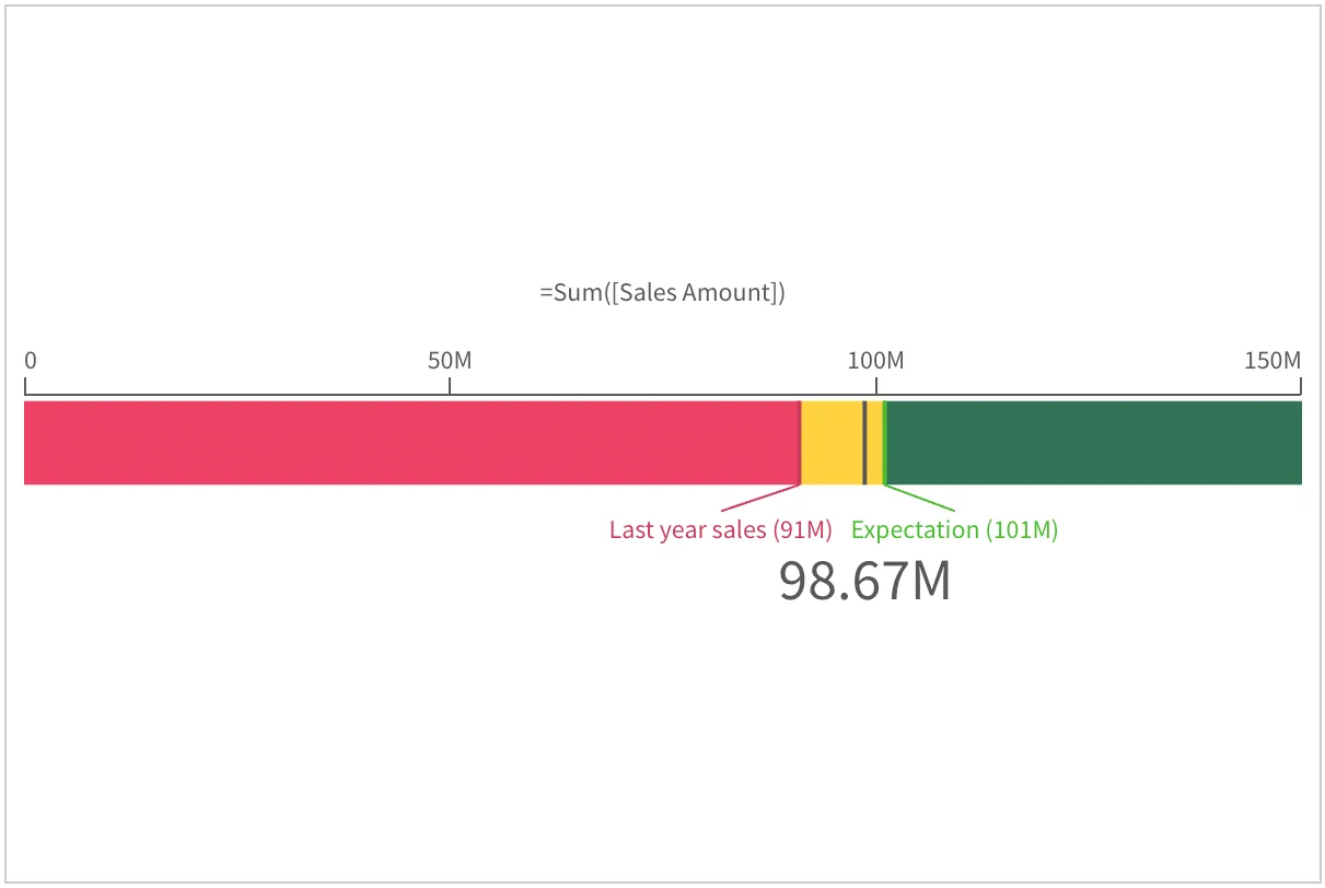
nebula.render({ type: "gauge", element: document.querySelector(".object"), fields: ["=[A Sales $ with measure color]"], properties: { gaugetype: "bar", measureAxis: { min: 0, max: 150000000 }, useSegments: true, color: { useBaseColors: "off" }, segmentInfo: { limits: [ { value: 91000000, gradient: false }, { value: 101000000, gradient: false }, ], paletteColors: [ { color: "#EE4266" }, { color: "#FFD23F" }, { color: "#337357" }, ], }, refLine: { refLines: [ { label: "Last year sales", refLineExpr: { value: 91000000, label: "91000000" }, paletteColor: { color: "#cc3c5b" }, }, { label: "Expectation", refLineExpr: { value: 101000000, label: "101000000" }, paletteColor: { color: "#49bd2b" }, }, ], }, },});