Creating filter panes
Where possible, use qlik-embed and qlik/api rather than this framework.
You can add a filter pane to control what data is shown in the visualizations on a sheet. A filter pane can filter the data of several dimensions at once. For example, if you have a chart of sales over time, you can use a filter pane to only show sales from a selected time period, from certain product categories, and from a certain region.
Filter panes are good for making selections and defining data sets. But they also show the relationship between different values, the associations. The green, white, and gray colors reflect the data associations that exist and the ones that do not exist. By analyzing these associations, you can make new discoveries, for example, that a sales representative has too many customers, or that a region lacks a sales representative.
Learn more about the filter pane, or review the filter pane API specification.
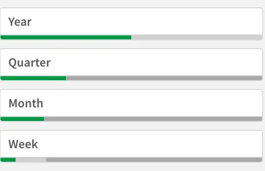
// Configure nucleusconst nuked = window.stardust.embed(app, {  context: { theme: "light" },  types: [    {      name: "filterpane",      load: () => Promise.resolve(window["filterpane"]),    },  ],});
// Rendering a filter panenuked.render({  element: document.querySelector('.listbox'),  type: "filterpane",  fields: ["Year", "Quarter", "Month", "Week"],});
With filter panes, you can easily make several selections to define your data set exactly as you want it. With your well-defined data set, you can explore data of particular interest. By using the selection menu options in the filter panes (select possible, select alternative, and select excluded), you can make adjustments to the data set and compare the results with the previous selection.
Requirements
Requires @nebula.js/stardust.
Installing
If you use npm: npm install @nebula.js/sn-filter-pane.
You can also load through the script tag directly from https://unpkg.com.
More examples
Filter pane with all dimensions expanded
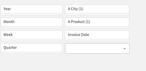
When a dimension is added, it is placed to the right of the previous dimensions, or below, depending on the available space. As long as there is enough space, the dimensions are displayed as expanded lists. If there is not enough space, the dimensions that were added first are turned into filter panes. In a filter pane, you can use up to 1000 dimensions.
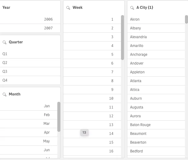
nuked.render({ element: document.querySelector('.listbox'), type: "filterpane", fields: ["Year", "Quarter", "Month", "Week", "City"],});In the example below, the filter pane is shown with collapsed listboxes for some fields as there is not enough space.
Selections in filter pane
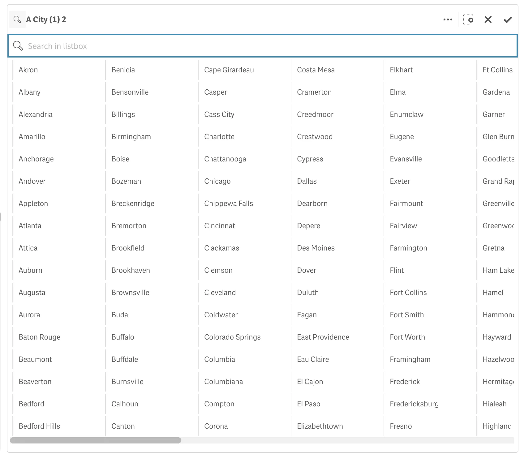
During analysis, you click a compressed filter pane dimension to open a selection list. When you make a selection, it is reflected in the small bars at the bottom of each filter pane dimension. Four states can be displayed in the bars: selected (green), possible (white), alternative (light gray), and excluded (dark gray).
Locked values are indicated by a lock icon. The details of the selections are displayed in the selections bar, at the top of the sheet. You can click an item to see the details and change your selection. Fields are filtered out from each dimension to be shown in the visualizations on the sheet.
Selections using checkboxes
You can add checkboxes next to each dimension value for individual selection. You can choose this with the checkbox mode option for each dimension. The selections tool offers an option to get an overview of the fields and dimensions in an app. In the selections tool, you can make selections in all the fields and dimensions in the app, regardless of whether they are used in the app or not.
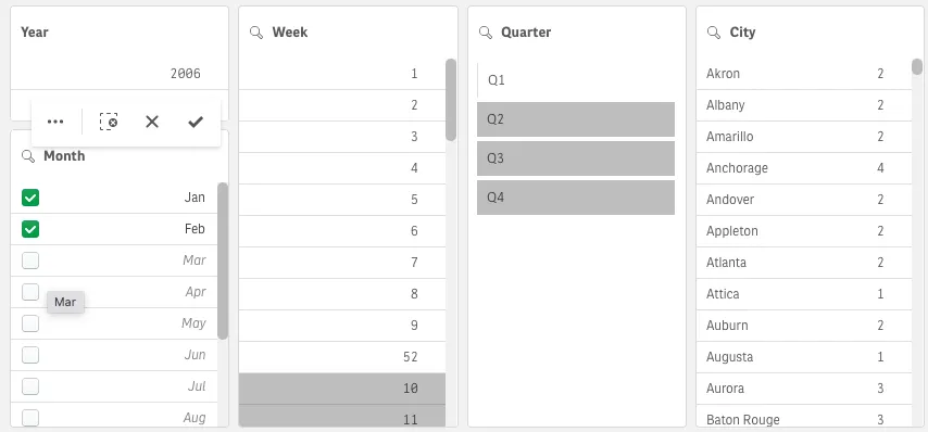
nuked.render({ type: "filterpane", element: document.querySelector('.listbox'), fields: [ { qListObjectDef: { qDef: {qFieldDefs: ["Month"]} }, checkboxes: true, }, ],});In the properties panel, you can customize the look and feel of the filter pane. Listboxes for each dimension can be customized individually.
Showing the frequency of values
You can show the frequency next to each value, either as an absolute number or as a percentage. You select this with Show frequency under each dimension. In some cases, the frequency cannot be calculated and is displayed as -. One example of this is for key fields.
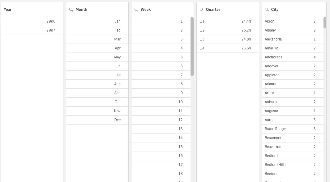
nuked.render({ type: "filterpane", element: document.querySelector('.listbox'), fields: [ { qListObjectDef: { qDef: {qFieldDefs: ["Quarter"]} frequencyEnabled: true qFrequencyMode: "P" }, }, { qListObjectDef: { qDef: {qFieldDefs: ["City"]} frequencyEnabled: true qFrequencyMode: "V" }, }, ],});Listbox layout as grid
Each filter pane dimension can be shown as a single column or a grid. You can choose this with Show data in under each dimension. In Grid mode, you can choose to order by row or column.
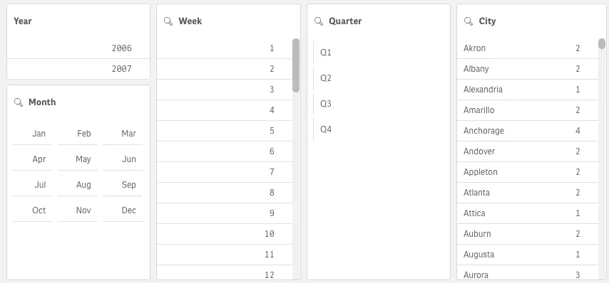
nuked.render({ type: "filterpane", element: document.querySelector('.listbox'), fields: [ { qListObjectDef: { qDef: {qFieldDefs: ["Quarter"]} }, layoutOptions: { dataLayout: 'grid', layoutOrder: 'row', }, }, { qListObjectDef: { qDef: {qFieldDefs: ["Month"]} }, layoutOptions: { dataLayout: 'grid', layoutOrder: 'column', }, }, ],});Search in filter pane
In the Listbox properties, you can choose whether or not users can search for individual field values in each listbox within the filter pane. You can also switch the default Search mode from Normal to Wildcard. Wildcard adds default wildcard symbols (*) to the search field.
