Creating distribution plot charts
Where possible, use qlik-embed and qlik/api rather than this framework.
The distribution plot is suitable for comparing range and distribution for groups of numerical data. Data is plotted as value points along an axis.
Learn more about the distribution plot, or review the distribution plot API specification.
In a distribution plot you need to use one or two dimensions, and one measure. If you use a single dimension you receive a single line visualization. If you use two dimensions, you get one line for each value of the second, or outer, dimension.
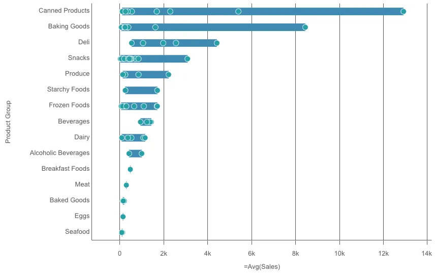
// 'app' is an enigma app modelconst embeddable = embed(app, {  types: [    {      // register distribution plot chart      name: "distributionplot",      load: () => Promise.resolve(distributionplot),    },  ],});
embeddable.render({  element,  type: "distributionplot",  fields: ["Product Sub Group", "Product Group", "=Avg(Sales)"],});
Requirements
Requires @nebula.js/stardust version 1.4.0 or later.
Installing
If you use npm: npm install @nebula.js/sn-distributionplot.
You can also load through the script tag directly from
https://unpkg.com.
More examples
Vertical distribution plot
Setting orientation property value to vertical. Default value is horizontal.
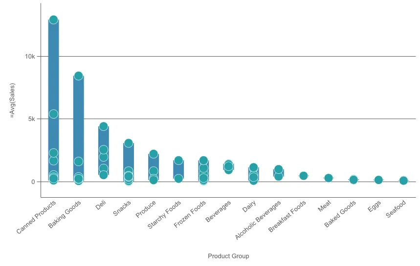
embeddable.render({ element, type: "distributionplot", fields: ["Product Sub Group", "Product Group", "=Avg(Sales)"], // overrides default properties properties: { orientation: "vertical", },});Different ways to present distribution plot
Points only
Displays value points only.
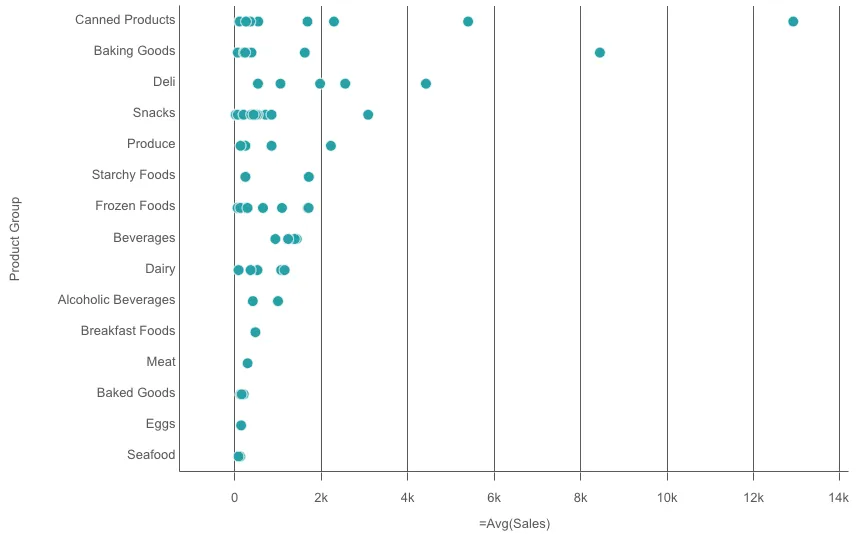
embeddable.render({ element, type: "distributionplot", fields: ["Product Sub Group", "Product Group", "=Avg(Sales)"], // overrides default properties properties: { presentation: { visibleComponents: "points", }, },});Background only
Displays a bounding box showing the range of the values only.
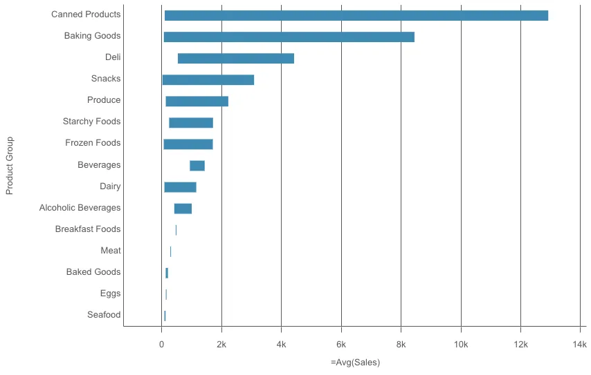
embeddable.render({ element, type: "distributionplot", fields: ["Product Sub Group", "Product Group", "=Avg(Sales)"], // overrides default properties properties: { presentation: { visibleComponents: "box", }, },});Bubble size and jitter
You can adjust the size of the bubbles
that illustrate the value points by setting bubbleScales value.
You can set displacement to jitter to jitter several overlapping value points.
This moves some of the points slightly to create a larger footprint
that shows that there are more than one value behind the point.
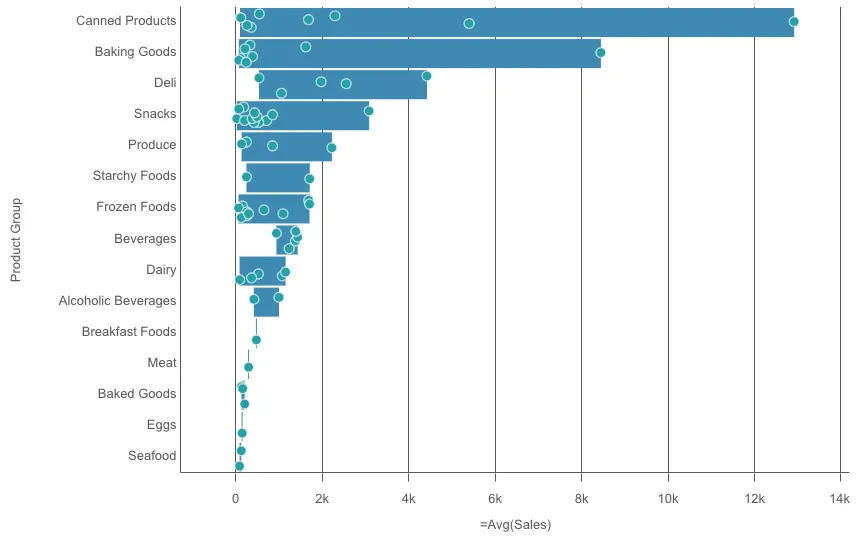
embeddable.render({ element, type: "distributionplot", fields: ["Product Sub Group", "Product Group", "=Avg(Sales)"], // overrides default properties properties: { dataPoint: { bubbleScales: 90, displacement: "jitter", }, },});