Creating combo charts
Where possible, use qlik-embed and qlik/api rather than this framework.
The combo chart is suitable for comparing two sets of measure values that have different scale. In its simplest form, a combo chart has one dimension and two measures and is basically a bar chart combined with a line chart.
Learn more about the combo chart, or review the combo chart API specification.
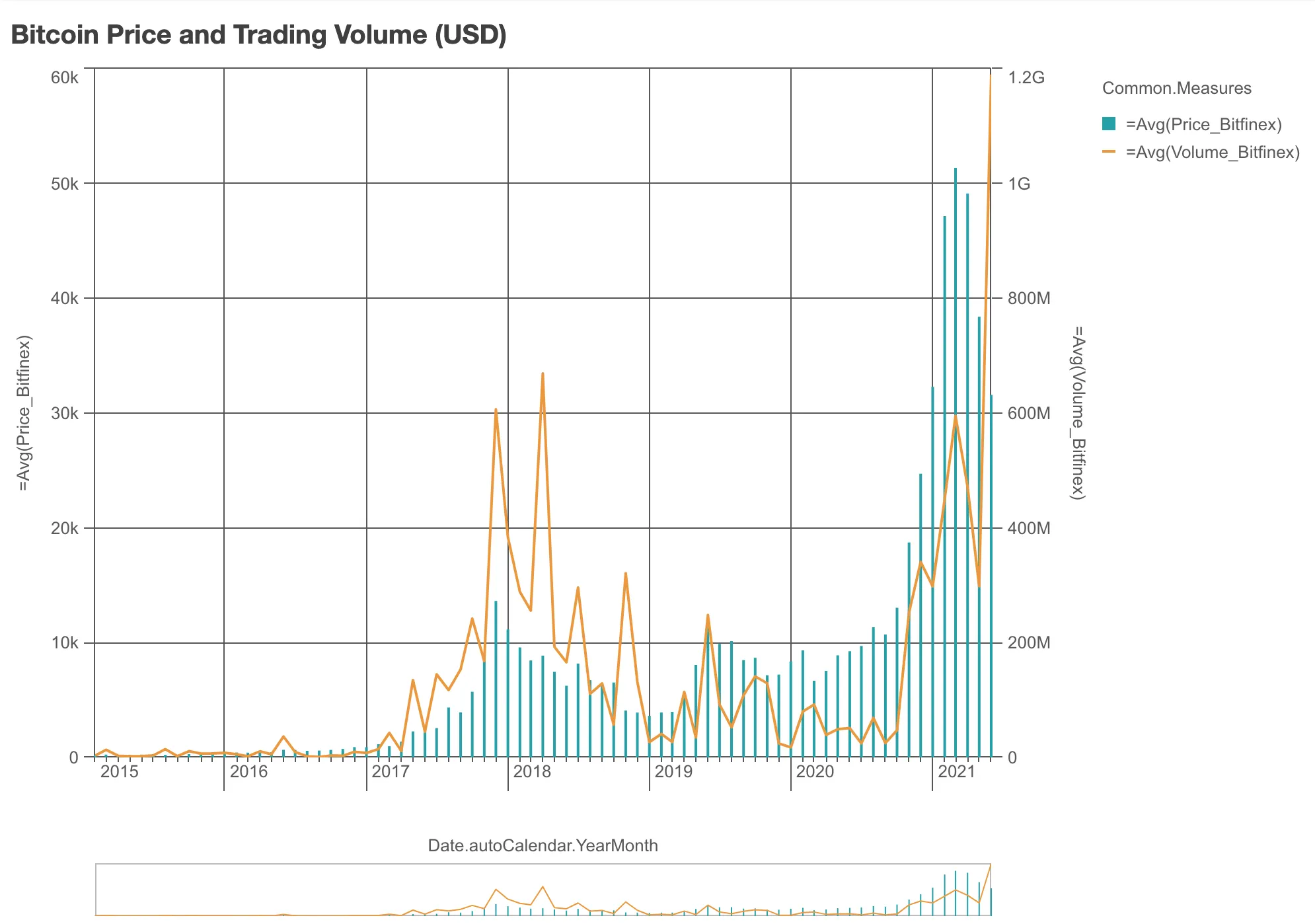
In the example below, the Bitcoin price and trade volume in the Bitfinex platform are plotted in a combo chart. Despite being two different measures, they show apparent correlation.
// Configure nucleusconst nuked = window.stardust.embed(app, {  context: { theme: "light" },  types: [    {      name: "combo-chart",      load: () => Promise.resolve(window["sn-combo-chart"]),    },  ],});
// Rendering a simple combo chartnuked.render({  element: document.querySelector(".combo"),  type: "combo-chart",  fields: [    "Date.autoCalendar.YearMonth",    "=Avg(Price_Bitfinex)",    "=Avg(Volume_Bitfinex)",  ],  properties: {    title: "Bitcoin Price and Trading Volume (USD)",  },});
Requirements
Requires @nebula.js/stardust version 1.2.0 or later.
Installing
If you use npm: npm install @nebula.js/sn-combo-chart.
You can also load through the script tag directly from
https://unpkg.com.
More examples
Customize the look of bars and lines
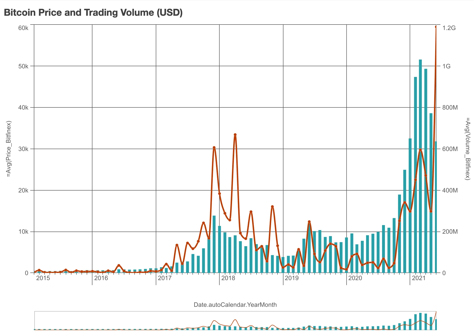
You can make the previous chart more appealing by making the bars thicker. For the line, you can change its color, add data points and curviness.
nuked.render({  element: document.querySelector(".combo"),  type: "combo-chart",  fields: [    "Date.autoCalendar.YearMonth",    "=Avg(Price_Bitfinex)",    "=Avg(Volume_Bitfinex)",  ],
  // Customizing bars and lines  properties: {    title: "Bitcoin Price and Trading Volume (USD)",    components: [      {        key: "bar",        style: {          strokeWidth: "large",          strokeColor: {            color: "#25A0A8",          },        },      },      {        key: "line",        style: {          lineThickness: 3,          lineCurve: "monotone",        },      },    ],    dataPoint: {      show: true,    },    color: {      auto: false,      mode: "primary",      paletteColor: {        color: "#be3b03",      },    },  },});
Use markers instead of bars
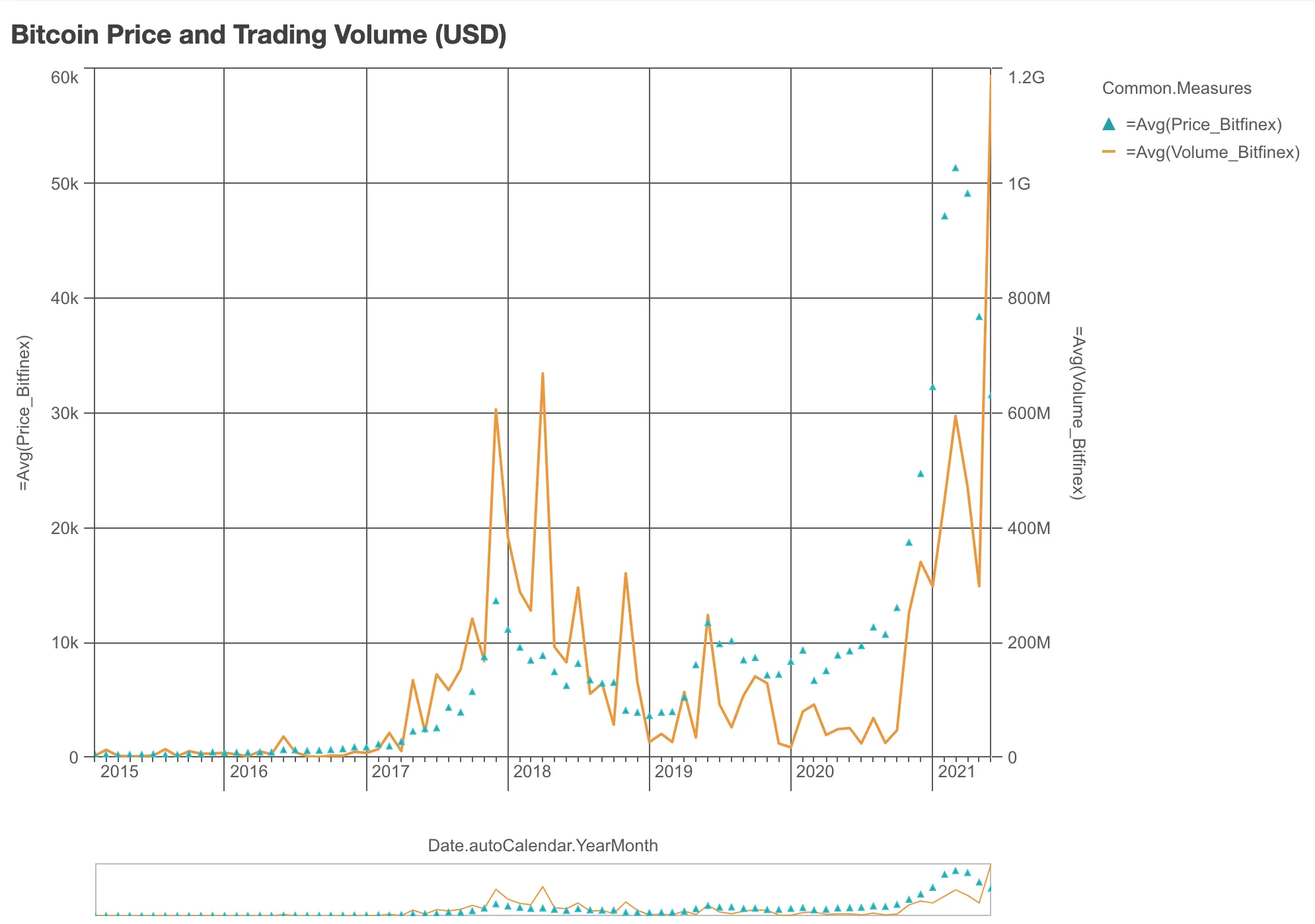
Beside bars and lines, there is a third option: markers. In the following example, the bars from the previous chart are replaced by markers.
To override the default measure configuration (one bar series, one line), the
measures are defined in properties instead of in fields.
nuked.render({  element: document.querySelector(".combo"),  type: "combo-chart",  fields: ["Date.autoCalendar.YearMonth"],
  // Define measures in `properties`, instead of in `fields`  properties: {    title: "Bitcoin Price and Trading Volume (USD)",    qHyperCubeDef: {      qMeasures: [        {          qDef: {            qDef: "=Avg(Price_Bitfinex)",            series: { axis: 0, type: "marker", marker: "triangle" },          },        },        {          qDef: {            qDef: "=Avg(Volume_Bitfinex)",            series: { axis: 1, type: "line" },          },        },      ],    },  },});
Horizontal combo chart
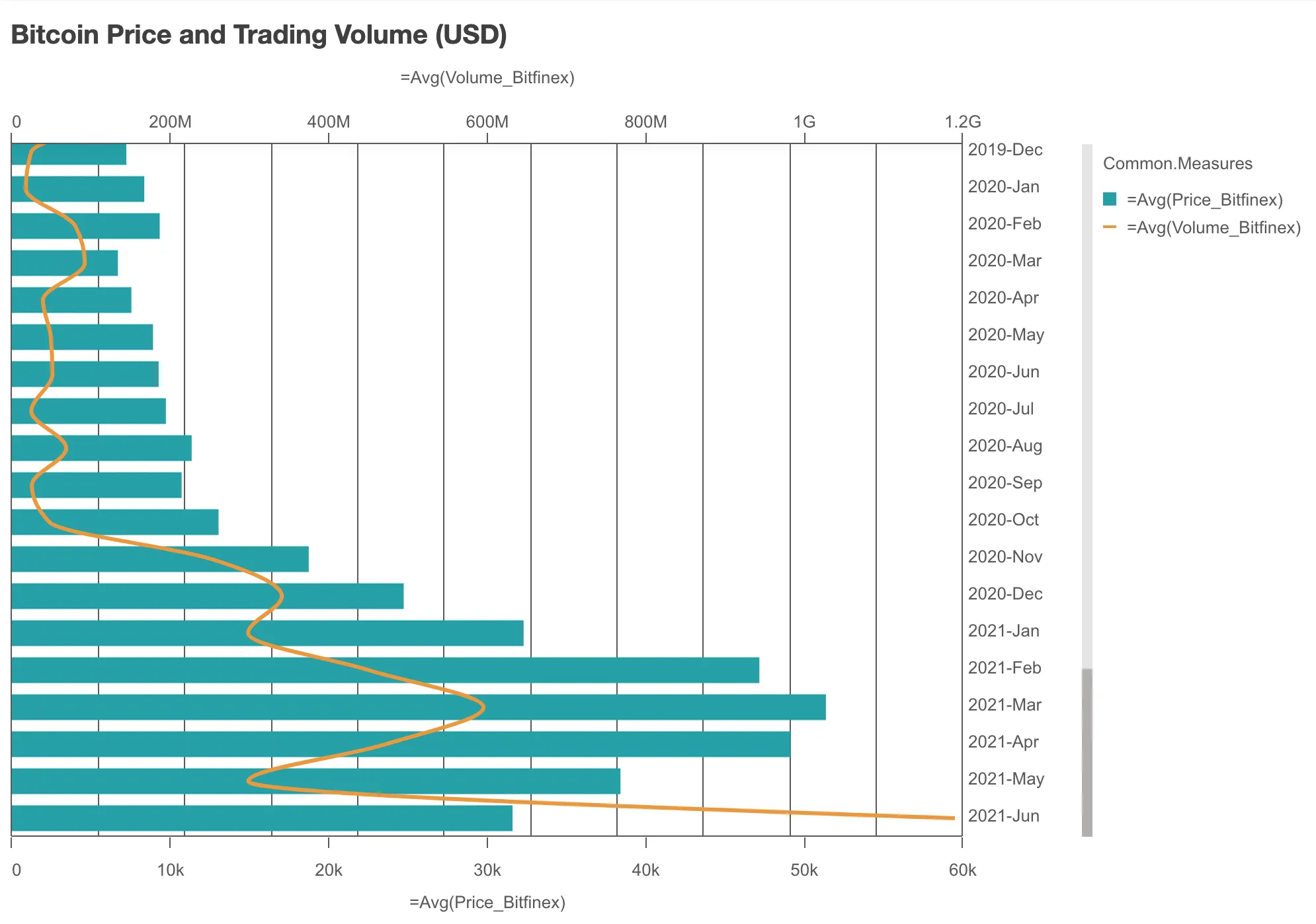
By default, the combo chart is oriented vertically like in the previous examples: the bars are vertical and the line is horizontal. If you wish, you can change the chart orientation to horizontal.
nuked.render({  element: document.querySelector(".combo"),  type: "combo-chart",  fields: [    "Date.autoCalendar.YearMonth",    "=Avg(Price_Bitfinex)",    "=Avg(Volume_Bitfinex)",  ],
  // Making the combo chart horizontal  properties: {    title: "Bitcoin Price and Trading Volume (USD)",
    // You should set this ...    orientation: "horizontal",
    // ... but also these to turn off continuous dimension scale    dimensionAxis: {      continuousAuto: false,    },    preferContinuousAxis: false,
    // Just make the line looks better    components: [      {        key: "line",        style: {          lineThickness: 3,          lineCurve: "monotone",        },      },    ],  },});
Comparing two pairs of measures
You can add multiple measures into a combo chart. Each measure can be either a series of bar, a line, or a series of markers.
In the following example, by using two series of bars and two lines, the Bitcoin price and trading volume of two different trading platforms can be compared in the same chart.
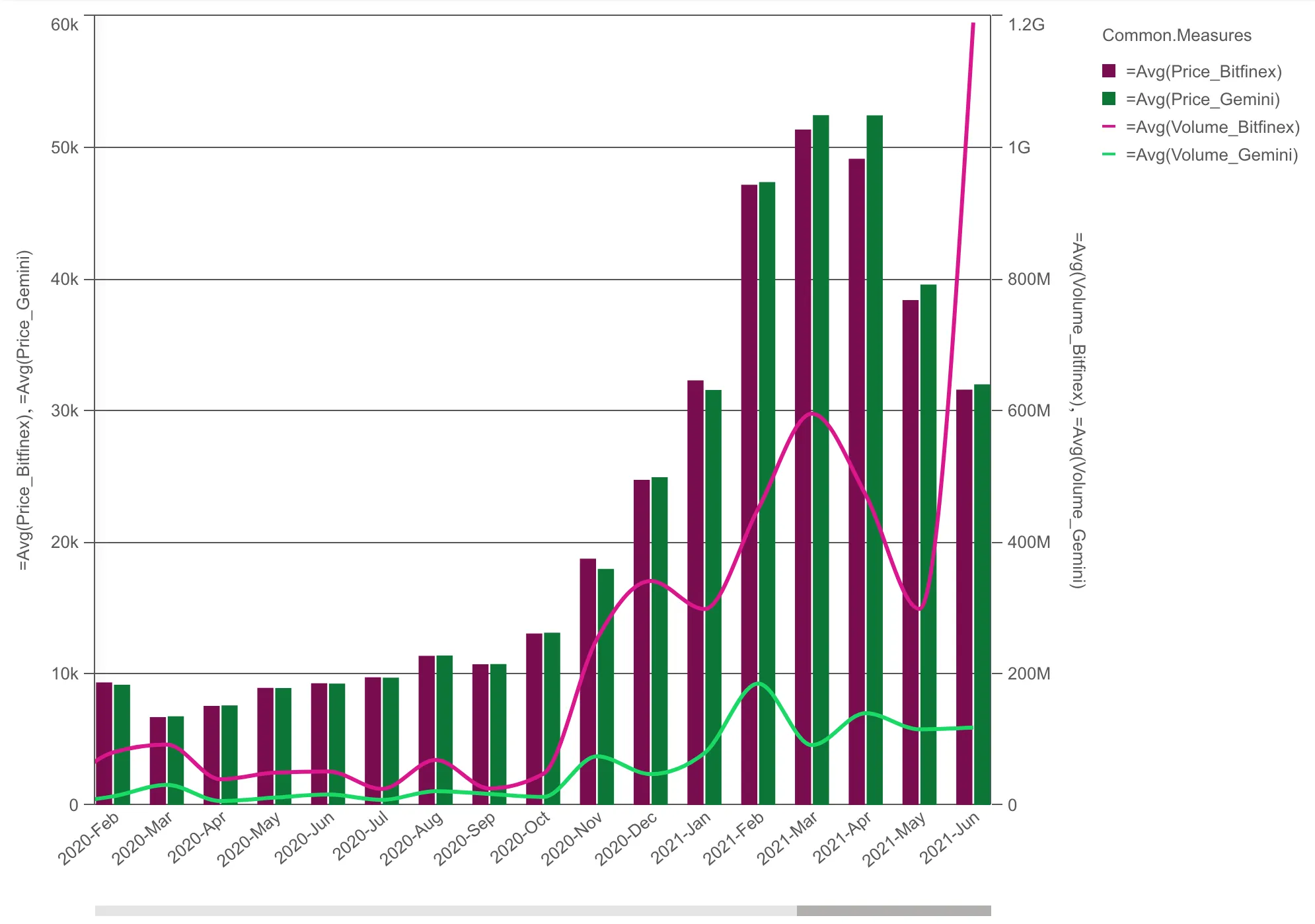
Some notes about the code:
- By default, if you add 4 measures, you get one bar series and
three lines. To define two bar series and two lines instead, you have
to specify that in
propertiesin stead of infields. - Customized colors are defined in
qDef. - The
preferContinuousAxisshould be set tofalse(turn off continuous dimension scale) for the bars to be grouped instead of stacked.
// Configure nucleusconst nuked = window.stardust.embed(app, {  context: { theme: "light" },  types: [    {      name: "combo-chart",      load: () => Promise.resolve(window["sn-combo-chart"]),    },  ],});
// Render the combo chartnuked.render({  element: document.querySelector(".combo"),  type: "combo-chart",  fields: ["Date.autoCalendar.YearMonth"],  properties: {    qHyperCubeDef: {      qMeasures: [        {          qDef: {            qDef: "=Avg(Price_Bitfinex)",            series: { axis: 0, type: "bar" },            color: {              on: true,              paletteColor: { color: "#790C4D" },            },          },        },        {          qDef: {            qDef: "=Avg(Price_Gemini)",            series: { axis: 0, type: "bar" },            color: {              on: true,              paletteColor: { color: "#0C7737" },            },          },        },        {          qDef: {            qDef: "=Avg(Volume_Bitfinex)",            series: { axis: 1, type: "line" },            color: {              on: true,              paletteColor: { color: "#DB168C" },            },          },        },        {          qDef: {            qDef: "=Avg(Volume_Gemini)",            series: { axis: 1, type: "line" },            color: {              on: true,              paletteColor: { color: "#16DB64" },            },          },        },      ],    },    dimensionAxis: {      dock: "near",      axisDisplayMode: "custom",      maxVisibleItems: 50,    },    preferContinuousAxis: false,
    // Make the lines look better    components: [      {        key: "line",        style: {          lineThickness: 3,          lineCurve: "monotone",        },      },    ],  },});