Creating bullet charts
Where possible, use qlik-embed and qlik/api rather than this framework.
The bullet chart displays a gauge with extended options. Bullet charts can be used to visualize and compare performance of a measure to a target value and to a qualitative scale, such as poor, average, and good.
Learn more about the bullet chart, or review the bullet chart API specification.
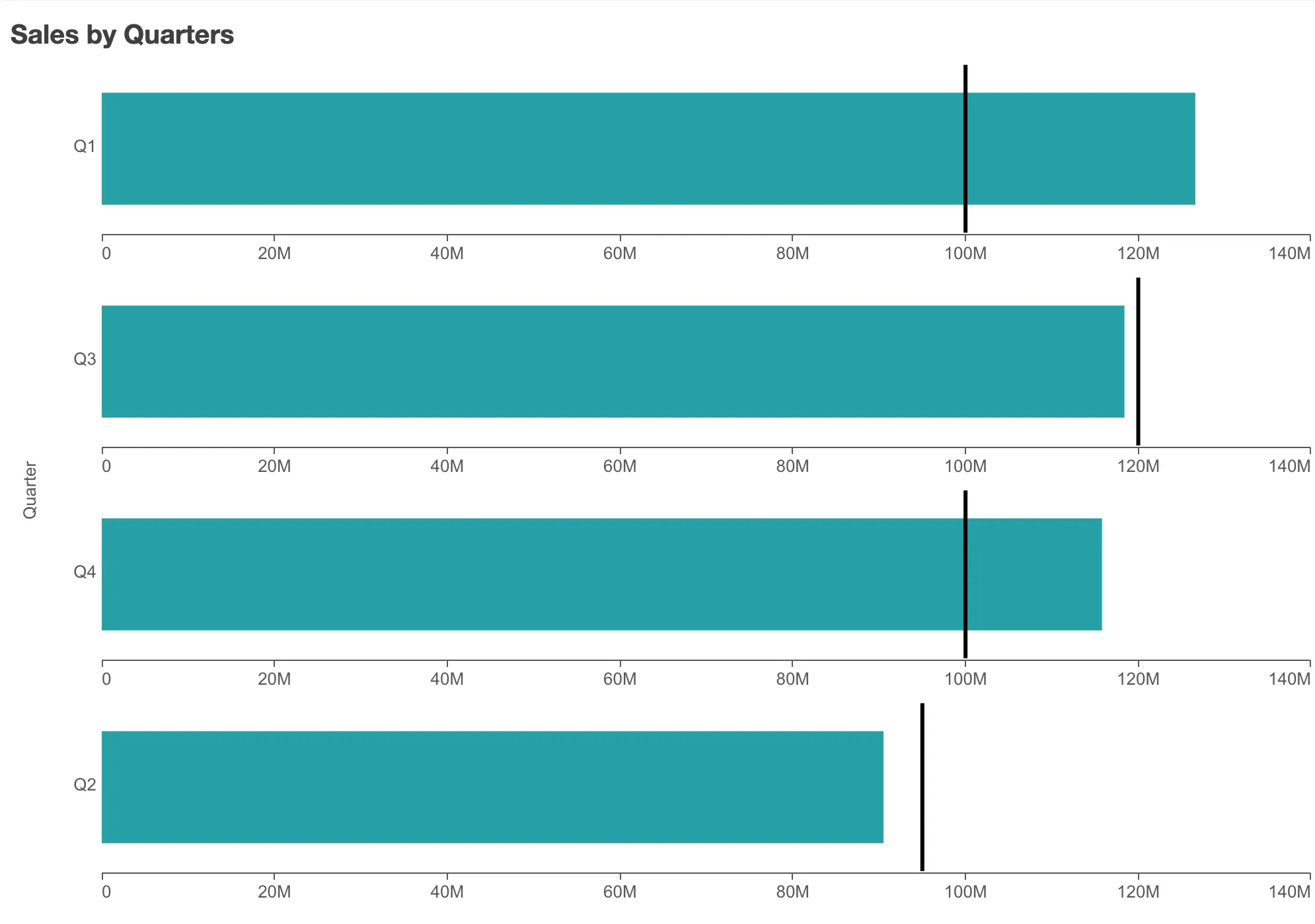
In the example below, the sales in different quarters are compared using a bullet chart.

// Configure nucleusconst nuked = window.stardust.embed(app, {  context: { theme: "light" },  types: [    {      name: "bullet-chart",      load: () => Promise.resolve(window["sn-bullet-chart"]),    },  ],});
// Rendering a simple bullet chartnuked.render({  element: document.querySelector(".bullet"),  type: "bullet-chart",  fields: ["Quarter", "=Sum(Sales)"],  properties: {    title: "Sales by Quarters",  },});
You can create a bullet chart with one dimension and one measure, or no dimension and multiple measures.
| Dimensions | Measures | Results |
|---|---|---|
| 1 | 1 | A bullet chart with columns corresponding to different values in the dimension |
| 0 | n | A bullet chart with columns corresponding to the measures, aggregated over the dimension. |
Requirements
Requires @nebula.js/stardust version 1.2.0 or later.
Installing
If you use npm: npm install @nebula.js/sn-bullet-chart.
You can also load through the script tag directly from
https://unpkg.com.
More examples
Horizontal bullet chart with common range
Sometime it is easier for the eyes to perceive the information from a bullet chart if it is horizontal and its measure has a common range.

// Render a bullet chart horizontally, and with common rangenuked.render({ element: document.querySelector(".bullet"), type: "bullet-chart", fields: ["Quarter", "=Sum(Sales)"], properties: { title: "Sales by Quarters", orientation: "horizontal", measureAxis: { commonRange: true, dock: "near", }, },});Adding target
By adding targets, you can compare not only the sales between different quarters but also the sale of each quarter to its sale target.
// Rendering a bullet chart with targetsnuked.render({  element: document.querySelector(".bullet"),  type: "bullet-chart",  fields: ["Quarter"],
  // Define `qMeasures` in `properties` instead of in `fields`  properties: {    title: "Sales by Quarters",    qHyperCubeDef: {      qMeasures: [        {          qDef: {            qDef: "Sum(Sales)",            target: "Sum([Sale targets])",          },          qSortBy: {            qSortByNumeric: -1,          },          qAttributeExpressions: [            {              qExpression: "Sum([Sale targets])",              id: "bullet-target",            },          ],        },      ],      qInitialDataFetch: [        {          qLeft: 0,          qTop: 0,          qWidth: 15,          qHeight: 500,        },      ],    },
    // Horizontal, with common range    orientation: "horizontal",    measureAxis: {      commonRange: true,      dock: "near",    },  },});
Add color segments
You can also add color segments to the chart to show poor/normal/good performance. Here two limits are added, splitting the range into three segments: red (lower than 90% of the target), yellow (within 90-110% of the target), and green (higher than 110% of the target).

// Rendering a bullet chart with segmentsnuked.render({  element: document.querySelector(".bullet"),  type: "bullet-chart",
  // Define all `fields` in `properties`  properties: {    title: "Sales by Quarters",
    qHyperCubeDef: {      qDimensions: [        {          qDef: {            qFieldDefs: ["Quarter"],            qSortCriterias: [{ qSortByAscii: 1 }],          },        },      ],      qMeasures: [        {          qDef: {            qDef: "Sum(Sales)",            target: "Sum([Sale targets])",            conditionalColoring: {              segments: {                limits: [                  {                    value: {                      qValueExpression: {                        qExpr: "Sum([Sale targets])*0.9",                      },                    },                  },                  {                    value: {                      qValueExpression: {                        qExpr: "Sum([Sale targets])*1.1",                      },                    },                  },                ],                paletteColors: [                  {                    color: "#7c4345",                  },                  {                    color: "#e0db4d",                  },                  {                    color: "#53ad55",                  },                ],              },            },          },          qSortBy: {            qSortByNumeric: -1,          },          qAttributeExpressions: [            {              id: "bullet-target",              qExpression: "Sum([Sale targets])",            },
            {              id: "bullet-segment",              qExpression: "Sum([Sale targets])*0.9",            },            {              id: "bullet-segment",              qExpression: "Sum([Sale targets])*1.1",            },          ],        },      ],      qInitialDataFetch: [        {          qLeft: 0,          qTop: 0,          qWidth: 15,          qHeight: 500,        },      ],      qInterColumnSortOrder: [0, 1],    },
    // Horizontal, with common range    orientation: "horizontal",    measureAxis: {      commonRange: true,      dock: "near",    },  },});
Multiple measures, no dimension
The bullet chart can also be defined with no dimension and multiple measures. Each bar represents corresponding measure aggregate over the dimension.
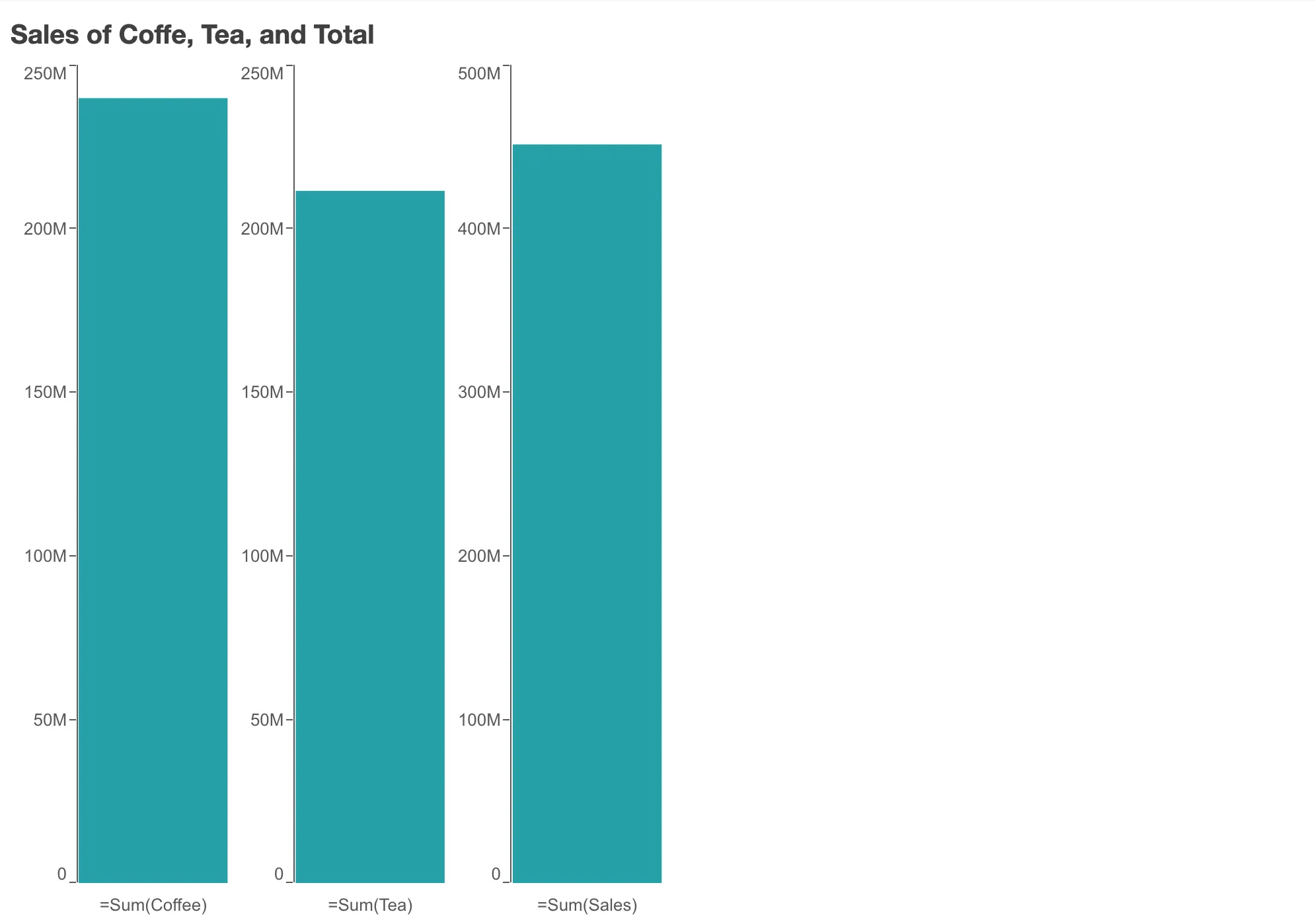
// Rendering a bullet chart with three measures and no dimensionnuked.render({ element: document.querySelector(".bullet"), type: "bullet-chart", fields: ["=Sum(Coffee)", "=Sum(Tea)", "=Sum(Sales)"], properties: { title: "Sales of Coffee, Tea, and Total", },});