Creating bar charts
Where possible, use qlik-embed and qlik/api rather than this framework.
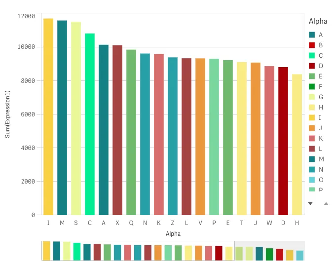
The bar chart is suitable for comparing multiple values. The dimension axis shows the category items that are compared, and the measure axis shows the value for each category item.
Learn more about the bar chart, or review the bar chart API specification.
// Configure nucleusconst nuked = window.stardust.embed(app, {  context: { theme: "light" },  types: [    {      name: "barchart",      load: () => Promise.resolve(window["sn-bar-chart"]),    },  ],});
// Rendering a bar chart on the flynuked.render({  type: "barchart",  element: document.querySelector(".bars"),  fields: ["Dim1", "=Sum(Expression1)"],  options: {    direction: "ltr",    freeResize: true,    viewState: {      scrollPosition: 25,    },  },  properties: {    color: { mode: "byDimension" }, // overrides default properties  },});
Options
- direction - ltr/rtl
- freeResize - in conjunction with snapshotData on layout, lets the chart ignore size set on snapshotData
- viewState - settings for the initial rendering of the table
- viewState.scrollPosition - pixel position of the scroll
Requirements
Requires @nebula.js/stardust version 1.2.0 or later.
Installing
If you use npm: npm install @nebula.js/sn-bar-chart.
You can also load through the script tag directly from
https://unpkg.com.
More examples
You can make more complex comparisons of data by using grouped or stacked bars. This requires using two dimensions and one measure. The Grouped bar chart and Stacked bar chart use the same two dimensions and the same measure.
You can change the orientation of a bar chart by following this Horizontal bar chart example.
Grouped bar chart
Grouped bars: with grouped bars, you can compare two or more items in the same categorical group.
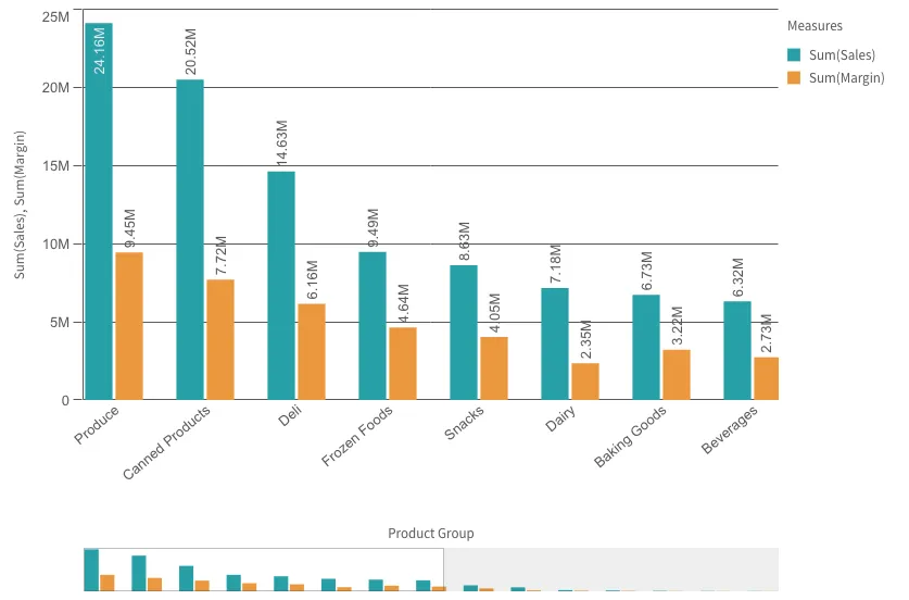
// Rendering a bar chart on the flynuked.render({ type: "barchart", element: document.querySelector(".bars"), fields: ["Product Group", "=Sum(Sales)", "=Sum(Margin)"], // overrides default properties properties: { barGrouping: { grouping: "grouped", }, dataPoint: { showLabels: true, showSegmentLabels: false, showTotalLabels: true, }, },});Stacked bar chart
Stacked bars: with stacked bars it is easier to compare the total quantity between different months. Stacked bars combine bars of different groups on top of each other and the total height of the resulting bar represents the combined result.
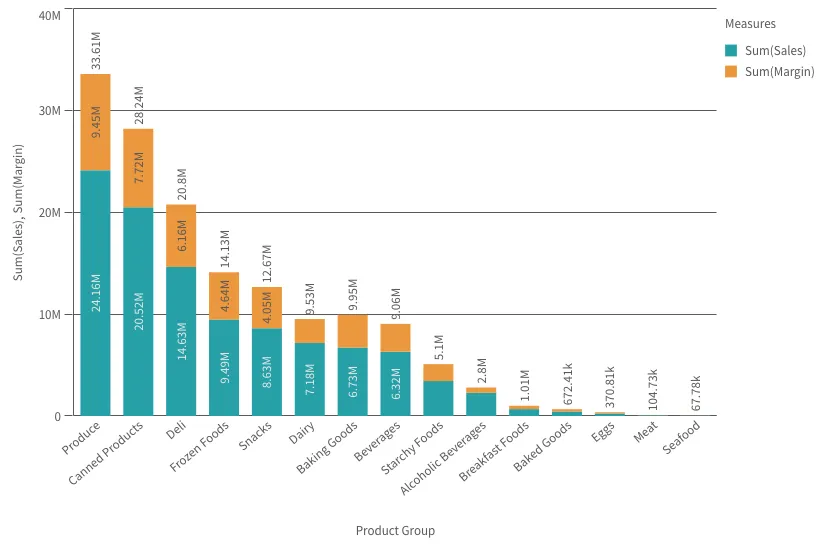
// Rendering a bar chart on the flynuked.render({ type: "barchart", element: document.querySelector(".bars"), fields: ["Product Group", "=Sum(Sales)", "=Sum(Margin)"], // overrides default properties properties: { barGrouping: { grouping: "stacked", }, dataPoint: { showLabels: true, showSegmentLabels: true, showTotalLabels: true, }, },});Horizontal bar chart
The bar chart can be displayed horizontally or vertically
by setting orientation property to horizontal or vertical,
as a horizontal bar chart example below:
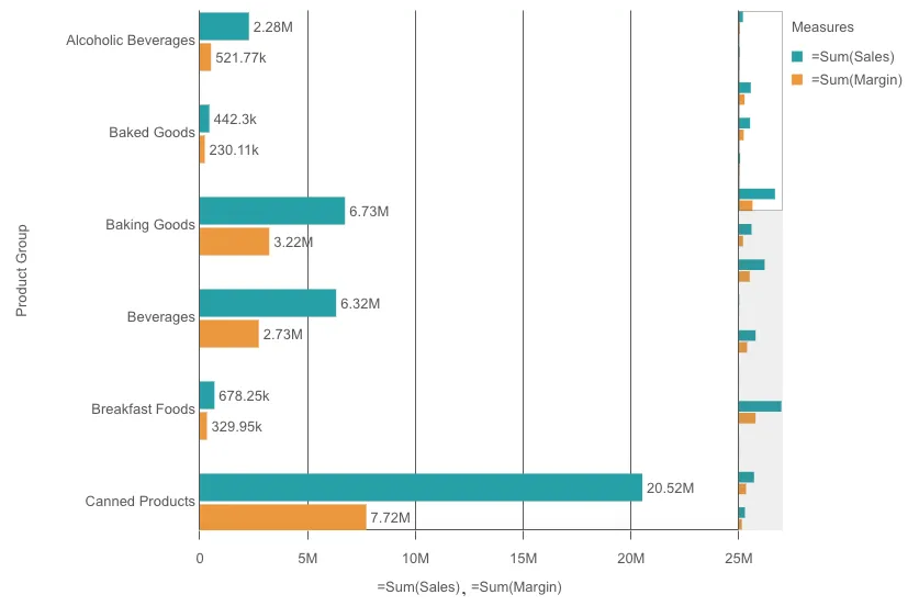
// Rendering a bar chart on the flynuked.render({ type: "barchart", element: document.querySelector(".bars"), fields: ["Product Group", "=Sum(Sales)", "=Sum(Margin)"], // overrides default properties properties: { barGrouping: { grouping: "grouped", }, dataPoint: { showLabels: true, showSegmentLabels: false, showTotalLabels: true, }, orientation: "horizontal", },});