Creating action buttons
Where possible, use qlik-embedand qlik/api rather than this framework.
The action button is a chart for triggering actions. It does not visualize data but is used to modify other charts or data, like managing selections, applying bookmarks, and setting variable values. You can define actions and order them to create a desired flow. There is also a specific navigation action to move to a new page, that always executes last (Only available inside Qlik Sense).
Learn more about the action button, or review the Nebula Button API specification.
const embeddable = window.stardust.embed(app, { context: { theme: "light" }, types: [ { name: "button", load: () => Promise.resolve(window["sn-action-button"]), }, ],});// Rendering a Buttonembeddable.render({ type: "sn-action-button", element: document.querySelector(".button"), properties: { actions: [ { actionType: "selectValues", actionLabel: "select A and B", field: "Alpha", value: "A;B", softLock: false, }, ], style: { label: "Make selections", }, },});Requirements
Requires @nebula.js/stardust version 2.1.0 or later.
Installing
If you use npm: npm install @nebula.js/sn-action-button.
You can also load through the script tag directly from
https://unpkg.com.
More examples
Executing several actions
You can define a flow of actions.
The actions are executed sequentially so the second action is not started until
the first one is done. Here is an example of selecting values in field Dim1,
then selecting all possible values in field Dim2
and finally clearing selections in field Dim1.
embeddable.render({ type: "sn-action-button", element: document.querySelector("#one"), properties: { actions: [ { actionLabel: "Select in Dim1", actionType: "selectValues", field: "Dim1", softLock: false, value: "B", }, { actionLabel: "Select possible in Dim2", actionType: "selectPossible", field: "Dim2", softLock: false, }, { actionLabel: "Clear selected in Dim1", actionType: "clearField", field: "Dim1", softLock: false, }, ], style: { label: "Trigger selection flow", }, },});Styling
The label, background, and border styling can be changed. Inside Qlik Sense you can also add an icon and a background image. Here are is an example utilizing most of the settings.
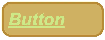
embeddable.render({ type: 'sn-action-button', element: document.querySelector('.button'), properties: { style: { label: 'Button', font: { size: 0.7, color: { index: 7, color: '#87205d' }, style: { bold: true, italic: true, underline: true }, align: 'left' }, background: { color: { index: -1, color: '#cfb162' }, }, border: { useBorder: true, radius: 0.53, width: 0.125, color: { index: -1, color: '#b98c34' }, }, },});