Creating pie charts
Where possible, use qlik-embed and qlik/api rather than this framework.
This section describes how to create pie charts with the Visualization API.
Creating a basic pie chart
In this example, you will create a basic pie chart, containing one dimension and one measure, and switch the titles off.
-
Create the chart.
Create the container for the chart. The visualization type is
piechart.app.visualization.create('piechart',[],{}) -
Define the dimension.
Define the dimension as a column.
[{"qDef": {"qFieldDefs": ["GirResult"],"qFieldLabels": ["Greens in regulation"]}}] -
Define the measure.
Define the measure as a column.
[{"qDef": {"qFieldDefs": ["GirResult"],"qFieldLabels": ["Greens in regulation"]}},"=Count(HoID)"] -
Switch off the titles.
Since the dimension label by default is visible in the visualization, you will select to switch the titles off.
{"showTitles": false}
Result
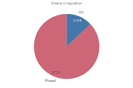
Complete code example: Basic pie chart
-
Visualization API
const config = {host: '<TENANT_URL>', //for example, 'abc.us.example.com'prefix: '/',port: 443,isSecure: true,webIntegrationId: '<WEB_INTEGRATION_ID>'};require.config({baseUrl: `https://${config.host}/resources`,webIntegrationId: config.webIntegrationId});require(["js/qlik"], (qlik) => {qlik.on('error', (error) => console.error(error));const app = qlik.openApp('<APP_ID>', config);app.visualization.create('piechart',[{"qDef": {"qFieldDefs": ["GirResult"],"qFieldLabels": ["Greens in regulation"]}},"=Count(HoID)"],{"showTitles": false}).then((vis)=>{vis.show("QV01");});});
Creating a basic donut chart
In this example, you will create exactly the same chart as in Creating a basic pie chart, but you will select to display it as a donut. This is done by simply adding the donut definition in the options.
-
Define the dimension.
Define the dimension as a column.
[{"qDef": {"qFieldDefs": ["GirResult"],"qFieldLabels": ["Greens in regulation"]}}] -
Define the measure.
Define the measure as a column.
[{"qDef": {"qFieldDefs": ["GirResult"],"qFieldLabels": ["Greens in regulation"]}},"=Count(HoID)"] -
Switch off the titles.
Since the dimension label by default is visible in the visualization, you will select to switch the titles off.
{"showTitles": false} -
Display the chart as a donut.
Since the dimension label by default is visible in the visualization, you will select to switch the titles off.
{"showTitles": false,"donut": {"showAsDonut": true}}
Result

Complete code example: Basic donut chart
-
Visualization API
const config = {host: '<TENANT_URL>', //for example, 'abc.us.example.com'prefix: '/',port: 443,isSecure: true,webIntegrationId: '<WEB_INTEGRATION_ID>'};require.config({baseUrl: `https://${config.host}/resources`,webIntegrationId: config.webIntegrationId});require(["js/qlik"], (qlik) => {qlik.on('error', (error) => console.error(error));const app = qlik.openApp('<APP_ID>', config);app.visualization.create('piechart',[{"qDef": {"qFieldDefs": ["GirResult"],"qFieldLabels": ["Greens in regulation"]}},"=Count(HoID)"],{"showTitles": false,"donut": {"showAsDonut": true}}).then((vis)=>{vis.show("QV01");});});
Using custom value labels
In this example, you will change the value labels so that they display actual values instead of percentage.
-
Change number formatting of measure.
First, you will change the number formatting of the measure in the columns. Set
"qType": "F"to indicate that a fixed number of decimals is used. Then set"qnDec": 0to indicate that no decimals are used.{"qDef": {"qLabel": "Frequency","qGrouping": "N","qDef": "Count(HoID)","qNumFormat": {"qType": "F","qnDec": 0,"qUseThou": 0,"qFmt": "#,##0","qDec": ".","qThou": ","}}} -
Define value label mode.
You want to display the actual values instead of the share so inside the
dataPointobject (in the options), set"labelMode": "value".{"showTitles": false,"donut": {"showAsDonut": true},"dataPoint": {"auto": false,"labelMode": "value"}}
Result
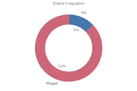
Complete code example: Custom value labels
-
Visualization API
const config = {host: '<TENANT_URL>', //for example, 'abc.us.example.com'prefix: '/',port: 443,isSecure: true,webIntegrationId: '<WEB_INTEGRATION_ID>'};require.config({baseUrl: `https://${config.host}/resources`,webIntegrationId: config.webIntegrationId});require(["js/qlik"], (qlik) => {qlik.on('error', (error) => console.error(error));const app = qlik.openApp('<APP_ID>', config);app.visualization.create('piechart',[{"qDef": {"qFieldDefs": ["GirResult"],"qFieldLabels": ["Greens in regulation"]}},{"qDef": {"qLabel": "Frequency","qGrouping": "N","qDef": "Count(HoID)","qNumFormat": {"qType": "F","qnDec": 0,"qUseThou": 0,"qFmt": "#,##0","qDec": ".","qThou": ","}}}],{"showTitles": false,"donut": {"showAsDonut": true},"dataPoint": {"auto": false,"labelMode": "value"}}).then((vis)=>{vis.show("QV01");});});
Adding a radius measure
In this example, you will add a second measure to calculate the radius. The measure added is the average Stableford points.
-
Create the chart.
Create the container for the chart. The visualization type is
piechart.app.visualization.create('piechart',[],{}) -
Define the dimension.
Define the dimension as a column.
[{"qDef": {"qFieldDefs": ["GirResult"],"qFieldLabels": ["Greens in regulation"]}}] -
Define the first measure.
Define the first measure as a column.
[{"qDef": {"qFieldDefs": ["GirResult"],"qFieldLabels": ["Greens in regulation"]}},"=Count(HoID)"] -
Define the second measure.
Define the second measure as a column.
[{"qDef": {"qFieldDefs": ["GirResult"],"qFieldLabels": ["Greens in regulation"]}},"=Count(HoID)","=Avg(Stableford)"] -
Switch off the titles.
Since the dimension label, by default, is visible in the visualization, you will select to switch the titles off.
{"showTitles": false}
Result
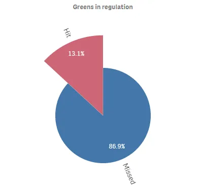
Complete code example: Radius measure
-
Visualization API
const config = {host: '<TENANT_URL>', //for example, 'abc.us.example.com'prefix: '/',port: 443,isSecure: true,webIntegrationId: '<WEB_INTEGRATION_ID>'};require.config({baseUrl: `https://${config.host}/resources`,webIntegrationId: config.webIntegrationId});require(["js/qlik"], (qlik) => {qlik.on('error', (error) => console.error(error));const app = qlik.openApp('<APP_ID>', config);app.visualization.create('piechart',[{"qDef": {"qFieldDefs": ["GirResult"],"qFieldLabels": ["Greens in regulation"]}},"=Count(HoID)","=Avg(Stableford)"],{"showTitles": false}).then((vis)=>{vis.show("QV01");});});