Creating line charts
Where possible, use qlik-embed and qlik/api rather than this framework.
This section describes how to create line charts with the Visualization API.
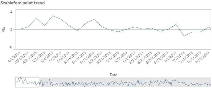
Create a basic line chart
In this example, you will create a basic line chart, containing one dimension and one measure, with a custom title.
-
Create the chart.
Create the container for the chart. The visualization type is
linechart.app.visualization.create('linechart',[],{}) -
Define the dimension.
Define the dimension as a column. Note the Dual function used in the dimension definition:
"qFieldDefs": [ "=Dual([Date.autoCalendar.Date],ID)" ]. It is used to separate values that belong to separate ranges (ID) but has the same date([Date.autoCalendar.Date]).For more information about the Dual function, see Dual - script and chart function on Qlik Help.
[{"qDef": {"qGrouping": "N","qFieldDefs": ["=Dual([Date.autoCalendar.Date],ID)"],"qFieldLabels": ["Date"]},"qNullSuppression": true}] -
Define the measure.
Define the measure as a column.
[{"qDef": {"qGrouping": "N","qFieldDefs": ["=Dual([Date.autoCalendar.Date],ID)"],"qFieldLabels": ["Date"]},"qNullSuppression": true},{"qDef": {"qLabel": "Pts","qGrouping": "N","qDef": "Avg(Stableford)","qNumFormat": {"qType": "U","qnDec": 10,"qUseThou": 0}}}] -
Define the title.
Define the title in the options.
{"showTitles": true,"title": "Stableford point trend"}
Result
Complete code example: Basic line chart
-
Visualization API
const config = {host: '<TENANT_URL>', //for example, 'abc.us.example.com'prefix: '/',port: 443,isSecure: true,webIntegrationId: '<WEB_INTEGRATION_ID>'};require.config({baseUrl: `https://${config.host}/resources`,webIntegrationId: config.webIntegrationId});require(["js/qlik"], (qlik) => {qlik.on('error', (error) => console.error(error));const app = qlik.openApp('<APP_ID>', config);app.visualization.create('linechart',[{"qDef": {"qGrouping": "N","qFieldDefs": ["=Dual([Date.autoCalendar.Date],ID)"],"qFieldLabels": ["Date"]},"qNullSuppression": true},{"qDef": {"qLabel": "Pts","qGrouping": "N","qDef": "Avg(Stableford)","qNumFormat": {"qType": "U","qnDec": 10,"qUseThou": 0}}}],{"showTitles": true,"title": "Stableford point trend"}).then((vis)=>{vis.show("QV01");});});
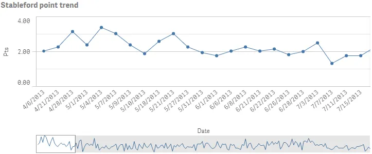
Number formatting and presentation
In this example, the number formatting has changed, show data points is enabled, grid line spacing is narrow, and missing values are shown as connections.
-
Change number formatting
You will change the number formatting of the measure to show two decimals. Set
"qType": "F"to indicate that a fixed number of decimals is used. Then set"qnDec": 2to indicate that two decimals is used.
{ "qDef": { "qLabel": "Pts", "qGrouping": "N", "qDef": "Avg(Stableford)", "qNumFormat": { "qType": "F", "qnDec": 2, "qUseThou": 0, "qFmt": "#,##0.00", "qDec": ".", "qThou": "," } } }-
Show data points
In the options, enable data points:
"dataPoint": { "show": true, "showLabels": false }. Value labels are not shown on the data points in this example.{"showTitles": true,"title": "Stableford point trend","dataPoint": {"show": true,"showLabels": false}} -
Narrow grid line spacing
Next, set grid line spacing to narrow:
"gridLine": { "auto": false, "spacing": 3 }, where 3 means narrow.{"showTitles": true,"title": "Stableford point trend","dataPoint": {"show": true,"showLabels": false},"gridLine": {"auto": false,"spacing": 3}} -
Connect missing values
Finally, define that missing values should be shown as connections:
"nullMode": "connect".{"showTitles": true,"title": "Stableford point trend","nullMode": "connect","dataPoint": {"show": true,"showLabels": false},"gridLine": {"auto": false,"spacing": 3}}
Result
Complete code example: Number formatting and presentation
-
Visualization API
const config = {host: '<TENANT_URL>', //for example, 'abc.us.example.com'prefix: '/',port: 443,isSecure: true,webIntegrationId: '<WEB_INTEGRATION_ID>'};require.config({baseUrl: `https://${config.host}/resources`,webIntegrationId: config.webIntegrationId});require(["js/qlik"], (qlik) => {qlik.on('error', (error) => console.error(error));const app = qlik.openApp('<APP_ID>', config);app.visualization.create('linechart',[{"qDef": {"qGrouping": "N","qFieldDefs": ["=Dual([Date.autoCalendar.Date],ID)"],"qFieldLabels": ["Date"]},"qNullSuppression": true},{"qDef": {"qLabel": "Pts","qGrouping": "N","qDef": "Avg(Stableford)","qNumFormat": {"qType": "F","qnDec": 2,"qUseThou": 0,"qFmt": "#,##0.00","qDec": ".","qThou": ","}}}],{"showTitles": true,"title": "Stableford point trend","nullMode": "connect","dataPoint": {"show": true,"showLabels": false},"gridLine": {"auto": false,"spacing": 3}}).then((vis)=>{vis.show("QV01");});});
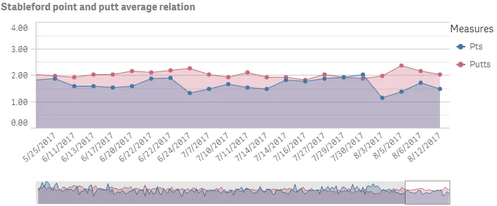
Area chart with two measures and numerous settings
In this example, you will display the chart as an area chart. You will also add a second measure and some presentation settings are defined.
-
Add a second measure.
Define the second measure as a column.
{"qDef": {"qLabel": "Putts","qGrouping": "N","qDef": "Avg(Putts)","qNumFormat": {"qType": "F","qnDec": 2,"qUseThou": 0,"qFmt": "#,##0.00","qDec": ".","qThou": ","}}} -
Define area chart. In this example, you want to present the chart as an area chart. This is defined in the options:
"lineType": "area".{"showTitles": true,"title": "Stableford point and putt average relation","lineType": "area","nullMode": "connect","dataPoint": {"show": true,"showLabels": false},"gridLine": {"auto": false,"spacing": 3}} -
Define the scroll alignment.
Define the scroll alignment to be at the end:
"scrollStartPos": 1.{"showTitles": true,"title": "Stableford point and putt average relation","lineType": "area","scrollStartPos": 1,"nullMode": "connect","dataPoint": {"show": true,"showLabels": false},"gridLine": {"auto": false,"spacing": 3}} -
Define the dimension axis.
Axis settings are set in the
dimensionAxisandmeasureAxisobjects. On the dimension axis, set to display labels only that are tilted:"dimensionAxis": {"continuousAuto": true, "show": "labels", "label": "tilted"}.{"showTitles": true,"title": "Stableford point and putt average relation","lineType": "area","scrollStartPos": 1,"nullMode": "connect","dataPoint": {"show": true,"showLabels": false},"gridLine": {"auto": false,"spacing": 3},"dimensionAxis": {"continuousAuto": true,"show": "labels","label": "tilted"}} -
Define the measure axis.
On the measure axis, also set to display labels only and then set the measure axis scale to
narrow: "measureAxis": { "show": "labels", "dock": "near", "spacing": 0.5 }.{"showTitles": true,"title": "Stableford point and putt average relation","lineType": "area","scrollStartPos": 1,"nullMode": "connect","dataPoint": {"show": true,"showLabels": false},"gridLine": {"auto": false,"spacing": 3},"dimensionAxis": {"continuousAuto": true,"show": "labels","label": "tilted"},"measureAxis": {"show": "labels","dock": "near","spacing": 0.5}}
Result
Complete code example: Area chart with two measures and numerous settings
-
Visualization API
const config = {host: '<TENANT_URL>', //for example, 'abc.us.example.com'prefix: '/',port: 443,isSecure: true,webIntegrationId: '<WEB_INTEGRATION_ID>'};require.config({baseUrl: `https://${config.host}/resources`,webIntegrationId: config.webIntegrationId});require(["js/qlik"], (qlik) => {qlik.on('error', (error) => console.error(error));const app = qlik.openApp('<APP_ID>', config);app.visualization.create('linechart',[{"qDef": {"qGrouping": "N","qFieldDefs": ["=Dual([Date.autoCalendar.Date],ID)"],"qFieldLabels": ["Date"]},"qNullSuppression": true},{"qDef": {"qLabel": "Pts","qGrouping": "N","qDef": "Avg(Stableford)","qNumFormat": {"qType": "F","qnDec": 2,"qUseThou": 0,"qFmt": "#,##0.00","qDec": ".","qThou": ","}}},{"qDef": {"qLabel": "Putts","qGrouping": "N","qDef": "Avg(Putts)","qNumFormat": {"qType": "F","qnDec": 2,"qUseThou": 0,"qFmt": "#,##0.00","qDec": ".","qThou": ","}}}],{"showTitles": true,"title": "Stableford point and putt average relation","lineType": "area","scrollStartPos": 1,"nullMode": "connect","dataPoint": {"show": true,"showLabels": false},"gridLine": {"auto": false,"spacing": 3},"dimensionAxis": {"continuousAuto": true,"show": "labels","label": "tilted"},"measureAxis": {"show": "labels","dock": "near","spacing": 0.5}}).then((vis)=>{vis.show("QV01");});});
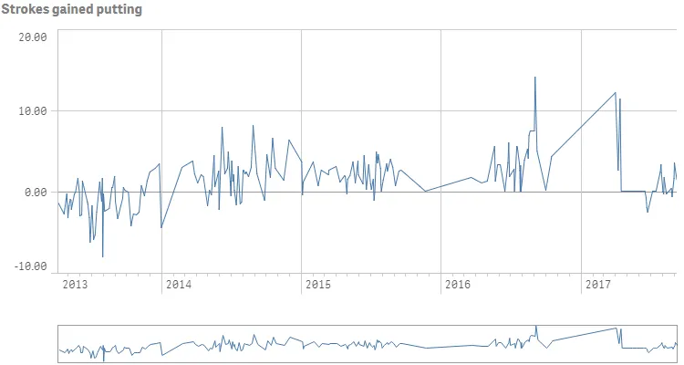
Creating a time-aware line chart
In this example, you will create a time-aware line chart, containing one dimension and one measure.
-
Define the dimension.
Define the dimension as a column.
{"qDef": {"qGrouping": "N","qFieldDefs": ["Date.autoCalendar.Date"],"qFieldLabels": ["Date"]}} -
Define the measure.
Define the measure as a column.
{"qDef": {"qGrouping": "N","qFieldDefs": ["Date.autoCalendar.Date"],"qFieldLabels": ["Date"]}},{"qDef": {"qLabel": "Strokes gained putting","qDef": "Sum(ExpPutts-Putts)","qNumFormat": {"qType": "F","qnDec": 2,"qUseThou": 0,"qFmt": "#,##0.00","qDec": ".","qThou": ","},"autoSort": true}} -
Set the title.
Define a title in the options:
"title": "Strokes gained putting".{"showTitles": true,"title": "Strokes gained putting"} -
Set labels on the dimension axis.
You want to show labels only on the dimension axis. You will also set
"continuousAuto": falseto indicate that you want to customize the scaling of the dimensional axis. This is then done by setting"preferContinuousAxis": true, which means that the scale along the dimensional axis is continuous if supported by the data.{"showTitles": true,"title": "Strokes gained putting","dimensionAxis": {"continuousAuto": false,"show": "labels"},"preferContinuousAxis": true} -
Set labels on the measure axis.
You want to show labels only on the measure axis:
"measureAxis": { "show": "labels" }.{"showTitles": true,"title": "Strokes gained putting","dimensionAxis": {"continuousAuto": false,"show": "labels"},"preferContinuousAxis": true,"measureAxis": {"show": "labels"}}
Result
Example of time-aware line chart
Complete code example: Time-aware line chart
-
Visualization API
const config = {host: '<TENANT_URL>', //for example, 'abc.us.example.com'prefix: '/',port: 443,isSecure: true,webIntegrationId: '<WEB_INTEGRATION_ID>'};require.config({baseUrl: `https://${config.host}/resources`,webIntegrationId: config.webIntegrationId});require(["js/qlik"], (qlik) => {qlik.on('error', (error) => console.error(error));const app = qlik.openApp('<APP_ID>', config);app.visualization.create('linechart',[{"qDef": {"qGrouping": "N","qFieldDefs": ["Date.autoCalendar.Date"],"qFieldLabels": ["Date"]}},{"qDef": {"qLabel": "Strokes gained putting","qDef": "Sum(ExpPutts-Putts)","qNumFormat": {"qType": "F","qnDec": 2,"qUseThou": 0,"qFmt": "#,##0.00","qDec": ".","qThou": ","},"autoSort": true}}],{"showTitles": true,"title": "Strokes gained putting","dimensionAxis": {"continuousAuto": false,"show": "labels"},"preferContinuousAxis": true,"measureAxis": {"show": "labels"}}).then((vis)=>{vis.show("QV01");});});