Creating histogram charts
Where possible, use qlik-embed and qlik/api rather than this framework.
This section describes how to create histograms with the Visualization API.
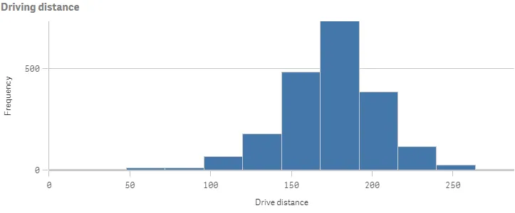
Creating a basic histogram
In this example, you will create a basic histogram, containing a single dimension and a custom title.
-
Create the chart
Create the container for the chart. The visualization type is histogram.
Visualization API
app.visualization.create('histogram',[],{}) -
Define the dimension.
Define the dimension as a column.
NoteYou can only apply a single dimension to a histogram. The dimension must be a numerical field. Histograms do not need a measure, as the frequency of the binned data is automatically calculated.
[{"qDef": {"qFieldDefs": ["DrDist"],"qFieldLabels": ["Drive distance"]}}] -
Define the title in the options.
{"title": "Driving distance"}
Result
Complete code example: Basic histogram
-
Visualization API
const config = {host: '<TENANT_URL>', //for example, 'abc.us.example.com'prefix: '/',port: 443,isSecure: true,webIntegrationId: '<WEB_INTEGRATION_ID>'};require.config({baseUrl: `https://${config.host}/resources`,webIntegrationId: config.webIntegrationId});require(["js/qlik"], (qlik) => {qlik.on('error', (error) => console.error(error));const app = qlik.openApp('<APP_ID>', config);app.visualization.create('histogram',[{"qDef": {"qFieldDefs": ["DrDist"],"qFieldLabels": ["Drive distance"]}}],{"showTitles": true,"title": "Driving distance"}).then((vis)=>{vis.show("QV01");});});
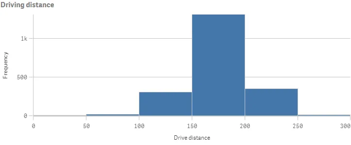
Setting maximum number of bars
In this example, you will set the maximum number of bars that you want to divide
the data into. You will select to display a maximum of 6 bars (or bins). You
achieve this by configuring the bins object in the options.
-
Disable auto-bins.
In the
binsobject, enable custom bars by setting"auto": false."bins": {"auto": false} -
Define the maximum number of bars.
To use the maximum number of bars feature, set
"binMode": "maxCount"and then define the maximum number:"binCount": 6."bins": {"auto": false,"binMode": "maxCount","binCount": 6}
Result
Complete code example: Setting maximum number of bars
-
Visualization API
const config = {host: '<TENANT_URL>', //for example, 'abc.us.example.com'prefix: '/',port: 443,isSecure: true,webIntegrationId: '<WEB_INTEGRATION_ID>'};require.config({baseUrl: `https://${config.host}/resources`,webIntegrationId: config.webIntegrationId});require(["js/qlik"], (qlik) => {qlik.on('error', (error) => console.error(error));const app = qlik.openApp('<APP_ID>', config);app.visualization.create('histogram',[{"qDef": {"qFieldDefs": ["DrDist"],"qFieldLabels": ["Drive distance"]}}],{"showTitles": true,"title": "Driving distance","bins": {"auto": false,"binMode": "maxCount","binCount": 6}}).then((vis)=>{vis.show("QV01");});});
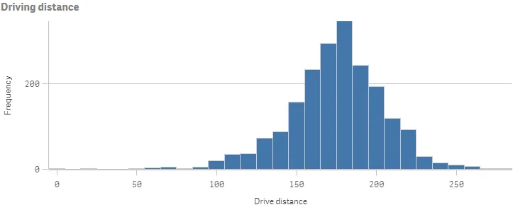
Setting bar width on the x-axis
In this example, you will define how wide each bar should be, based on the
values on the x-axis, and which offset the bars are using by configuring the
bins object in the options.
-
Disable auto-bins.
Make sure that custom bars are enabled (“auto”: false).
"bins": {"auto": false} -
Define the bar width.
To use the bar width feature, set
"binMode": "size". Set the width of each bar"binSize": 10and then set the offset:"offset": 5.In this example, you have set the bar width to 10 and the offset is 5. That means the first bar is 5 to 15, the second bar is 15 to 25, and so forth.
"bins": {"auto": false,"binMode": "size","binSize": 10,"offset": 5}
Result
Complete code example: Setting bar width on the x-axis
-
Visualization API
const config = {host: '<TENANT_URL>', //for example, 'abc.us.example.com'prefix: '/',port: 443,isSecure: true,webIntegrationId: '<WEB_INTEGRATION_ID>'};require.config({baseUrl: `https://${config.host}/resources`,webIntegrationId: config.webIntegrationId});require(["js/qlik"], (qlik) => {qlik.on('error', (error) => console.error(error));const app = qlik.openApp('<APP_ID>', config);app.visualization.create('histogram',[{"qDef": {"qFieldDefs": ["DrDist"],"qFieldLabels": ["Drive distance"]}}],{"showTitles": true,"title": "Driving distance","bins": {"auto": false,"binMode": "size","binSize": 10,"offset": 5}}).then((vis)=>{vis.show("QV01");});});
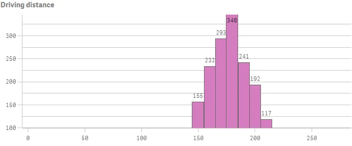
Presentation, colors and axis settings
In this example, you will define some settings for how the histogram is presented. All these settings are defined in the options.
-
Grid line spacing
The spacing between the grid lines are set in the gridlines object. To use narrow grid line spacing, set
"auto": falseand then set"spacing": 3, where 3 means narrow."gridlines": {"auto": false,"spacing": 3} -
Y-axis settings
This example shows labels only on the Y-axis (measure axis), uses narrow scale, and has a custom value range defined. These settings are set in the
measureAxisobject.To show labels only, set
"show": "labels". Then set narrow scale:"spacing": 0.5where 0.5 means narrow. Finally, set"autoMinMax": false,"minMax": "min", and"min": 100to define the custom range."measureAxis": {"show": "labels","dock": "near","spacing": 0.5,"autoMinMax": false,"minMax": "min","min": 100} -
X-axis settings
To show labels only on the X-axis (dimension axis):
"dimensionAxis": {"show": "labels"} -
Value labels on data points
To show values labels on data points:
"dataPoint": {"showLabels": true} -
Bar colors
The bar color is defined in the color object. In this example, you will define a color that is not part of the default color palette.
"color": {"bar": {"paletteColor": {"index": -1,"color": "#d47dbe"}}}
Result
Complete code example: Presentation, colors and axis settings
-
Visualization API
const config = {host: '<TENANT_URL>', //for example, 'abc.us.example.com'prefix: '/',port: 443,isSecure: true,webIntegrationId: '<WEB_INTEGRATION_ID>'};require.config({baseUrl: `https://${config.host}/resources`,webIntegrationId: config.webIntegrationId});require(["js/qlik"], (qlik) => {qlik.on('error', (error) => console.error(error));const app = qlik.openApp('<APP_ID>', config);app.visualization.create('histogram',[{"qDef": {"qFieldDefs": ["DrDist"],"qFieldLabels": ["Drive distance"]}}],{"showTitles": true,"title": "Driving distance","bins": {"auto": false,"binMode": "size","binSize": 10,"offset": 5},"gridlines": {"auto": false,"spacing": 3},"measureAxis": {"show": "labels","spacing": 0.5,"autoMinMax": false,"minMax": "min","min": 100},"dimensionAxis": {"show": "labels"},"dataPoint": {"showLabels": true},"color": {"bar": {"paletteColor": {"index": -1,"color": "#d47dbe"}}}}).then((vis)=>{vis.show("QV01");});});