Creating bar charts
Where possible, use qlik-embed and qlik/api rather than this framework.
This section describes how to create bar charts with the Visualization API.
Creating a basic bar chart
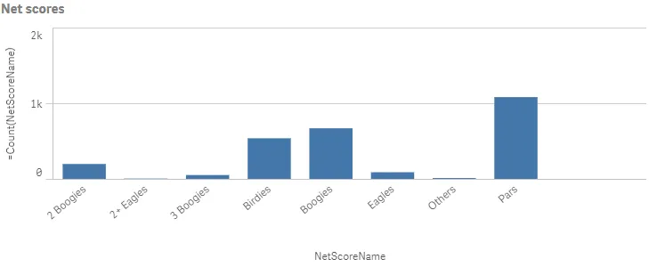
In this example, you will create a basic bar chart, containing one dimension and one measure, and with a custom title.
-
Create the chart.
Create the container for the chart. The visualization type is
barchart.Visualization API:
app.visualization.create('barchart',[],{}) -
Define the dimension and the measure as columns.
["NetScoreName","=Count(NetScoreName)"] -
Define the title in the options.
{"showTitles": true,"title": "Net scores"}
Result
Complete code example: Basic bar chart
-
Visualization API
const config = {host: '<TENANT_URL>', //for example, 'abc.us.example.com'prefix: '/',port: 443,isSecure: true,webIntegrationId: '<WEB_INTEGRATION_ID>'};require.config({baseUrl: `https://${config.host}/resources`,webIntegrationId: config.webIntegrationId});require(["js/qlik"], (qlik) => {qlik.on('error', (error) => console.error(error));const app = qlik.openApp('<APP_ID>', config);app.visualization.create('barchart',["NetScoreName","=Count(NetScoreName)"],{"showTitles": true,"title": "Net scores"}).then((vis)=>{vis.show("QV01");});});
Sorting and presentation settings
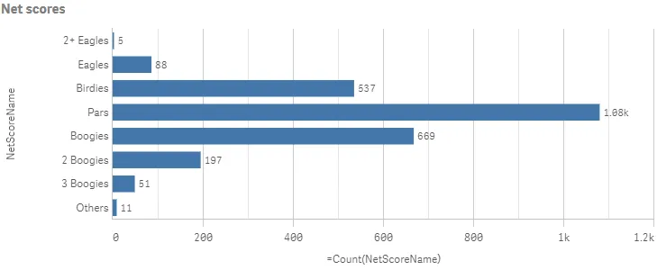
In this example, you will sort the dimension values based on its numerical representation (NetScoreDiff).
-
Sorting
Sorting is set on the dimension in the columns by disabling auto sort and defining the qSortCriterias object.
Disable automatic sorting by setting
"autoSort": false. In theqSortCriteriasobject, enable sort by expression and then define the expression, which in this case is the fieldNetScoreDiff:{ "qSortByExpression": 1, "qExpression": {"qv": "NetScoreDiff" } }.{"qDef": {"qFieldDefs": ["NetScoreName"],"qSortCriterias": [{"qSortByExpression": 1,"qExpression": {"qv": "NetScoreDiff"}}],"autoSort": false}} -
Horizontal orientation
If you also want to change the way the bar chart is presented by changing to horizontal orientation, adding narrow grid line spacing and also showing the value labels. All these changes are done in the options.
Start by changing to horizontal orientation:
"orientation": "horizontal"./*Horizontal orientation*/"orientation": "horizontal" -
Grid line spacing
Grid line spacing is changed in the gridLine object. Disable automatic grid line spacing (“auto”: false) and then define the custom spacing.
Set “spacing”: 3 since you want narrow grid line spacing.
/*Horizontal orientation*/"orientation": "horizontal",/*Narrow grid line spacing*/"gridLine": {"auto": false,"spacing": 3} -
Data points
Value labels are displayed by setting “showLabels”: true in the dataPoint object.
/*Horizontal orientation*/"orientation": "horizontal",/*Narrow grid line spacing*/"gridLine": {"auto": false,"spacing": 3},/*show value labels*/"dataPoint": {"showLabels": true}
Result
Complete code example: Sorting and presentation settings
-
Visualization API
const config = {host: '<TENANT_URL>', //for example, 'abc.us.example.com'prefix: '/',port: 443,isSecure: true,webIntegrationId: '<WEB_INTEGRATION_ID>'};require.config({baseUrl: `https://${config.host}/resources`,webIntegrationId: config.webIntegrationId});require(["js/qlik"], (qlik) => {qlik.on('error', (error) => console.error(error));const app = qlik.openApp('<APP_ID>', config);app.visualization.create('barchart',[{"qDef": {"qFieldDefs": ["NetScoreName"],"qSortCriterias": [{"qSortByExpression": 1,"qExpression": {"qv": "NetScoreDiff"}}],"autoSort": false}},"=Count(NetScoreName)"],{"showTitles": true,"title": "Net scores","orientation": "horizontal","gridLine": {"auto": false,"spacing": 3},"dataPoint": {"showLabels": true}}).then((vis)=>{vis.show("QV01");});});
Color and legend settings
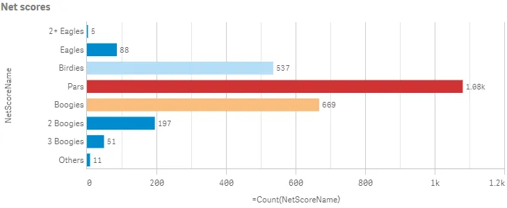
In this example, you will color the bar chart by the measure and hide the color legend.
-
Color by measure
Coloring is defined in the color object. Custom coloring is done by setting
"auto": false. When auto-colors are switched off, you must set a mode to color by.If you want to color the bar chart by measure, set
"mode": "byMeasure". Then define thebyMeasureDefproperty./*Color by measure*/"color": {"auto": false,"mode": "byMeasure","measureScheme": "dc","reverseScheme": false,"autoMinMax": true,"byMeasureDef": {"label": "Count(NetScoreName)","key": "Count(NetScoreName)","type": "expression"}} -
Hide color legend
In this example, you do not want to show the legend, so it is switched off in the legend object by setting
"show": false./*Color by measure*/"color": {"auto": false,"mode": "byMeasure","measureScheme": "dc","reverseScheme": false,"autoMinMax": true,"byMeasureDef": {"label": "Count(NetScoreName)","key": "Count(NetScoreName)","type": "expression"}},/*Do not show color legend*/"legend": {"show": false}
Result
Complete code example: Color and legend settings
-
Visualization API
const config = {host: '<TENANT_URL>', //for example, 'abc.us.example.com'prefix: '/',port: 443,isSecure: true,webIntegrationId: '<WEB_INTEGRATION_ID>'};require.config({baseUrl: `https://${config.host}/resources`,webIntegrationId: config.webIntegrationId});require(["js/qlik"], (qlik) => {qlik.on('error', (error) => console.error(error));const app = qlik.openApp('<APP_ID>', config);app.visualization.create('barchart',[{"qDef": {"qFieldDefs": ["NetScoreName"],"qSortCriterias": [{"qSortByExpression": 1,"qExpression": {"qv": "NetScoreDiff"}}],"autoSort": false}},"=Count(NetScoreName)"],{"showTitles": true,"title": "Net scores","orientation": "horizontal","gridLine": {"auto": false,"spacing": 3},"dataPoint": {"showLabels": true},"color": {"auto": false,"mode": "byMeasure","measureScheme": "dc","reverseScheme": false,"autoMinMax": true,"byMeasureDef": {"label": "Count(NetScoreName)","key": "Count(NetScoreName)","type": "expression"}},"legend": {"show": false}}).then((vis)=>{vis.show("QV01");});});
Dimension and measure axis settings
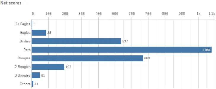
In this example, you want to do some changes to how the dimension axis and the measure axis are presented.
This example is a continuation of the Sorting and presentation settings example.
-
Dimension axis
Dimension axis settings are set in the
dimensionAxisobject. Placement in the visualization is depending on the orientation of the bar chart.Set to display labels only on the dimension axis:
"show": "labels"./*Dimension axis: Show labels only*/"dimensionAxis": {"show": "labels"} -
Measure axis
Measure axis settings are set in the
measureAxisobject. Placement in the visualization is depending on the orientation of the bar chart.Set to display labels only. Place the position of the axis at the top by setting
"dock": "far". A custom range of the measure values can be used by disabling auto-range:"autoMinMax": falseand setting theminMaxmode. The mode can be eithermin,maxorminMax. In this example, you select to usemaxand therefore need to set the maximum value./*Dimension axis: Show labels only*/"dimensionAxis": {"show": "labels"},/*Measure axis: Show labels only, axis on top, narrow scale,Custom range: max 1100*/"measureAxis": {"show": "labels","dock": "far","spacing": 0.5,"autoMinMax": false,"minMax": "max","max": 1100}
Result
Complete code example: Dimension and measure axis settings
-
Visualization API
const config = {host: '<TENANT_URL>', //for example, 'abc.us.example.com'prefix: '/',port: 443,isSecure: true,webIntegrationId: '<WEB_INTEGRATION_ID>'};require.config({baseUrl: `https://${config.host}/resources`,webIntegrationId: config.webIntegrationId});require(["js/qlik"], (qlik) => {qlik.on('error', (error) => console.error(error));const app = qlik.openApp('<APP_ID>', config);app.visualization.create('barchart',[{"qDef": {"qFieldDefs": ["NetScoreName"],"qSortCriterias": [{"qSortByExpression": 1,"qExpression": {"qv": "NetScoreDiff"}}],"autoSort": false}},"=Count(NetScoreName)"],{"showTitles": true,"title": "Net scores","orientation": "horizontal","gridLine": {"auto": false,"spacing": 3},"dataPoint": {"showLabels": true},"dimensionAxis": {"show": "labels"},"measureAxis": {"show": "labels","dock": "far","spacing": 0.5,"autoMinMax": false,"minMax": "max","max": 1100}}).then((vis)=>{vis.show("QV01");});});
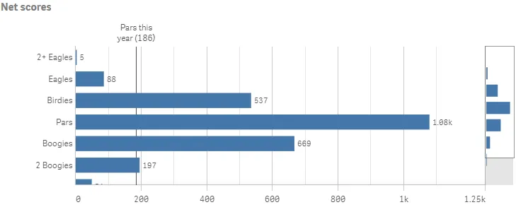
Using reference lines
In this example, you add a reference line to the bar chart.
-
RefLine object
Reference lines are defined in the
refLineobject. You can have several reference lines defined for the same visualization. The properties of the reference line are set in an array (refLines).This example depicts a reference line based on a value expression.
"refLine": {"refLines": [{"show": true,"label": "Pars this year","paletteColor": {"index": 14,"color": "#545352"},"refLineExpr": {"value": {"qValueExpression": {"qExpr": "=Count({<[Date.autoCalendar.YearsAgo]={'3'},NetScoreName={'Pars'}>}NetScoreName)"}},"label": {"qStringExpression": {"qExpr": "=Count({<[Date.autoCalendar.YearsAgo]={'3'},NetScoreName={'Pars'}>}NetScoreName)"}}},}]}
Result
Complete code example: Using reference lines
-
Visualization API
const config = {host: '<TENANT_URL>', //for example, 'abc.us.example.com'prefix: '/',port: 443,isSecure: true,webIntegrationId: '<WEB_INTEGRATION_ID>'};require.config({baseUrl: `https://${config.host}/resources`,webIntegrationId: config.webIntegrationId});require(["js/qlik"], (qlik) => {qlik.on('error', (error) => console.error(error));const app = qlik.openApp('<APP_ID>', config);app.visualization.create('barchart',[{"qDef": {"qFieldDefs": ["NetScoreName"],"qSortCriterias": [{"qSortByExpression": 1,"qExpression": {"qv": "NetScoreDiff"}}],"autoSort": false}},"=Count(NetScoreName)"],{"refLine": {"refLines": [{"show": true,"label": "Pars this year","paletteColor": {"index": 14,"color": "#545352"},"refLineExpr": {"value": {"qValueExpression": {"qExpr": "=Count({<[Date.autoCalendar.YearsAgo]={'3'},NetScoreName={'Pars'}>}NetScoreName)"}},"label": {"qStringExpression": {"qExpr": "=Count({<[Date.autoCalendar.YearsAgo]={'3'},NetScoreName={'Pars'}>}NetScoreName)"}}},}]},"showTitles": true,"title": "Net scores","orientation": "horizontal","gridLine": {"auto": false,"spacing": 3},"dataPoint": {"showLabels": true},"dimensionAxis": {"show": "labels"},"measureAxis": {"show": "labels","dock": "near","spacing": 0.5,"autoMinMax": false,"minMax": "max","max": 1250}}).then((vis)=>{vis.show("QV01");});});
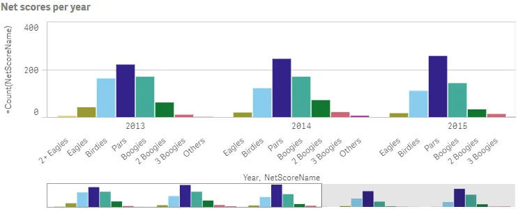
Grouped and stacked bar charts
You can make more complex comparisons of data by using grouped or stacked bars. This requires using two dimensions and one measure. The two example charts use the same two dimensions and the same measure.
-
Grouped bar chart
With grouped bars, you can compare two or more items in the same categorical group. Grouped bars are defined in the barGrouping object.
"barGrouping": {"grouping": "grouped"}Result
-
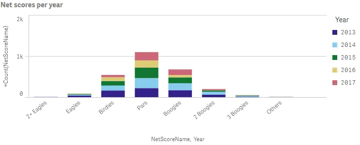
Stacked bar chart
With stacked bars it is easier to compare the total quantity between different periods. Stacked bars combine bars of different groups on top of each other and the total height of the resulting bar represents the combined result.
When creating stacked bar charts, you must define the way the data is handled internally by the engine. This is done in the
qModeproperty inside theqHyperCubeDef."qHyperCubeDef": {"qMode": "K"}Stacked bars are then defined in the barGrouping object.
"barGrouping": {"grouping": "stacked"}
Result
Complete code example: Grouped bar chart
-
Visualization API
const config = {host: '<TENANT_URL>', //for example, 'abc.us.example.com'prefix: '/',port: 443,isSecure: true,webIntegrationId: '<WEB_INTEGRATION_ID>'};require.config({baseUrl: `https://${config.host}/resources`,webIntegrationId: config.webIntegrationId});require(["js/qlik"], (qlik) => {qlik.on('error', (error) => console.error(error));const app = qlik.openApp('<APP_ID>', config);app.visualization.create('barchart',[{"qDef": {"qFieldDefs": ["Date.autoCalendar.Year"],"qFieldLabels": ["Year"]}},{"qDef": {"qFieldDefs": ["NetScoreName"],"qSortCriterias": [{"qSortByExpression": 1,"qExpression": {"qv": "NetScoreDiff"}}],"autoSort": false}},"=Count(NetScoreName)"],{"showTitles": true,"title": "Net scores per year","showDetails": false,"barGrouping": {"grouping": "grouped"},"legend": {"show": false}}).then((vis)=>{vis.show("QV01");});});
Complete code example: Stacked bar chart
-
Visualization API
const config = {host: '<TENANT_URL>', //for example, 'abc.us.example.com'prefix: '/',port: 443,isSecure: true,webIntegrationId: '<WEB_INTEGRATION_ID>'};require.config({baseUrl: `https://${config.host}/resources`,webIntegrationId: config.webIntegrationId});require(["js/qlik"], (qlik) => {qlik.on('error', (error) => console.error(error));const app = qlik.openApp('<APP_ID>', config);app.visualization.create('barchart',[{"qDef": {"qFieldDefs": ["NetScoreName"],"qSortCriterias": [{"qSortByExpression": 1,"qExpression": {"qv": "NetScoreDiff"}}],"autoSort": false}},{"qDef": {"qFieldDefs": ["Date.autoCalendar.Year"],"qFieldLabels": ["Year"]}},"=Count(NetScoreName)"],{"showTitles": true,"title": "Net scores per year","showDetails": false,"qHyperCubeDef": {"qMode": "K"},"barGrouping": {"grouping": "stacked"}}).then((vis)=>{vis.show("QV01");});});