Scatter plot
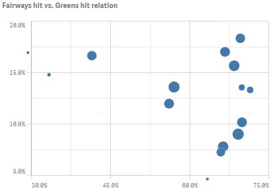
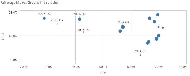
The scatter plot presents pairs of values from two or three measures. This is useful when you want to show data where each instance has two numbers, for example, the relationship between Fairways hit (FIR%) and Greens hit (GIR%) per Year & Quarter. In the scatter plot below, a third measure (number of holes played) is used to generate the bubble size.
Number of columns (dimensions and measures)
In a scatter plot you need one dimension and at least two measures. You can have maximum one dimension and three measures, where the third measure is visualized as bubble size.
Default settings for a scatter plot
Most native Qlik Sense chart types are automatically sorted on the dimension content:
- Numeric content is numerically sorted.
- Categorical content is alphabetically sorted.
Out of range
You can set a limit for the x-axis and y-axis ranges. Without a limit, the range is automatically set to include the highest positive and lowest negative value, but if you set a limit you may have values that exceed that limit. When a data point value lies outside the defined range, a single bubble indicates that there are values outside of the range.
{ "xAxis": { "show": "labels", "autoMinMax": false, "minMax": "min", "min": 0.3 }, "yAxis": { "show": "labels", "autoMinMax": false, "minMax": "min", "min": 0.05 }}