Pivot table
The pivot table presents dimensions and measures as rows and columns in a table. In a pivot table you can analyze data by multiple measures and in multiple dimensions at the same time. You can rearrange the measures and dimensions to get different views of the data. The activity of moving measures and dimensions interchangeably between rows and columns is known as “pivoting”.
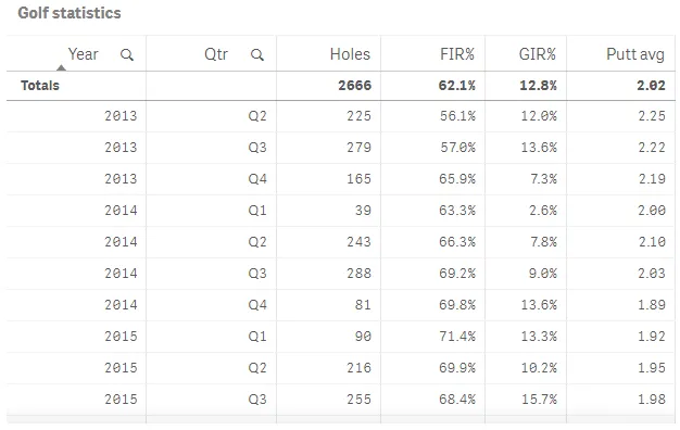
The efficiency of a pivot table can be illustrated by comparing a regular table with a pivot table that has the same data. In the following table, you have two dimensions: Year, and Quarter (Qtr), and three measures: Number of holes played (Holes), Fairway accuracy (FIR%), Greens in regulation (GIR%), and Putt average (Putt avg).
The table shows attendance numbers and goal averages for some venues. Year is presented more than once, and it is not possible to get a good summary of the data.

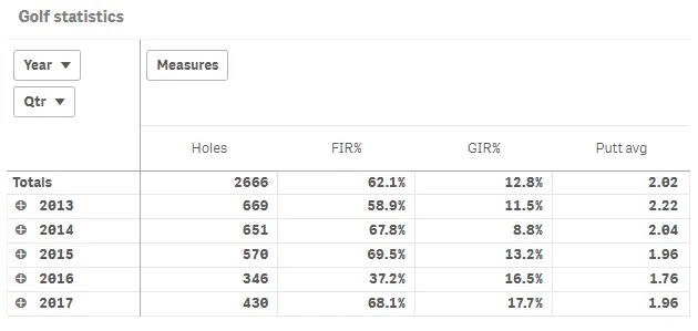
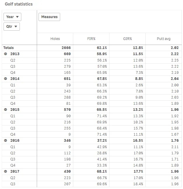
Here is the same data in a pivot table.

As you can see, the pivot table presents the data in a much more condensed way, which simplifies analysis and comparison. Compared to the regular table, the number or rows has been drastically decreased the number of columns is five instead of six.

Default settings for a pivot table
Most native Qlik Sense chart types are automatically sorted on the dimension content:
- Numeric content is numerically sorted.
- Categorical content is alphabetically sorted.