Pie chart
The pie chart displays the relation between values as well as the relation of a single value to the total. You can use a pie chart when you have a single data series with only positive values.
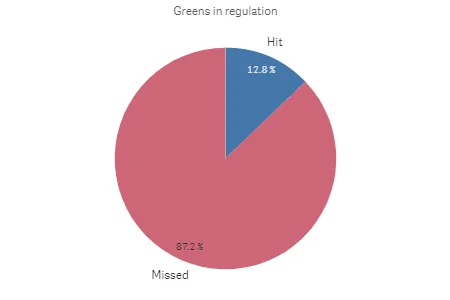
Greens in regulation in a pie chart
Default settings for a pie chart
The following settings are used by default in a pie chart:
- The top 10 sectors are presented in descending size order, clockwise.
- Colors are presented by dimension.
- Value labels are presented in percent.
- Dimension labels are automatically oriented along the slice to avoid intersecting other slices.
All these settings can be changed in the properties.
Number of columns (dimensions and measures)
In the pie chart, the dimensions form sectors of the measure value. You can include one or two measures and one dimension in a pie chart.
If you add a second measure value, this will be used to encode the outer radius of each slice.
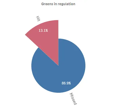
Greens in regulation in a pie chart with the average Stableford points determining slice radius
Donut charts
The pie char can be displayed as a donut instead of a pie.
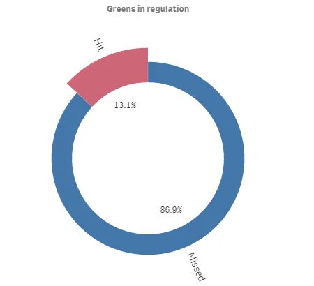
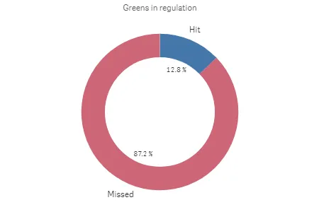
Greens in regulation in a donut chart
Greens in regulation in a donut chart with the average Stableford points determining slice radius