Gauge
The gauge is designed to show a single measure value and visualize how to interpret that value.
The gauge is often used to present KPIs, for example, on an executive dashboard, and together with segmenting and color coding, it is an effective way of illustrating a performance result.
Default settings for a gauge
The following settings are used by default in a gauge:
- A radial gauge
- A single (blue) color
- Range limits: min (0), max (100)
- No segments
- Label and title are displayed
Number of columns (dimensions and measures)
In a gauge, you can only have one measure and no dimensions.
Gauge types
Gauges can be displayed as a radial or as a bar. This is defined by the
gaugetype property.
"gaugetype": "radial"; // default"gaugetype": "bar";
Measure axis
Range limits
The default range limits are in most cases not usable: chances are your measure value is outside of the default limits, as indicated by an arrow at the max end or the min end.
"measureAxis": { "min": 0, "max": 100,}, // default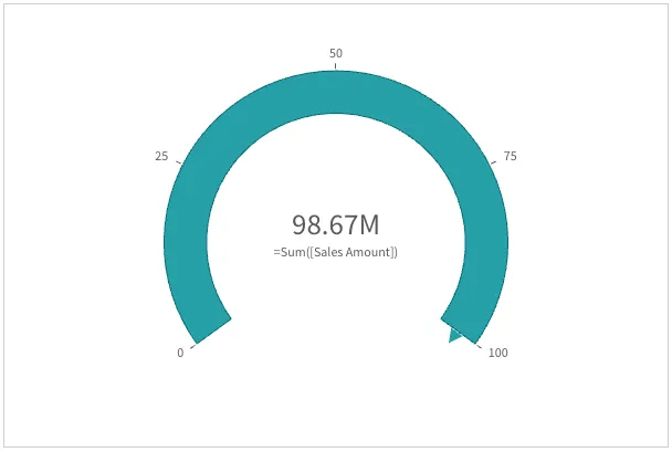
You should specify the range limits using relevant values or expressions to support the interpretation of the value.
"measureAxis": { "min": 0, "max": { "qValueExpression": { "qExpr": "Sum ([Sales Amount])*1.1", }, },},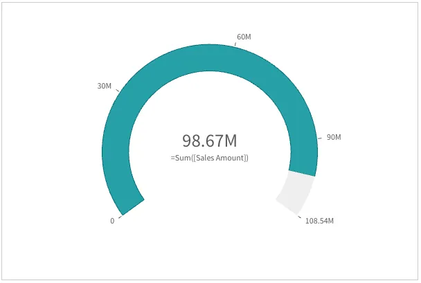
Labels and title
By default, both labels and tile of the measure axis are shown.
"measureAxis": { "show": "all", // default},
But you can show only labels ("labels"), only title ("title"),
or none of them ("none").
"measureAxis": { "show": "none",},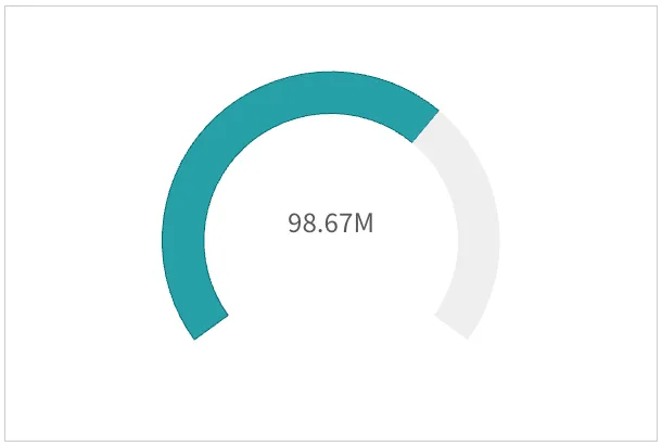
Spacing
The distance between ticks can be configured with
the "spacing" properties, with 1 being medium (default),
0.5 being narrow and 2 being wide.
"measureAxis": { "spacing": 1, // default},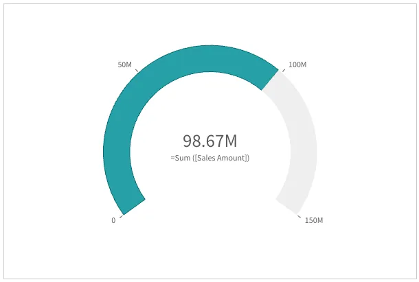
"measureAxis": { "spacing": 0.5, // narrow},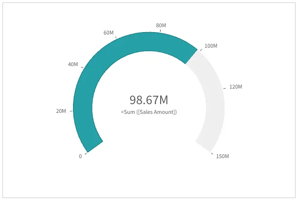
Bar gauge orientation
If autoOrientation is true, the bar is oriented along the longer side of the chart.
"autoOrientation": true; // default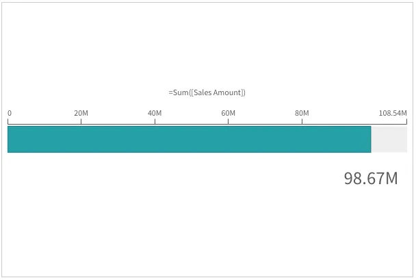
If autoOrientation is false, the orientation is dictated by the orientation property.
"autoOrientation": false;"orientation": "vertical",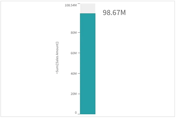
Coloring
There are several options to color a gauge, depending on your needs.
Progress
The simplest way to color a gauge is to only color the progress, that is the part of the gauge representing the value of interest.
By default, the master measure’s color is used. For it to work, you need to specify the ID of the master measure you want to get the color from.
"useSegments": false, // default"color": { "useBaseColors": "measure" }, // default"qHyperCubeDef": { "qMeasures": [{ "qLibraryId": "id-of-the-qMeasureInfo-in-your-app" }], "qInitialDataFetch": [{ "qWidth": 1, "qHeight": 1 }],},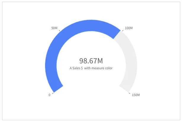
Progress color can also be specified explicitly in "paletteProgressColor"
"useSegments": false, // default"color": { "useBaseColors": "off" },"paletteProgressColor": { "color": "#aa347a" },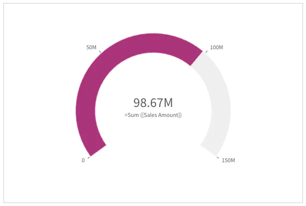
Segments
A gauge can also be colored with multiple segments, enabling visualizing additional information.
Similar to progress color, segments colors can be taken from a master measure, or can be specified explicitly. The first option is to use the segments from a master measure. The master measure has been configured (not shown here) with segments colors with red at the lowest 50% range, and green at the highest 50% range, and with gradient (that is gradual changing color).
"useSegments": true,"color": { "useBaseColors": "measure" }, // default"qHyperCubeDef": { "qMeasures": [{ "qLibraryId": "id-of-the-qMeasureInfo-in-your-app" }], "qInitialDataFetch": [{ "qWidth": 1, "qHeight": 1 }],},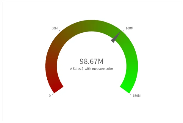
Segments colors can also be specified explicitly in "segmentInfo".
Note: in the example below, expressions are used for the limits,
but limits can simply be numbers (for example "value": 100).
"useSegments": true,"color": { "useBaseColors": "off" },"segmentInfo": { "limits": [ { "value": { "qValueExpression": { "qExpr": "Sum ([Sales Amount])*0.8" } }, "gradient": false }, { "value": { "qValueExpression": { "qExpr": "Sum ([Sales Amount])*1.2" } }, "gradient": false }, ], "paletteColors": [{ "color": "#ff3834" }, { "color": "yellow" }, { "color": "#20aa1a" }],},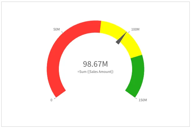
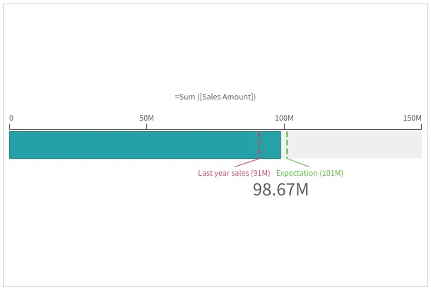
Reference lines
Reference lines, configured in the refLine property,
provide additional information to
help interpret the gauge value.
Below is an example of having two reference lines to help put the gauge value in context.
"refLine": { "refLines": [ { "show": true, // default "label": "Last year sales", "showLabel": true, // default "refLineExpr": { "value": 91000000, "label": "91000000" }, "showValue": true, // default "paletteColor": { "color": "#cc3c5b" }, "style": { "lineThickness": 2, "lineType": "8 4" }, }, { "label": "Expectation", "refLineExpr": { "value": 101000000, "label": "101000000" }, "paletteColor": { "color": "#49bd2b" }, "style": { "lineThickness": 2, "lineType": "8 4" }, }, ],},