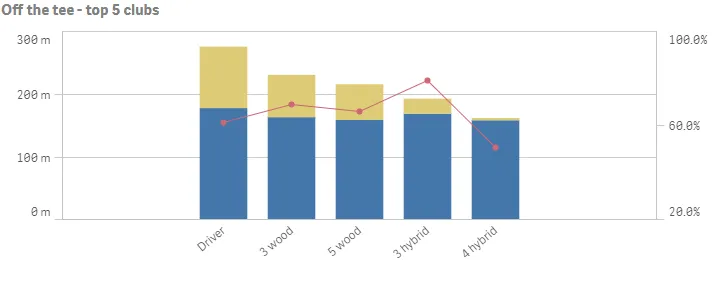
Combo chart
The combo chart is suitable for comparing two sets of measure values that are usually hard to compare because of the differences in scale.
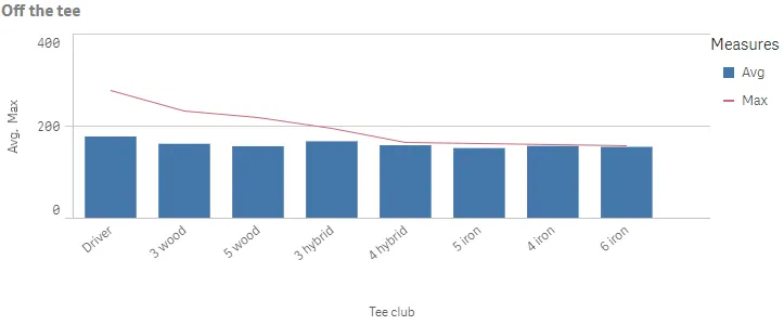
A typical example is when you have a bar chart with numeric values and want to combine these figures with values in percent. With a combo chart you can combine these values by, for example, using bars for the numeric values and a line for the values in percent. The two measures use the same dimension.
If you have yet another measure with values in a comparable range as the numeric values, you can add the third measure as bars and either stack or group the new measure values with the numeric values. With grouped bars, you can compare two or more items in the same categorical group. Stacked bars combine bars of different groups on top of each other and the total height of the resulting bar represents the combined result.
The combo chart can only be displayed vertically.
Number of columns (dimensions and measures)
In a combo chart, you need at least one dimension and one measure. You can only have one dimension but up to 15 measures.
Default settings for a combo chart
Most native Qlik Sense chart types are automatically sorted on the dimension content:
- Numeric content is numerically sorted.
- Categorical content is alphabetically sorted.
Out of range
You can set a range limit for the measure axis in the measureAxes object.
Without a limit, the range is automatically set to include the highest positive
and lowest negative value, but if you set a limit you may have values that
exceed that limit. A bar that exceeds the limit will be cut diagonally to show
that it is out of range. For a line data point value that is out of range, an
arrow indicates the direction of the value.
"measureAxes": [ { "show": "all", "dock": "near", "spacing": 0.5, "autoMinMax": false, "minMax": "minMax", "min": 150, "max": 200 }, { "show": "all", "dock": "far", "spacing": 1, "autoMinMax": false, "minMax": "minMax", "min": 0.05, "max": 0.65 }]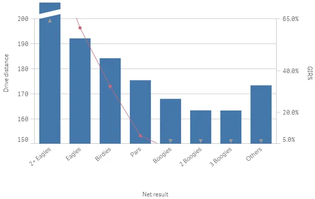
Bars, lines and markers
The series object resides inside each measure definition in the hypercube
(or column). It defines how to visualize the series (as a bar, line, or marker)
and also which y-axis to use, where 0 is the primary axis and 1 is the secondary
axis.
{ "qDef": { "qLabel": "Typical", "qDef": "Median(DrDist)", "series": { "type": "bar", "axis": 0 } }},{ "qDef": { "qLabel": "Max", "qDef": "Max(DrDist)", "series": { "type": "marker", "axis": 0, "marker": "diamond", "markerFill": true } }},{ "qDef": { "qLabel": "Avg", "qDef": "Avg(DrDist)", "series": { "type": "marker", "axis": 0, "marker": "line", "markerFill": true } }}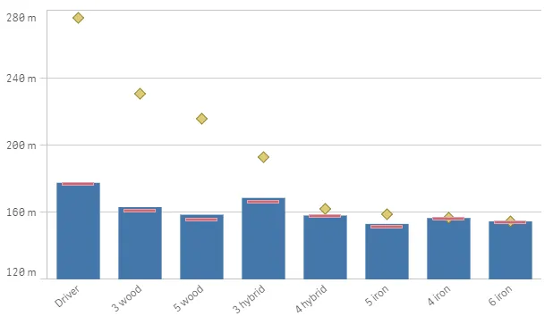
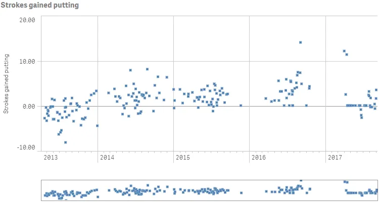
Time-aware charts
Time-aware charts are visualizations that use a continuous scale to provide a complete and accurate view of time-based data. That is, when you enable continuous scaling on the x-axis in a chart with date fields, data points are separated from each other by a distance relative to their associated time. As well, the axis labels are evenly separated whether or not there is data for that point and the chart view is compressed to avoid scrolling.
A continuous scale is most commonly used with date fields such as:
- Second
- Minute
- Hour
- Week
- Month
- YearMonth
- Quarter
- YearQuarter
- Year
- Date
- Timestamp