Text area properties
The text area definition property template can be used to add a custom property of text area type. When defining a text area property, the following fields can be used:
Definition properties
| Field | Description |
|---|---|
type | Should always be string for text area properties.Note The link effect is achieved by defining the component field to "textarea"; see below. |
component | Used for defining how the property is visualized in the property panel. Used to override the default component that comes with the type setting. This field is mandatory for a text area property and should always be "textarea". |
label | Used for defining the label of the item. |
rows | The amount of rows in the text area component. Default is 3. |
maxlength | Used for defining the maximum number of characters in the text. If undefined, maxLength will automatically be 512 characters. |
ref | Name or ID used to reference a property. |
defaultValue | Used for defining the default value of your custom property. |
show | Function returning true if property should be displayed. |
Example
Defining a custom text area
Defining a custom property of text area type can look like below.
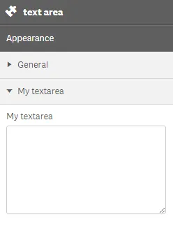
Example:
Note
Customization of properties always starts with items.
define( [], ( ) => { return { definition : { type : "items", component : "accordion", items: { settings: { uses: "settings", items: { MyTextarea: { label:"My textarea", component: "textarea", rows: 7,//the amount of rows in the textarea component (default is 3) maxlength: 100,//will not allow more than 100 characters ref: "myTextarea" } } } } }, paint: ($element, layout) => { //add your rendering code here $element.html( "props-textarea"+ layout.myTextarea ); } }; } );This is what it looks like in the property panel