Text properties
The text definition property template can be used to add a custom property of text type. When defining a text property, the following fields can be used:
Definition properties
| Field | Description |
|---|---|
type | This field is optional for links. Can be either string, integer, number, array, or boolean.Note The link effect is achieved by setting the component field to "text"; see below. |
component | Used for defining how the property is visualized in the property panel. Used to override the default component that comes with the type setting. This field is mandatory for a link property and should always be "text". |
label | Used for defining the label that is displayed on the link. |
Example
Defining a custom text
Defining a custom property of text type can look like below.
Example:
Note
Customization of properties always starts with items.
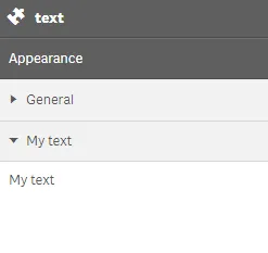
define( [], ( ) => { return { definition : { type : "items", component : "accordion", items: { settings: { uses: "settings", items: { MyText: { label:"My text", component: "text" } } } } }, paint: ($element) => { //add your rendering code here $element.html( "props-text" ); } }; } );This is what it looks like in the property panel