Switch properties
The switch definition property template can be used to add a custom property of switch type. When defining a switch property, the following fields can be used:
Definition properties
| Field | Description |
|---|---|
type | Used for all custom property type definitions. Can be either string, integer, number, array, or boolean.This field is mandatory and should always be "boolean" for a switch property type definition.Note The switch effect is achieved by setting the component field to "switch"; see below. |
component | Used for defining how the property is visualized in the property panel. Used to override the default component that comes with the type setting. This field is mandatory for a switch property and should always be "switch". |
label | Used for defining the label that is displayed in the property panel. |
ref | Name or ID used to reference a property. |
defaultValue | Used for defining the default value of your custom property. |
options | Array of options. Can be value and label.Example: options: [{value: "v",label: "Vertical"}, {value: "h",label: "Horizontal"}], |
Examples
Defining a custom property of switch type can look like below.
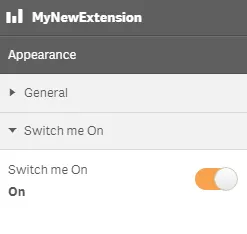
Example: Add custom switch property to Appearance accordion
Note
Customization of properties always starts with items.
return { type: "items", component: "accordion", items: { settings: { uses: "settings", items: { MySwitchProp: { type: "boolean", component: "switch", label: "Switch me On", ref: "myproperties.border", options: [{ value: true, label: "On" }, { value: false, label: "Not On" }], defaultValue: true } } }This is what it looks like in the property panel
You can also define a new accordion item as a switch property.
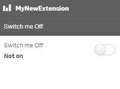
Example: Add custom switch property as a new accordion item
return { type: "items", component: "accordion", items: { MyAccordion: { type: "boolean", component: "switch", label: "Switch me Off", ref: "myproperties.border", options: [{ value: true, label: "On" }, { value: false, label: "Not on" }], defaultValue: false }This is what it looks like in the property panel