Range-slider properties
The range-slider definition property template can be used to add a custom property of range-slider type. When defining a range-slider property, the following fields can be used:
Definition properties
| Field | Description |
|---|---|
type | Used for all custom property type definitions. Can be either string, integer, number, array, or boolean.This field is mandatory and should always be “array” for a range-slider property type definition. Note The range-slider effect is achieved by setting the component field to "slider"; see below. |
component | Used for defining how the property is visualized in the property panel. Used to override the default component that comes with the type setting. This field is mandatory for a slider property and should always be "slider". |
label | Used for defining the label that is displayed in the property panel. |
ref | Name or ID used to reference a property. |
defaultValue | Used for defining the default value of your custom property. Since you are defining a range of numbers, two default values need to be defined in the following format: defaultValue: [n1, n2] |
min | Used for defining the minimum value of the property. |
max | Used for defining the maximum value of the property. |
step | Used for defining the step value of the property. |
Examples
Defining a custom property of range slider type can look like below.
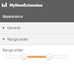
Example: Add custom range slider property to Appearance accordion
Note
Customization of properties always starts with items.
return { type: "items", component: "accordion", items: { settings: { uses: "settings", items: { MyRangeSliderProp: { type: "array", component: "slider", label: "Range slider", ref: "myproperties.range", min: 10, max: 20, step: 0.5, defaultValue: [13, 17] } } }This is what it looks like in the property panel:
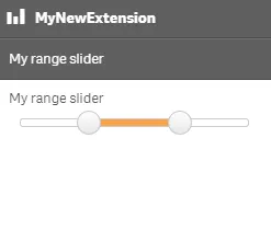
You can also define a new accordion item as a range slider property.
Example: Add custom range slider property as a new accordion item
return { type: "items", component: "accordion", items: { MyAccordion: { type: "array", component: "slider", label: "My range slider", ref: "myproperties.range", min: 10, max: 20, step: 0.5, defaultValue: [13, 17] }This is what it looks like with the range slider property defined as an accordion item in the property panel: