Media properties
Note
This feature is considered experimental and may be subject to change or be removed in future releases.
The media definition property template can be used to add a custom property of media type. When defining a media property, the following fields can be used:
Definition properties
| Field | Description |
|---|---|
type | This field is mandatory for media. Can be either string, integer, number, array, or boolean.Should always be defined as string for media items.Note The media effect is achieved by setting the component field to "media"; see below. |
label | Used for defining the label of the item. |
component | Used for defining how the property is visualized in the property panel. Used to override the default component that comes with the type setting. This field is mandatory for a link property and should always be "media". |
ref | Name or ID used to reference a property. |
layoutRef | Name or Id used to reference the layout. Note Adding media from the In app media library is not supported. |
Example
Defining a custom media property
Defining a custom property of media type can look like below.
Example:
Note
Customization of properties always starts with items.
define( [],( ) => {  return {    definition : {      type : "items",      component : "accordion",      items: {        settings: {          uses: "settings",            items: {              MyMedia: {                label:"My media",                component: "media",                ref: "myMedia",                layoutRef: "myMedia",                type: "string"              }            }        }      }    },    paint: ($element, layout) => {      //add your rendering code here      $element.css("background-size","cover");      $element.css("background","url("+layout.myMedia+") no-repeat left top fixed");      $element.html( "props-media "+layout.myMedia );    }  };
} );
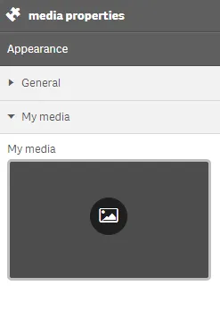
This is what it looks like in the property panel

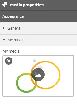
This is what it may look like after selecting to display an image

And this is what the visualization itself may look like after selecting to display an image
