Color-picker properties
Note
This feature is considered experimental and may be subject to change or be removed in future releases.
The color-picker definition property template can be used to add a custom color-picker property. When defining a color-picker property, the following fields can be used:
Definition properties
| Field | Description |
|---|---|
type | This field is mandatory and should always be “integer” or “object” for a color-picker property type definition. Defining type: "object" allows usage of custom colors from outside the standard palette and it also supports custom theme palettes.Note The color-picker effect is achieved by defining the component field to color-picker; see below. |
component | Used for defining how the property is visualized in the property panel. Used to override the default component that comes with the type setting. This field is mandatory for a color-picker property and should always be color-picker. |
ref | Name or ID used to reference a property. |
defaultValue | Used for defining the default value of your custom property. |
label | Used for defining the label of the item. |
Examples
Defining a color-picker as an integer
Defining a custom property of color-picker type can look like below when defined as an integer.
Note
Customization of properties always starts with items.
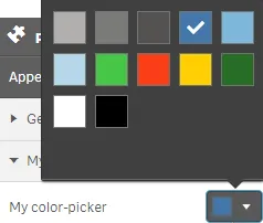
define( [], ( ) => { const palette = [ "#b0afae", "#7b7a78", "#545352", "#4477aa", "#7db8da", "#b6d7ea", "#46c646", "#f93f17", "#ffcf02", "#276e27", "#ffffff", "#000000" ]; return { definition : { type : "items", component : "accordion", items: { settings: { uses: "settings", items: { MyColorPicker: { label:"My color-picker", component: "color-picker", ref: "myColor", type: "integer", defaultValue: 3 } } } } }, paint: ($element, layout) => { //add your rendering code here $element.css("background-color", palette[layout.myColor]); } };} );This is what it looks like in the property panel

Defining a color-picker as an object
Defining a custom property of color-picker type can look like below when defined as an object.
Note
Customization of properties always starts with items.
define( [], ( ) => { return { definition : { type : "items", component : "accordion", items: { settings: { uses: "settings", items: { MyColorPicker: { label:"My color-picker", component: "color-picker", ref: "myColor", type: "object", defaultValue: { color: "ff5866", index: "-1" } } } } } }, paint: ($element, layout) => { //add your rendering code here $element.css("background-color", layout.myColor.color); } };} );This is what it looks like in the property panel
