Checkbox properties
The checkbox definition property template can be used to add a custom property of checkbox type. When defining a checkbox property, the following fields can be used:
Definition properties
| Field | Description |
|---|---|
type | Used for all custom property type definitions. Can be either string, integer, number, array, or boolean.This field is mandatory and should always be boolean for a checkbox property type definition. |
label | Used for defining the label that is displayed in the property panel. |
ref | Name or ID used to reference a property. |
defaultValue | Used for defining the default value of your custom property. |
Examples
Defining a custom property of checkbox type can look like below.
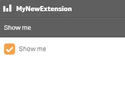
Example: Add custom checkbox property to Appearance accordion
Note
Customization of properties always starts with items.
define( [],  ( ) => {
    return {      definition: {        type: "items",        component: "accordion",        items: {          settings: {            uses: "settings",            items: {              MyCheckProp: {                type: "boolean",                label: "Show me",                ref: "myproperties.show",                defaultValue: true              }            }          }        }      }   };} );
This is what it looks like in the property panel
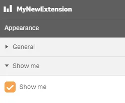
You can also define a new accordion item as a checkbox property.
Example: Add custom checkbox property as a new accordion item
define( [],  ( ) => {
  return {    definition : {      type: "items",      component: "accordion",      items: {        MyAccordion: {          type: "boolean",            label: "Show me",            ref: "myproperties.show",            defaultValue: true        }      }    }  };} );
This is what it looks like in the property panel