Button properties
The button definition property template can be used to add a custom property of button type. When defining a button property, the following fields can be used:
Definition properties
| Field | Description |
|---|---|
type | This field is optional for buttons. Can be either string, integer, number, array, or boolean. Note The button effect is achieved by setting the component field to button; see below. |
component | Used for defining how the property is visualized in the property panel. Used to override the default component that comes with the type setting. This field is mandatory for a button property and should always be button. |
label | Used for defining the label that is displayed on the button. |
ref | Name or ID used to reference a property. |
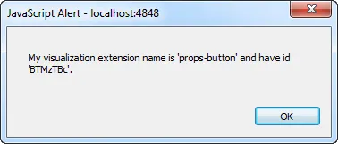
action | Used for defining the action when clicking the button. Example: action: (data)=>{//add your button action herealert("My visualization extension name is" +data.visualizationand has id '"+data.qInfo.qId+"'.");} |
Example
Defining a custom button
Defining a custom property of button type can look like below.
Example:
Note
Customization of properties always starts with items.
define( [], ( ) => {
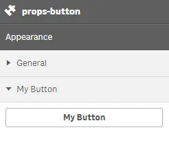
return { initialProperties : { qHyperCubeDef : { qDimensions : [], qMeasures : [], qInitialDataFetch : [{ qWidth : 10, qHeight : 50 }] } }, definition : { type : "items", component : "accordion", items: { settings: { uses: "settings", items: { MyButton: { label:"My Button", component: "button", action: (data) => { //add your button action here alert("My visualization extension name is '"+data.visualization+"' and have id '"+data.qInfo.qId+"'."); } } } } } } };} );This is what it looks like in the property panel
And this is what you receive back when clicking the button