Button group properties
The button group definition property template can be used to add a custom property of radio button type. When defining a button group property, the following fields can be used:
Definition properties
| Field | Description |
|---|---|
type | Used for all custom property type definitions. Can be either string, integer, number, array, or boolean. This field is mandatory and should always be “string” for a button group property type definition. Note The button effect is achieved by setting the component field to buttongroup; see below. |
component | Used for defining how the property is visualized in the property panel. Used to override the default component that comes with the type setting. This field is mandatory for a radio button property and should always be buttongroup. |
label | Used for defining the label that is displayed in the property panel. |
ref | Name or ID used to reference a property. |
defaultValue | Used for defining the default value of your custom property. |
options | Array of options to use for dropdown, radiobuttons, buttongroup, or switch components. For buttongroup, it can be value, label, and tooltip.Example options: [{value: "v",label: "Vertical",tooltip: "Select for vertical"},{value: "h",label: "Horizontal",tooltip: "Select for horizontal"}], |
Examples
Fetching options from an external resource
This example is using jQuery. Make sure to have jQuery included as a require-dependency.
return { type: "items", component: "accordion", items: { settings: { uses: "settings", items: { MyDropdownProp: { type: "string", component: "dropdown", label: "Data source", ref: "myproperties.datasource", options: () => { return $.get("datasource.php").then((items) => { return items.map((item) => { return { value:item.toLowerCase(), label:item }; }); }); }Options will be fetched every time a property is changed. To avoid repeating reloads, cache the result from the web service.
Defining a custom button group
Defining a custom property of button group type can look like below.
Example: Add custom button group property to Appearance accordion
Customization of properties always starts with items.
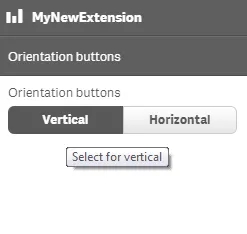
define( [], ( ) => { return { definition: { type: "items", component: "accordion", items: { settings: { uses: "settings", items: { MyButtongroupProp: { type: "string", component: "buttongroup", label: "Orientation buttons", ref: "myproperties.orientation", options: [{ value: "v", label: "Vertical", tooltip: "Select for vertical" }, { value: "h", label: "Horizontal", tooltip: "Select for horizontal" }], defaultValue: "v" } } } } } }});This is what it looks like in the property panel
You can also define a new accordion item as a button group property.
Example: Add custom button group property as a new accordion item
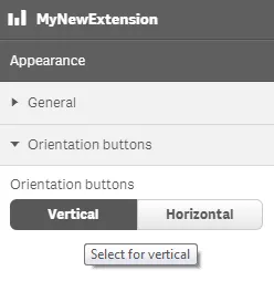
define( [], ( ) => { return { definition: { type: "items", component: "accordion", items: { MyButtongroupProp: { type: "string", component: "buttongroup", label: "Orientation buttons", ref: "myproperties.orientation", options: [{ value: "v", label: "Vertical", tooltip: "Select for vertical" }, { value: "h", label: "Horizontal", tooltip: "Select for horizontal" }], defaultValue: "v" } } } }});This is what it looks like in the property panel