Layout
The dock layout is the engine that controls how different components are positioned and whether a component is rendered or not, depending on available space, that is, the responsiveness.
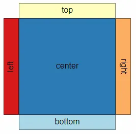
There are 5 different layout areas, with the center area being the primary
one. It is typically where the visual components are positioned. On each side
of the center area, there is another area on which a component can be
positioned (docked). They are referred to as top, bottom, left and right.

Most components should handle any of the 5 different areas, but it may make more sense for certain components to be primarily either in the center or at the sides.
Scaling
Size (physical size)
The default physical size is equal to that of the container (element) for the chart.
By explicitly setting a size, it is possible to override both width and height of the container. Either width or height, or both can be specified.
The input value is specified as a number and represents the size in pixels.
Example:
strategy: { size: { width: 100, height: 100 }}Logical size
Logical size represents the size given to the dock layout to work with. If the logical size is different than the physical size (size of the container or the size property), then scaling is applied to the components to fit into the physical size.
The default logical size is equal to the physical size.
The input value is specified as a number and represents the size in pixels.
Example:
strategy: { logicalSize: { width: 150, height: 150, preserveAspectRatio: false, align: 0.5 }}Responsiveness
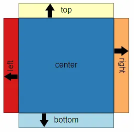
Each component can tell the layout engine that they require a certain amount of
space, where the direction of the space required is the perpendicular axis of
the dock area, given that left/ right area has a main axis of Y and
top/bottom main axis is X.
The arrow demonstrates the direction in which a component requests space for each dock area. Note that components docked in the center area have no impact on the space available, which is instead determined by the amount of space occupied by components docked at the sides.

The responsive engine has two ways to determine if a component should be rendered or not. The first way is to compare the space required by a component to the logical space available. If not enough space is available, the component is discarded and the engine moves on to process the next component. The second way is to define a minimum layout mode, this is currently the only way to discard a component docked in the center area.
Limiting space required by the center area
Each of the side areas can take a certain amount of space from the center area. If there is not enough space available for the center area, either in vertical or horizontal direction, the layout engine must remove one or more of the components docked at the side.
It is possible to control the amount of space required by the center area with
properties. By setting minWidthRatio and/or minHeightRatio to a value
between 0 and 1, the available size is set as a ratio of the logical size. With
1 meaning all logical size goes to the center area, as such no components docked
at the side are rendered. 0 means that components docked at the side take as
much space as needed from the center area.
When configured with either minWidth/minHeight or minWidthRatio/minHeightRatio,
the minimum required space of the center area is set to that size. However the
center area can never be larger than logical size and clamps to the logical size.
If minWidth and minWidthRatio are set, the absolute size from minWidth
has precedence over minWidthRatio.
Example:
strategy: { center: { minWidthRatio: 0.5, minHeightRatio: 0.5, minWidth: 10, minHeight: 10 }}Minimum layout mode
The minimum layout mode is a way to tell the layout engine that a component should be discarded if the logical size is below a certain threshold in width or height.
Example:
strategy: {  layoutModes: {    S: { width: 150, height: 150 }    L: { width: 300, height: 300 }  }}
// in the component definition{  type: 'my-component',  minimumLayoutMode: 'S',  settings...}
Component instance configuration
The following dock properties are available in the component definition:
showboolean. True if component should be rendered.layoutobject. Layout settingslayout.dockstring. Dock setting. Any oftop|right|bottom|leftlayout.displayOrdernumber. The order in which components are rendered (similar to CSS z-index).layout.prioOrdernumber. The order in which components are docked from the center area.layout.minimumLayoutModestring.
Example:
components: [ { type: "my-component", layout: { show: true, dock: "left", displayOrder: 0, prioOrder: 0, minimumLayoutMode: "S", }, },]; Working with displayOrder
The displayOrder property is used by the layout engine to lay out components.
Components are interpreted in the ascending order of the displayOrder value.
The layout engine applies the value in two ways: the first is the order in which
components are rendered, and the second is the area components are laid out in
when they have a direction, that is, docked to either top, bottom, left, or right.
If docked at the same area, the component with a higher displayOrder is
rendered on top of the component with a lower displayOrder. It can be seen as
defining a z-index. A lower displayOrder also means that a component is
laid out first in a given direction, that is, laid out closer to the central
area (non-directional area) than a component with a higher displayOrder.
It can, in this case, be seen as the x-index or y-index.
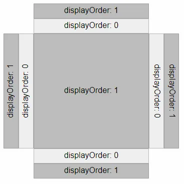
In the example below, all docking areas have two components with a displayOrder
of 0 and 1. Notice how the center area only displays the component with
displayOrder 1, which is the z-index in action.

Working with prioOrder
The prioOrder property is used to define the order in which components are
added to the layout engine; this is done before any components are laid out.
When there is not enough space to add any more components to a given area,
all components not already added are then discarded. The value of prioOrder
is in ascending order, such that a lower value is added to the layout engine first.
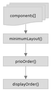
Component flowchart
The following diagram shows the order in which components flow through the layout engine.
