Pie
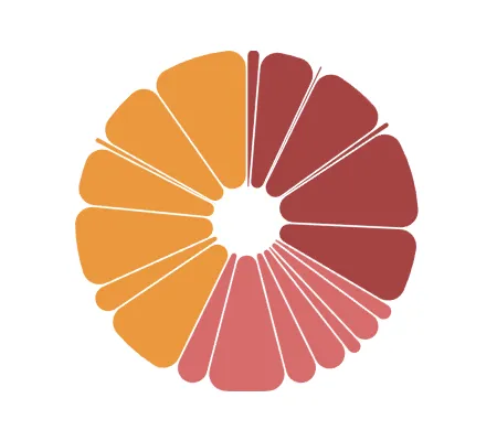
The pie component renders pie slices in a designated area.
Get started
Here is an example of a pie chart.
components: [ { key: "p", type: "pie", data: { extract: { field: "Year", props: { num: { field: "Sales" }, }, }, }, settings: { padAngle: 0.01, slice: { arc: { ref: "num" }, outerRadius: 1, innerRadius: 0.2, cornerRadius: 10, fill: { scale: "c" }, offset: 0, }, }, },];
Requirements
The data object is required for the pie component to work.
{ type: 'pie', data: { extract: { field: 'Products', props: { num: { field: 'Sales' } }, } },}Visual properties
The visual properties are defined in settings.
startAngle is an optional setting that lets you decide where the circle
should start.
endAngle is an optional setting that lets you decide where the circle
should end.
These two settings take in radiuses on the unit circle and move counter-clock
wise from the positive x-axis.
padAngle is an optional setting that sets how wide the padding between the
slices should be.
arc #TODO
outerRadius is an optional setting that sets how big the full circle should
be, innerRadius sets how big the hole in the center should be, cornerRadius
sets how rounded you want the corners to be.
opacity is an optional setting that sets the opacity and takes in a number
between 1 and 0.
offset is an optional setting that pushes out a slice and takes in a number
between 1 and 0. If no specific slice is declared, all slices get pushed out
from the center.
fill is an optional setting that sets the color of the slices.
strokeWidth is an optional setting that sets a border around a slice.
stroke sets the color of the border.

{  type: 'pie',  data: {...}  settings: {    //startAngle: Math.PI / 2,    //endAngle: 3,    padAngle: 0.01,    slice: {      arc: { ref: 'num' },      outerRadius: 0.8,      innerRadius: 0.2,      cornerRadius: 2,      opacity: 0.8,      offset: (e, ix) => {        return ix === 3 ? 0.1 : 0;      },      fill: '#6a6',      strokeWidth: (e, ix) => {        return ix === 3 ? 2 : 0;      },      stroke: '#333'    }  }
}
API Reference
For more information, see the API reference.