Labels
A component that renders labels based on the visual output of other components.
Since this component depends on other referenced components, it is important
that the displayOrder of this component is set to a larger value than all of
the referenced components.
Strategies
bars
A strategy used primarily for labeling the rectangles in a bar chart, histogram, waterfall, or similar.
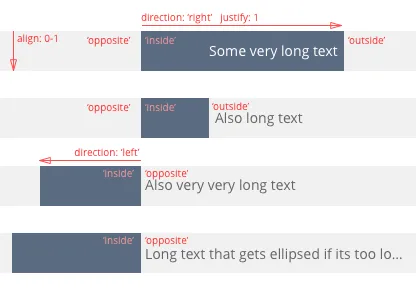
This strategy is based on the direction of a bar ('up', 'down', 'right',
'left'), which is used to find three possible positions for a label:
'inside', 'outside', 'opposite'. Which position fits best for any given
label depends on the measured size of the label, and the boundaries of the
different positions.

In this image, the order of label placements is ['inside', 'outside', 'opposite'], that is, the label is placed inside
the bar if it fits, then outside and finally on the opposite side of the bar’s direction. If the entire label doesn’t
fit in any of those places, it is placed inside the largest rectangle of the three. The label is then justified,
aligned, and ellipsed if necessary.
bars example
components: [ { type: "box", key: "bars", layout: { displayOrder: 1, }, /* ... */ }, { type: "labels", layout: { displayOrder: 2, // must be larger than the displayOrder for the 'bars' component }, settings: { sources: [ { component: "bars", selector: "rect", // select all 'rect' shapes from the 'bars' component strategy: { type: "bar", // the strategy type settings: { direction: function ({ data }) { // data argument is the data bound to the shape in the referenced component return data && data.end.value > data.start.value ? "up" : "down"; }, fontFamily: "Helvetica", fontSize: 14, align: 0.5, justify: 1, labels: [ { label({ data }) { return data ? data.end.label : ""; }, placements: [ // label placements in prio order. Label will be placed in the first place it fits into { position: "inside", fill: "#fff" }, { position: "outside", fill: "#666" }, ], }, ], }, }, }, ], }, },]; slices
A strategy used primarily for labelling the slices in a pie chart, donut chart or similar.
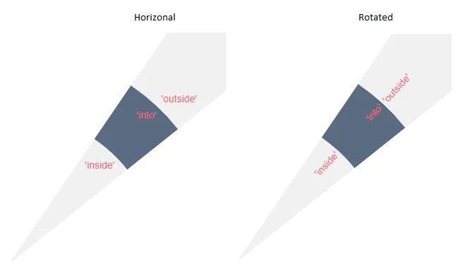
There are three possible positions ‘inside’, ‘into’ and ‘outside’. The default is ‘into’ and ‘inside’ is only usable in donut chart.
There are also two different directions ‘horizontal’ and ‘rotated’. ‘horizontal’ is the default and has the disadvantage that is for ‘inside’ and ‘outside’ positions if the entire label doesn’t fit is not shown. ‘rotated’ place the label along the slice either from the inside out or outside in depending on the angle. And it does support ellipsing labels that don’t fit.

slices example
components: [ { type: "pie", key: "myPie", layout: { displayOrder: 1, }, /* ... */ }, { type: "labels", layout: { displayOrder: 2, // must be larger than the displayOrder for the 'pie' component }, settings: { sources: [ { component: "myPie", selector: "path", // select all 'path' shapes from the 'pie' component strategy: { type: "slice", // the strategy type settings: { direction: "horizontal", fontFamily: "Helvetica", fontSize: 14, labels: [ { label({ data }) { // dimension label return data ? data.label : ""; }, placements: [ { position: "info", fill: ({ data }) => { return "#333"; }, // select a color contrasting the containing slice }, ], }, { // data label label({ data }) { return data ? data.arc.label : ""; }, placements: [{ position: "inside", fill: "#fff" }], }, ], }, }, }, ], }, },]; rows
A strategy used to place multiple rows of text (that can be styled differently) in a shape.
Currently it supports shapes of type ‘rect’ and ‘circle’. As a special case it detects 360-degree pie slices are treated as circles.
Use align, justify & padding to control the placement labels in the shape. The text is ellipsed if necessary.
rows example
components: [ { type: "rows", key: "rects", layout: { displayOrder: 1, }, /* ... */ }, { type: "labels", layout: { displayOrder: 2, // must be larger than the displayOrder for the 'rects' component }, settings: { sources: [ { component: "rects", selector: "rect", // select all 'rect' shapes from the 'rects' strategy: { type: "rows", // the strategy type settings: { fontFamily: "Helvetica", fontSize: 14, fill: ({ data }) => { return "#333"; }, // select a color contrasting the containing shape padding: 4, justify: 0.5, align: 0.5, labels: [ { fontSize: 24, // change this label to a larger font size label({ data }) { // dimension label return data ? data.label : ""; }, }, { // data label label({ data }) { return data ? data.value.label : ""; }, }, ], }, }, }, ], }, },];
API Reference
For more information, see the API reference.