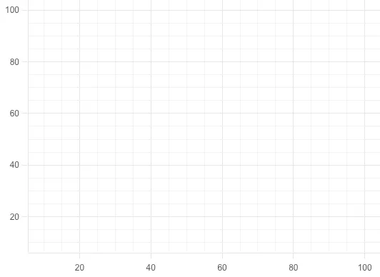
Grid line
Grid line component contains lines that cross the chart plot to show axis divisions. It helps viewers of the chart see what value is represented by an unlabeled data point. Especially for large or complicated charts, grid line component gives valuable cues to the viewer.

Basic grid line
The grid line as a component is easy to set up. To get started, the following is sufficient:
{ type: 'grid-line', x: { scale: 'x' }, y: { scale: 'y' }}As long as you specify the same scale for the axis and grid-line components,
the minorTicks and ticks in axis component are synced with the minorTicks and
ticks in grid line component.
This works fine for a scatter plot or other chart with two linear scales. You do not have to specify both the X and Y axis in case you are drawing, for example, a box plot or distribution chart.
Ticks configuration example
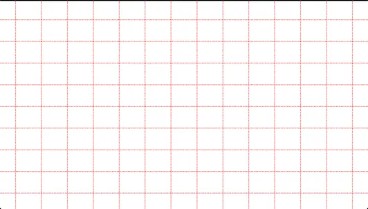
{ type: 'grid-line', x: { scale: 'x' }, y: { scale: 'y' }, ticks: { show: true, stroke: 'red', strokeWidth: 5, strokeDasharray: '3, 3' }, minorTicks: { show: false, stroke: 'blue', strokeWidth: 1 }}
In this example, both X and Y scales are showing major ticks as a red, 5px line with 3px dashes with 3px gaps. The settings for minor ticks are a blue, 1px line. However, since the minor ticks have the variable show set to false, they are not rendered. They may still be rendered on the axis if you have enabled them there.
Scales
It is worth mentioning that grid line is dependent on scales (and not at all on data configuration) and making changes to them does affect the grid lines.
API Reference
For more information, see the API reference.