Axis
Data and scales
The axis component doesn’t take any data as input directly, instead the data is implicitly fetched from the referenced scale.
From the scale, which is either discrete or continuous, an axis is constructed.
Discrete
Continuous
Layout
There are two directions in which the axis can be laid out, either horizontal or vertical. Depending on direction, different labeling modes are available.
A vertical axis is limited to only horizontal labels. While a horizontal axis have the option to show horizontal labels on two rows or show vertical labels tilted at an angle.
Tilted labels
Tilted labels are only supported on a discrete axis. When the mode property
is set to auto, labels are tilted when there is not enough space available.
{ type: 'axis', scale: 'myDiscreteScale', layout: { dock: 'bottom' }, settings: { labels: { mode: 'tilted', tiltAngle: 35 } }}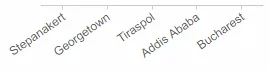
Layered labels
Layered labels are only supported on a discrete axis.
{ type: 'axis', scale: 'myDiscreteScale', layout: { dock: 'bottom' }, settings: { labels: { mode: 'layered' } }}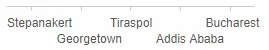
Using maxGlyphCount
The maxGlyphCount property is used to measure the largest possible size of a
label. The size of a label primarily affects two things: first, when
determining the required size to render an axis (this can also be limited via the
maxLengthPx property), and second, when the mode is set to auto, it is
used to calculate the threshold for switching between horizontal and tilted
labels.
Under the hood, maxGlyphCount is a multiplier on the size of the character
M, as measured using the fontSize and fontFamily.
{ type: 'axis', scale: 'myDiscreteScale', settings: { labels: { mode: 'auto', maxGlyphCount: 20 } }}Using paddingStart
The paddingStart property adds padding to the opposite side of where the axis
is docked (or aligned when using dock: center). It can be specified as
either a number or a function (does not receive any parameters).
Specified as a number, in this case 100px padding is added the right side
of the axis:
{ type: 'axis', scale: 'myScale', dock: 'left', settings: { paddingStart: 100, }}In this example, a function is used to move the axis next to a specific element (for example useful when adding one axis per bar in a bar chart):
{ type: 'axis', scale: 'myScale', dock: 'center', settings: { align: 'left', paddingStart: () => { // Move the axis next to a specific element const label = 'A value on the major axis'; const majorScale = chart.scale('myMajorScale'); return chartWidth * (majorScale(label) + majorScale.bandwidth()); } }}Using paddingEnd
The paddingEnd property can be used in the same way as paddingStart. If not
specified it defaults to 10. It adds padding to the same side as the axis
is docked (or aligned when using dock: center).
Formatting
Label formatting is derived from the scale and the data itself. But as with any
component, it is possible to reference a custom formatter using
the formatter property.
Custom formatting
{ type: 'axis', formatter: { formatter: 'd3', // The type of formatter to use type: 'number', // The type of data to format format: '-1.0%' // Format pattern }}Interaction
On a discrete axis it possible to configure the axis to consume and trigger brush events.
{ type: 'axis', scale: 'myDiscreteScale', brush: { trigger: [{ on: 'tap', contexts: ['highlight'] }], consume: [{ context: 'highlight', style: { inactive: { opacity: 0.3 } } }] }}For a continuous axis there is no direct way to configure interactions, instead it is done via other components, such as the brush-range or brush-area component.
API Reference
For more information, see the API reference.