Basic styling of apps using custom themes
These examples show how to apply basic styling to your apps using custom themes. All properties referenced in the examples below are described in detail in Custom theme JSON properties.
Defining variables
A variable is a symbolic name associated with a value and whose associated value
may be changed. They are defined in the _variables property and the variable
names must be prefixed with @.
Colors should be defined using hexadecimal values.
"_variables" : { "@grayscale-100" : "#FFFFFF", "@grayscale-98" : "#FBFBFB", "@grayscale-95" : "#F2F2F2", "@grayscale-90" : "#E6E6E6", "@grayscale-85" : "#D9D9D9", "@grayscale-80" : "#CCCCCC", "@grayscale-75" : "#BFBFBF", "@grayscale-70" : "#B3B3B3", "@grayscale-65" : "#A6A6A6", "@grayscale-60" : "#999999", "@grayscale-55" : "#8C8C8C", "@grayscale-50" : "#808080", "@grayscale-45" : "#737373", "@grayscale-40" : "#666666", "@grayscale-35" : "#595959", "@grayscale-30" : "#4D4D4D", "@grayscale-28" : "#474747", "@grayscale-25" : "#404040", "@grayscale-20" : "#333333", "@grayscale-15" : "#262626", "@grayscale-10" : "#1A1A1A", "@grayscale-5" : "#0D0D0D", "@grayscale-0" : "#000000", "@text" : "13px"}Setting the basic font color
The top-level color property controls all font colors in the app. If you define
the color property on a lower level, for example for object titles, subtitles,
and footnotes, these will override the top-level color definition.
"color": "@grayscale-20",Setting the general font size
The top-level fontSize property controls the font size in the app. If you
define the fontSize property on a lower level, for example for object titles,
subtitles and footnotes, these will override the top level fontSize definition.
"fontSize": "@text",Defining the background color of sheet titles
The top-level sheet property controls the background color of the sheet title. This property holds the following definitions:
Sheet title background color definitions
| Property | Description |
|---|---|
| titleBackgroundColor | This property defines the background color of the sheet title. |
| titleBackgroundGradientColor | This property defines the color of the gradient within the sheet title. |
"sheet": { "title": { "private":{ "titleBackgroundColor":"#ff0000", "titleBackgroundGradientColor":"#ffffff" }, "approved":{ "titleBackgroundColor":"#00ff00", "titleBackgroundGradientColor":"#000000" }, "published":{ "titleBackgroundColor":"#0000ff", "titleBackgroundGradientColor":"#ff0000" } } }Defining the background color of the visualizations
The top level backgroundColor property controls the background color of all
visualizations in the app. If you define the backgroundColor property on a
lower level, for example on a specific chart type, this will override the
top level backgroundColor definition.
"backgroundColor": "@grayscale-95",Defining the data colors
The top-level dataColors object holds the following color definitions:
Color definitions
| Property | Description |
|---|---|
| primaryColor | Primary data color definition. This is the default color for data in the charts when you use auto colors. |
| othersColor | Color definition for Others group values. The Others label may be displayed when you set a limit for a dimension in a visualization. |
| nullColor | Color definition for null values. |
| selected | Color property for selected values. This property appears in the selection bar and all listboxes. It also appears when making selections in the Straight table and Pivot table charts in the Visualization bundle. |
| alternative | Color property for alternative values. This property appears in the selection bar and all listboxes. |
| excluded | Color property for excluded values. This property appears in the selection bar and all listboxes. |
| selectedExcluded | Color property for selected excluded values. This property appears in the selection bar and all listboxes. |
| possible | Color property for possible values. This property appears in the selection bar and all listboxes. |
Example - bar chart colors
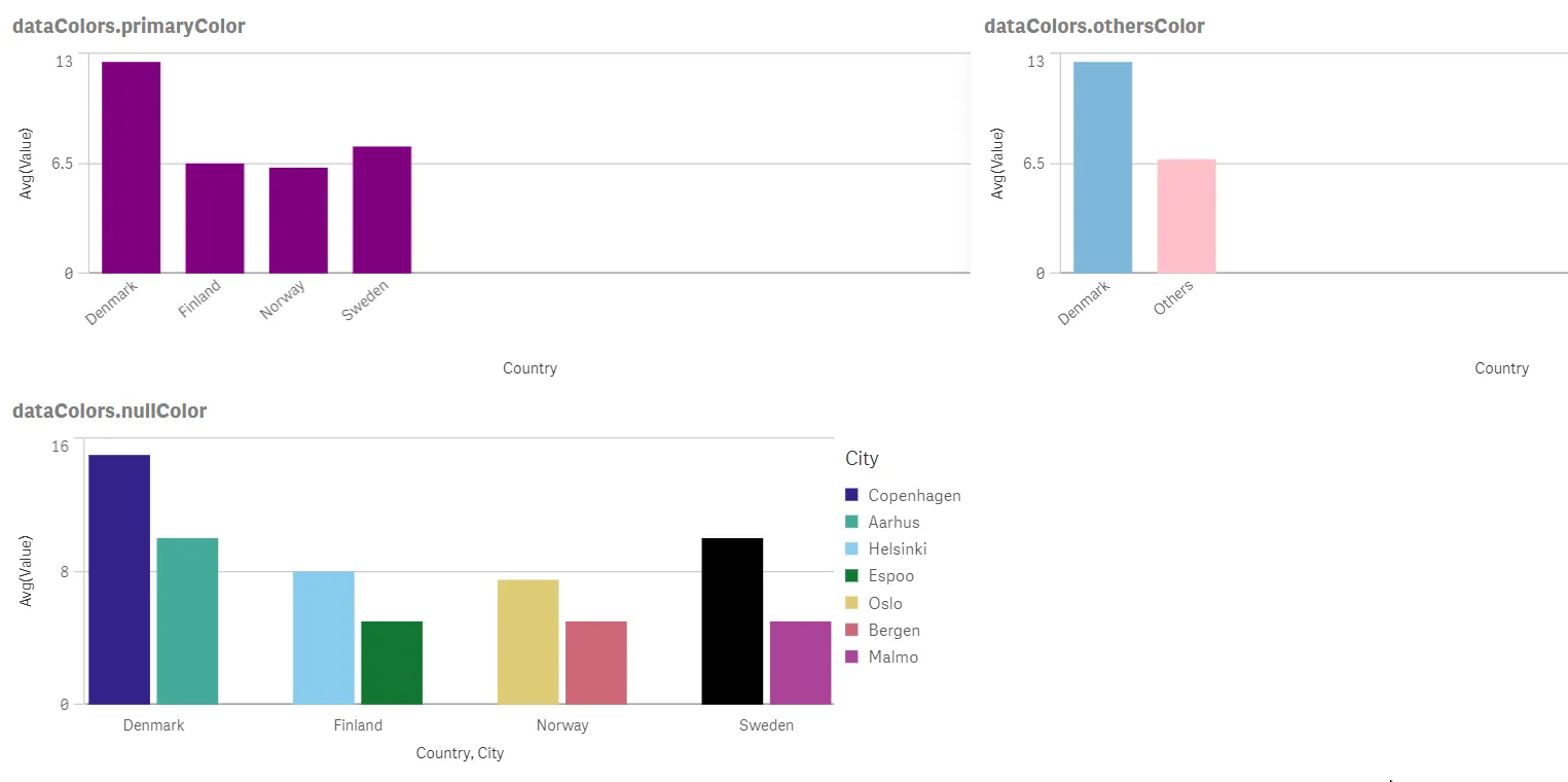
{ "_inherit": true, "dataColors": { "primaryColor": "purple", "othersColor": "pink", "nullColor": "black" }}The following image shows an example of bar charts using custom values for the
dataColors object based on the preceding color settings. Here are details about
how the dataColors properties are used in each of the charts.
- The dataColors.primaryColor chart has only one dimension and the Colors property
has been set to Auto. As a result, all the bars show the color set for the
primaryColorproperty. - The dataColors.othersColor chart highlights the
othersColorproperty, which is showing a pink color. The Others bar is an indication that there are other countries listed in the data but the chart has been limited to show only two bars. - The dataColors.nullColor chart highlights the
nullColorproperty. In this case, the country Sweden is missing a city value in the data, which causes the associated bar to show a black color for a null value.
Example - app selections
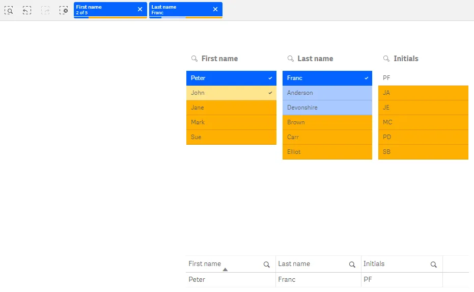
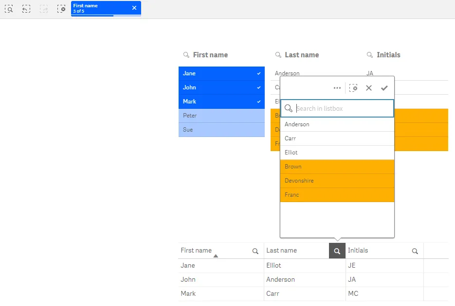
{ "_inherit": true, "dataColors": { "selected": "#0363ff", "alternative": "#a8c9ff", "excluded": "#ffaf03", "selectedExcluded": "#ffe58f", "possible": "#ffffff" }}The following images show an example of the selection bar and listboxes using custom values for the top-level
dataColors object.
The colors in the image are based on the color settings in the previous example.
Here are details about how the dataColors properties are used in each of the charts:
- The
dataColors.selectedproperty controls the main color of field items in the selection bar, as well as selected values in listboxes. This property has been set to a dark blue color. The field values Peter and Franc are colored with this property. - The
dataColors.alternativeproperty controls the color of alternative values in the selection bar and listboxes. This property has been set to a light blue color. The field values Anderson and Devonshire are colored with this property. - The
dataColors.excludedproperty controls the color of excluded values in the selection bar and listboxes. This property has been set to a dark orange color. Examples of field values with this color are Jane and Brown. - The
dataColors.selectedExcludedproperty controls the color of selected excluded values in the selection bar and listboxes. This property has been set to a light orange color. The field value John has this color. - The
dataColors.possibleproperty controls the color of possible values in listboxes. This property has been set to a white color. The field value PF has this color.
Full code example
theme.json
{ "_inherit": false, "_variables" : { "@grayscale-100" : "#FFFFFF", "@grayscale-98" : "#FBFBFB", "@grayscale-95" : "#F2F2F2", "@grayscale-90" : "#E6E6E6", "@grayscale-85" : "#D9D9D9", "@grayscale-80" : "#CCCCCC", "@grayscale-75" : "#BFBFBF", "@grayscale-70" : "#B3B3B3", "@grayscale-65" : "#A6A6A6", "@grayscale-60" : "#999999", "@grayscale-55" : "#8C8C8C", "@grayscale-50" : "#808080", "@grayscale-45" : "#737373", "@grayscale-40" : "#666666", "@grayscale-35" : "#595959", "@grayscale-30" : "#4D4D4D", "@grayscale-28" : "#474747", "@grayscale-25" : "#404040", "@grayscale-20" : "#333333", "@grayscale-15" : "#262626", "@grayscale-10" : "#1A1A1A", "@grayscale-5" : "#0D0D0D", "@grayscale-0" : "#000000", "@text" : "13px" }, "color": "@grayscale-20", "fontSize": "@text", "backgroundColor": "@grayscale-95", "dataColors": { "primaryColor": "@grayscale-28", "othersColor": "@grayscale-55", "errorColor": "@grayscale-90", "nullColor": "@grayscale-85", "selected": "#0363ff", "alternative": "#a8c9ff", "excluded": "#ffaf03", "selectedExcluded": "#ffe58f", "possible": "#ffffff" }}